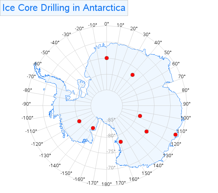
Have you ever tried to plot data on a map of Antarctica ... and been thoroughly frustrated or confused? If you're that person, or even a seasoned map maker wanting to hone your skills, then this blog post is for you! But first, here is a picture to get you
Tag: GfK
Plotting data on Antarctica - a mapping challenge!
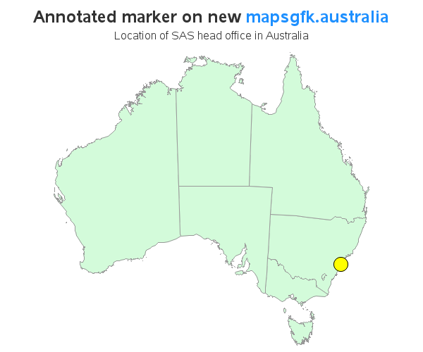
Converting your old SAS jobs to use the new GfK maps
Do you procrastinate and find excuses to delay doing certain things, even when you know they really ought to be done? And you probably realize that starting those projects is usually the hardest part, eh? Well, I finally started converting hundreds of my SAS examples to use the new GfK maps,
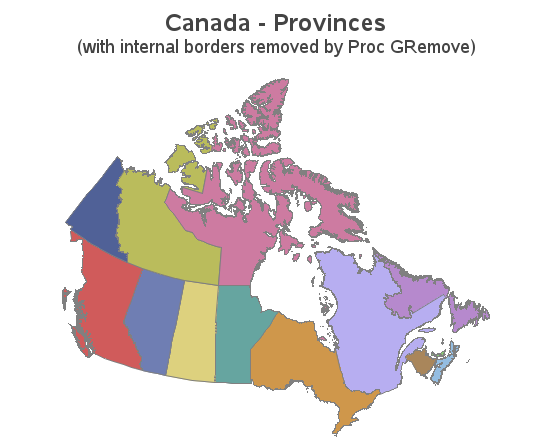
Your mapping toolkit tip #3 - removing internal borders
In recent versions of SAS/Graph, we have been shipping new/updated maps of each country, with 2 levels of detail (such as state & county, or province & division). But what if you only want a map showing the higher level of detail? In this blog post I share my third