Have you ever tried to plot data on a map of Antarctica ... and been thoroughly frustrated or confused? If you're that person, or even a seasoned map maker wanting to hone your skills, then this blog post is for you!
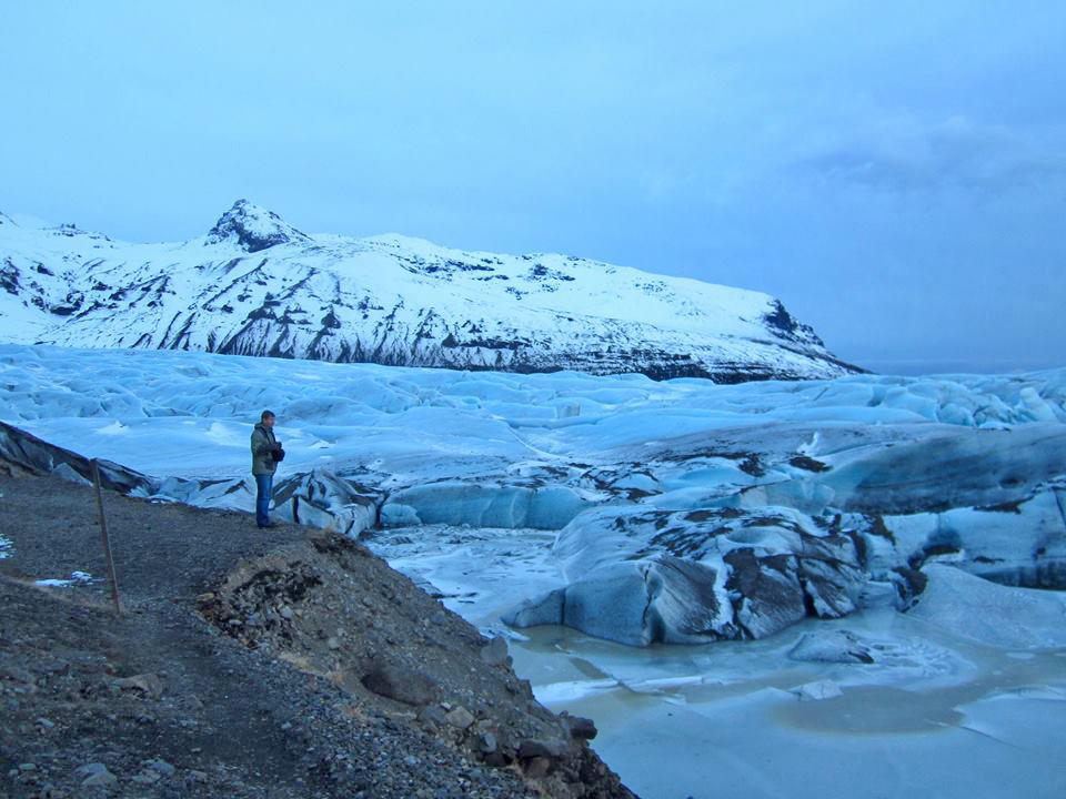
But first, here is a picture to get you into the mood for a blog about the chilly continent of Antarctica. This photo is from my friend Joy (that's her husband Erik in the photo). Is Erik in Antarctica, or in some other location? Leave your guess in a comment. And now that you're feeling chilly on this warm day, let's plot some data on Antarctica!
With the plethora of interactive online map viewers available (such as Google and OpenStreetmaps), most people are accustomed to viewing a rectangular map of the world. And since most people don't particularly care about Antarctica, they don't mind that it is stretched out across the entire bottom of the map, like this screen-capture of an OpenStreetmap:
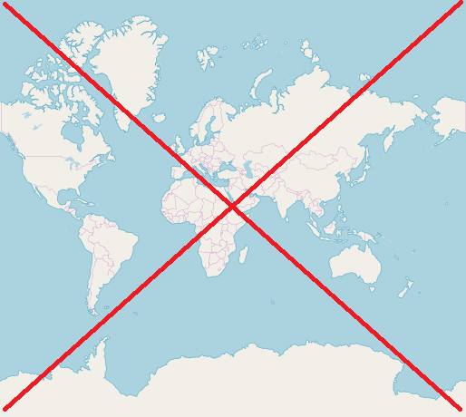
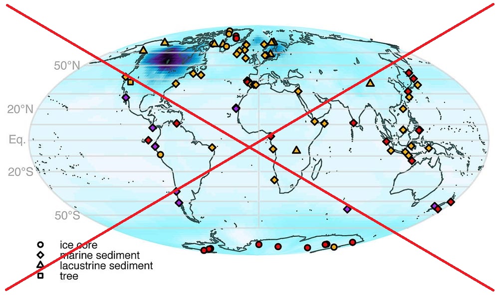
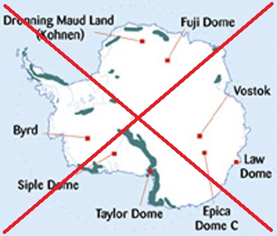
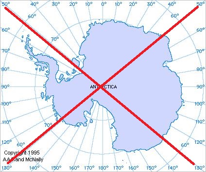
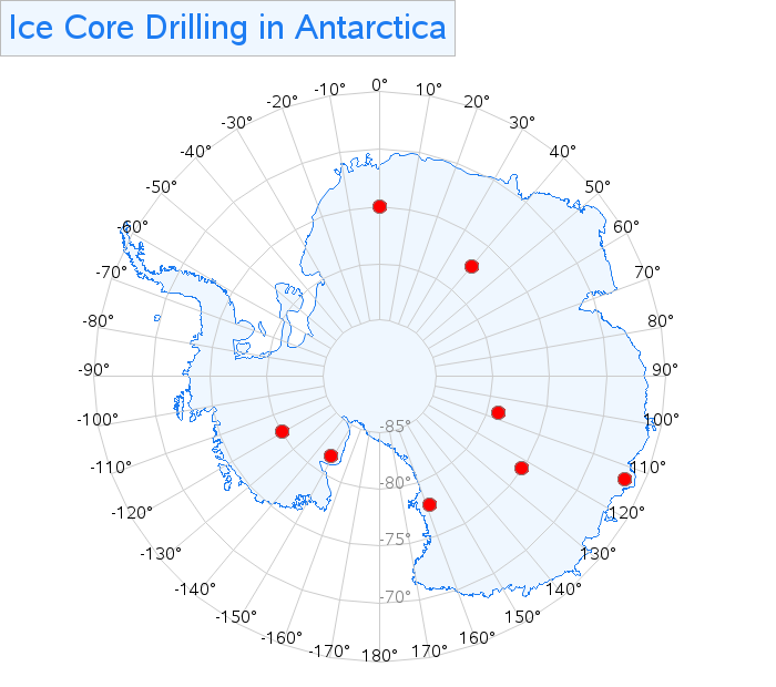
But when you start trying to plot data at specific latitude/longitude locations on the map, and some of those locations are in Antarctica, then having Antarctica stretched out of proportion becomes a problem. Here's an example of a random map I found on the web, that shows some locations where ice cores have been drilled in Antarctica. It's not quite as bad as the rectangular map above ... but it's still difficult to figure out where the markers really are on Antarctica, with it shown in this distorted fashion.
When I'm plotting data on Antarctica, I think it's much better to show Antarctica by itself, and use a map projection that leaves it in tact (and doesn't stretch it across the bottom of the map). Something more like this:
And I also like to add latitude/longitude lines to the map, like this one:
But can you do that with SAS software?!? ... The answer is yes!
When you license the SAS/Graph product, you get maps of all the countries and continents ... including Antarctica (mapsgfk.antarctica). And you can project the map any way you want, using Proc Gproject. To get something like the two maps directly above, you would have used options like "project=gnomon polelat=-90" with older versions of SAS, but in recent versions Gproject has the new "to=" option which allows you to specify PROJ.4 projections such as EPSG:3031 (which works well for Antarctica), using code something like this:
proc gproject data=my_map out=my_map latlong eastlong degrees dupok
to="EPSG:3031" latmax=-64;
id id;
run;
After projecting it, I plotted the map with Proc GMap, and used custom annotate code to draw and label a lat/long grid on the map (using simple move & draw functions), and place markers at the locations of the research stations (using the pie function). Here's a screen capture of my finished map - you can click on it to see the interactive version, with mouse-over text and drill-downs on the markers:
And now you know how to plot data on Antarctica! Perhaps if you become an expert at creating this type of map, that skill will help you get a job at a research station there some day! :-)
If you'd like to see the full SAS code, here is a link.

6 Comments
I was down in Antarctica way back in the 79-80 season. The picture resembles a normal depiction of the terrain around the Taylor Dry Valley area near Ross island. Can you identify the location?
Ahh - interesting! ... Erik is actually in Iceland in this photo! :-)
Great post, Robert, thanks!
Why do you always cross out the graph to indicate that its not yours? Is this a common convention?
The main reason is I don't want people who might just be casually glancing at the blog thinking it is my good/final graph!
Dear Robert,
May I ask for an online Training for medical use?
My Skype is yolnda.yu
Thanks a lot!
Yolanda
Here is the closest thing I've got:
http://robslink.com/SAS/democd_hls/aaaindex.htm