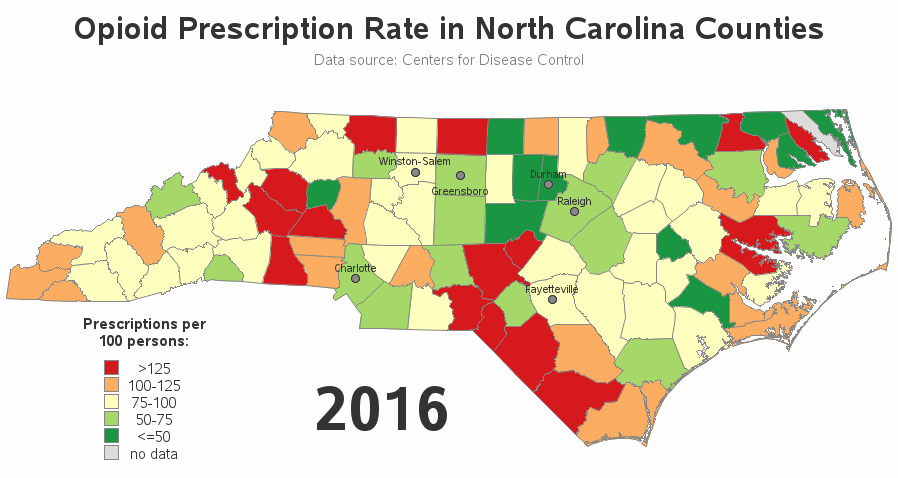
Where are opioids prescribed most, in North Carolina?

My buddy Rick Wicklin recently pointed me towards an animation of some opioid prescription rate data for Illinois. And, of course, I decided we needed a similar animation for North Carolina (with a few improvements...) Here's the original, and here are the problems that jump out at me: Counties with