Recently a colleague was requested to create a bar chart showing the performance of students in a school compared to county and state wide schools. The solution using SGPLOT was simple as shown below. /*--Create data--*/ data school; input Year Group $ Value; format Value percent5.1; datalines;
Tag: DataLabel
Custom bar labels

HBar with Data Labels
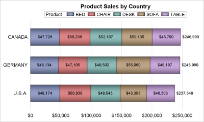
A common request on the communities page is to place data labels on horizontal bar charts. Often users want to display stacked horizontal bar charts, with the values displayed for each segment and the overall value of the bar itself as shown in the example below. In this example, the

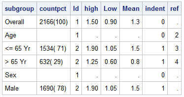
Ways to include textual data columns in graphs
Most simple graphs generally include graphical representation of data using various plot type such as bar charts, scatter plots, histograms, box plots step plots and more. Both SG procedures and GTL provide many easy ways to create such graphs. However, for many real world use cases, we need to display related textual data in
