Death is always a difficult topic to discuss, and death has been in the news a lot during this tragic coronavirus pandemic. Many news stories focus on states, counties, or cities that have the most cases or the most deaths. A related statistic is the case fatality rate, which is
Tag: coronavirus
In some cases, recovery provides immunity to future infections, however the evidence currently available for COVID-19 cannot confirm this immunity stage.
By this point you may be wondering whether the so-called hill that represents the move to operationalization may actually be a mountain.
Every day we face risks. If we drive to work, we risk a fatal auto accident. If we eat red meat and fatty foods, we risk a heart attack. If we go out in public during a pandemic, we risk contracting a disease. A logical response to risk is to
Being a state governor has never been more difficult than right at this moment, because the extreme steps governors are being forced to take in order to protect their citizens’ health are having an equally extreme impact on other critical aspects of our society. In the face of social distancing
During an epidemic, such as the coronavirus pandemic of 2020, the media often shows graphs of the cumulative numbers of confirmed cases for different countries. Often these graphs use a logarithmic scale for the vertical axis. In these graphs, a straight line indicates that new cases are increasing at an
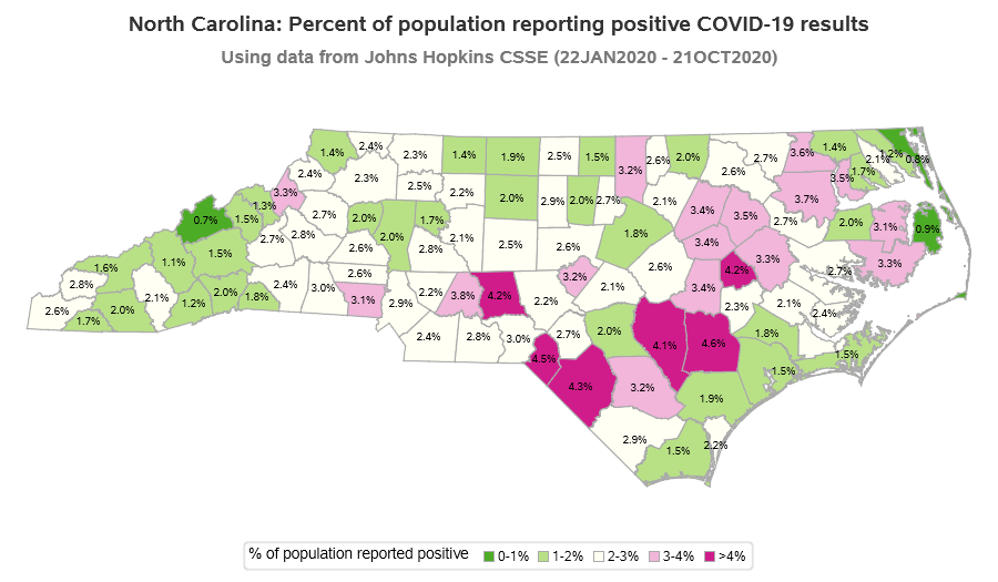
Now that COVID-19 is spreading in the US, I thought it might be helpful to view the data at a more granular level. Follow along as I plot the county data on a map and discuss how the color-binning can influence people's perception of the data. Maps like this can
A cumulative curve shows the total amount of some quantity at multiple points in time. Examples include: Total sales of songs, movies, or books, beginning when the item is released. Total views of blog posts, beginning when the post is published. Total cases of a disease for different countries, beginning
Forecasting During Chaos The Institute of Business Forecasting has produced an 80-minute virtual town hall on "Forecasting & Planning During the Chaos of a Global Pandemic." The on-demand video recording is available now and well worth a look. There is much solid practical guidance from an experienced panel: Eric Wilson,
During an outbreak of a disease, such as the coronavirus (COVID-19) pandemic, the media shows daily graphs that convey the spread of the disease. The following two graphs appear frequently: New cases for each day (or week). This information is usually shown as a histogram or needle plot. The graph
この記事はSAS Institute Japanが翻訳および編集したもので、もともとはMark Lambrechtによって執筆されました。元記事はこちらです(英語)。 世界的な公衆衛生問題が拡散する際、初期段階では多くの不明事項が存在するものですが、新型コロナウイルスのように急速な感染拡大の場合は特にその度合が高まります。データ・ビジュアライゼーションは、傾向を理解したり、複数のデータポイントから意味のあるストーリーを組み立てたりするための優れたスタート地点となりえます。ウイルスの拡散状況を視覚化できる機能は、問題意識の喚起、そのインパクトの理解、そして究極的には予防努力の支援に役立つ可能性があります。 2019年12月31日、世界保健機関(WHO)の中国オフィスは、中国湖北省の武漢市で検知された原因不明の肺炎の感染ケースについて報告を受けました。最初の報告以降、この新型コロナウイルス(SARS-CoV-2)は世界的な感染拡大を見せており、感染者は30ヶ国以上の数万人に及び、「新型コロナウイルス感染症(COVID-19)」と呼ばれる急性呼吸器疾病を引き起こしています。 この状況を受け、SASは新型コロナウイルスの現況、場所、拡散状況、トレンド分析を描き出すインタラクティブなレポートを作成しました。 元になるデータは日次で更新されており、感染拡大の進行状況を定期的にチェックすることや、世界的な拡散状況を時間軸に沿ったアニメーションで確認することができます。この対話操作型レポートでは以下のことが行えます。 過去10日以内に新たに確認された感染者の数を調べ、このウイルスの感染率、回復率、死亡率がどのように推移しているかを確認する。 このウイルスがどの地域に侵入したかを調べ、発生地の中国と世界の残りの地域とで状況を比較する。 感染確認済みのケースを分析することで、回復率が時の経過に沿ってどのように変化しているかを理解する。 このレポートはSAS Visual Analyticsと、WHO、CDC、ECDC、NHC、およびDXYからのデータ(JHU CSSEによってコンパイルされたもの)を用いて作成されています[訳注:JHU CSSE=米国ジョンズ・ホプキンズ大学システム科学工学センター]。 SAS Visual Analyticsで作成した新型コロナウイルス・レポートの概要 「新型コロナウイルス感染症(以下、COVID-19)」の感染拡大に関するサマリー情報を手早く確認したい場合は、こちらをご覧ください。 このサマリー情報は、世界各地の統計情報を用いて日次で更新されています。このWebページのこれ以降では、各種レポートからの重要な洞察をスクリーンショットでご紹介します。実際のレポートでは、最新のデータに基づき、ご自身で対話操作しながら統計情報や分析結果を閲覧することができます。 地域別の詳細情報を確認したい場合や、対話操作型レポート全体を探索したい場合は、サマリー情報ページの右上隅にある「Full Report」ボタンをクリックすると、完全なダッシュボードを起動できます。 最初に表示されるダッシュボード・ビュー([Status]タブ)では、日次で更新されるデータに基づき、COVID-19の感染拡大の概況を簡単に確認できます。具体的には、新たに確認された感染者数、回復者数、死亡者数などを地域別にフィルタリングして閲覧することができます。 図1: COVID-19の感染拡大の概況。新たに確認された感染者数、回復者数、死亡者数などを地域別にフィルタリングして閲覧することができます。 レポートの[Locations]タブ(下の図2)では、 全世界および特定国の新型コロナウイルス関連データを確認できます。 図2:[Locations]タブでは、全世界および特定国の新型コロナウイルス関連データを確認できます。 特定国のデータを見るには、左上のフィールドに国名を入力します(下の図3)。 図3: 国名を入力すると、その国の詳細情報だけに集中することができます。 新型コロナウイルスの最初の感染者が中国で報告されてから既に何週間も経過しており、感染拡大は世界各地へと広がっています。私たちは、Esri社のGISマッピング・ソフトウェアから取得した地理空間データのレイヤーを追加することで、対話操作型の画面を用いて、中国とその他の国々にまたがる形で新型コロナウイルスの拡散状況を探索できるようにしました。 [Spread]タブでは、SAS Visual Analyticsの時系列アニメーション機能(下の図4)を用いて、ウイルスが世界全体に拡散していく様子を見ることができます。アニメーションを再生すると、中国国内での拡散状況や、世界全体の拡散状況および深刻度を確認できます。 図4: 時系列アニメーションで、ウイルスが世界全体に拡散していく様子を見ることができます。 [Trend Analysis]タブでは、様々なビジュアライゼーションを切り替えながら、COVID-19の感染拡大に関連したその他のデータの傾向を見ることができます(下の図5)。 図5: 日次の感染者数/死亡者数のトレンド分析 [Epidemiological Analysis]タブでは、罹患率および有病率を見ることができます。 図6: 10万人あたりのCOVID-19感染者数を国ごとに見る 図7: 期間有病率を国または地域ごとに見る [Collective Insights]タブは、全世界のまたは国ごとの感染拡大状況を1つの表にまとめています(下の図8)。
Everyone's thinking about the Coronavirus Disease 2019 (COVID-19), and wondering if there are any cases near where they live. I recently used SAS Software to create a dashboard with a world map showing which countries had reported cases. And now that the virus has spread around the world, a world/country-level
In the early days and weeks of any widespread global health concern, particularly in a fast-moving outbreak like the coronavirus, there are many unknowns. Data visualization can be a good starting point to understand trends and piece data points together into a meaningful story. The ability to visualize the spread
El coronavirus ha sido un tema importante en las noticias últimamente: es una enfermedad similar a la neumonía que ha cobrado la vida de varias personas. Se cree que comenzó en China y se ha extendido a varios otros países, por lo que debemos estar preparados en caso de que
The COVID-19 Coronavirus outbreak has been in the news a lot lately, and everyone is probably looking for a quick/easy way to see the data. The best visualization I've seen so far is this dashboard by Johns Hopkins. Here's a screen-capture: But before we dive into the data analysis, let's
The coronavirus has been a big item in the news lately - it's a pneumonia-like illness that has killed several people. It's thought to have started in China, and has spread to several other countries (including at least one case in the U.S.). The World Health Organization says the coronavirus