Analysis of clinical data is easier when the data is presented in a visual form. Clinical graphs have special requirements to deliver study data together in one concise graph, often with statistical information that is aligned with the data values on the x or y axis. SAS SG Procedures and GTL provide you the features you need to create effective clinical graphs. Also see “Clinical Graphs using SAS”, a SAS Press.
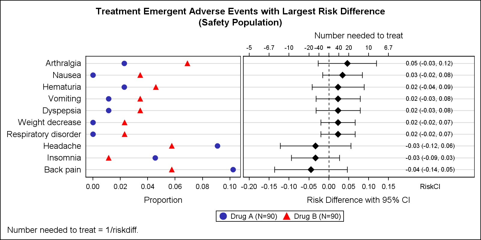
Adverse Events Graph with NNT

Early last year I wrote an article on how to create the "Most Frequent Adverse Events Sorted by Relative Risk" graph using the SGPLOT procedure. The key issue here is that such a graph normally displays two plots side by side, a scatter plot of the proportion values by treatment