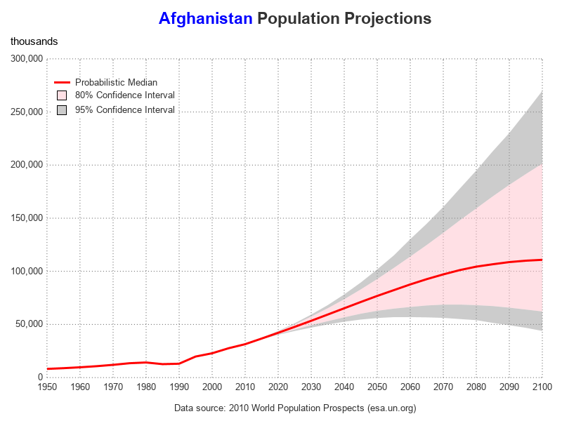
Plotting population projections, with a confidence interval

During the year 2020, many countries and areas will be conducting their decennial census, and making projections to estimate what their population will be in the future. Therefore I decided to dust off one of my old SAS/Graph samples based on the 2010 census, and rewrite it using more modern