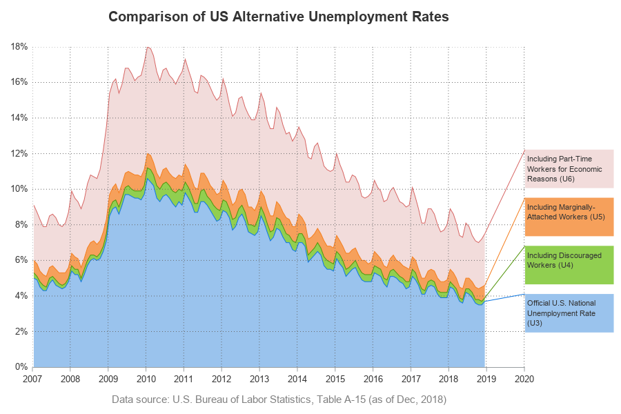
Many areas of the US are experiencing record low unemployment. This is great at the national level, and also great at a personal level (for example, I now have fewer unemployed friends asking to borrow money!) But just how low is the US unemployment rate, and how does it compare
Tag: BAND Plot
Visualizing unemployment data, with a band plot
Violin Plots
Over the past month or more, I have been in a conversation with SAS user James Marcus, on creation of some new displays for visual communication of uncertainty. These include display of densities using a "Violin" plot, "Density Strips" and more. With his permission, I can share some of the
Extended Bands
In the Clinical Research domain, there is often the need to display lab values by treatment or test and it is often useful to view this data along with reference lines showing the normal ranges. The obvious way is to use reference lines to denote the normal ranges. SGPLOT Code: proc sgplot data=band; scatter x=x y=y