
SAS Viya has a large list of mapping shapes for geographic visualizations, but sometimes business units have custom regions that need to be displayed. These can range from individual counties, sales regions, postal codes, and voting regions. To properly visualize these regions, SAS has a process to bring in regions with custom borders.
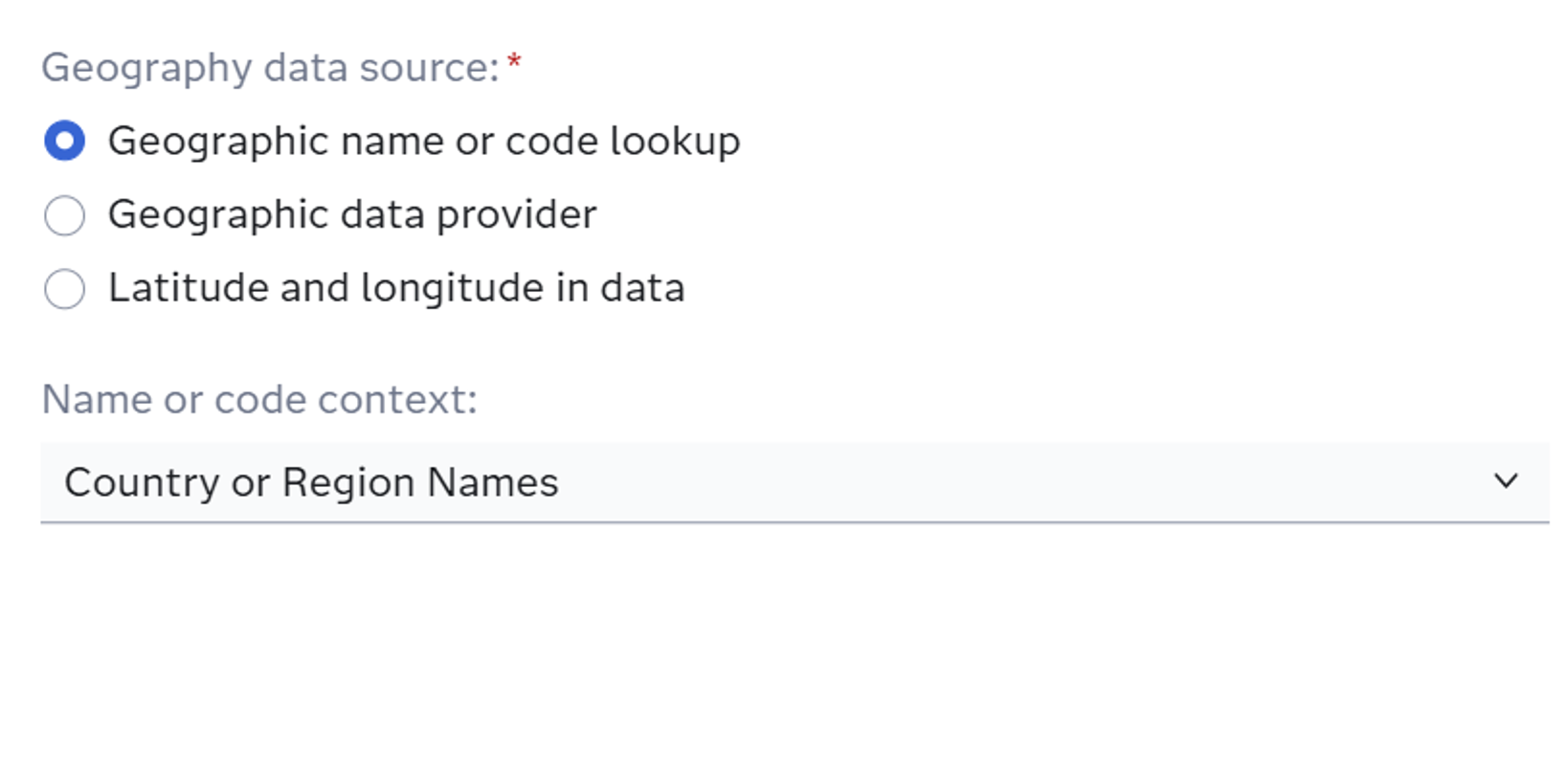
SAS already has many regions preloaded into the system. When creating a new geography item in Visual Analytics, Viya has three options: Geographic name or code lookup, Geographic data provider, or Latitude and Longitude in data. For building regions that are already in SAS, select the geographic name or code lookup option. A drop-down list will appear asking for a Name or Code lookup (Figure 1).
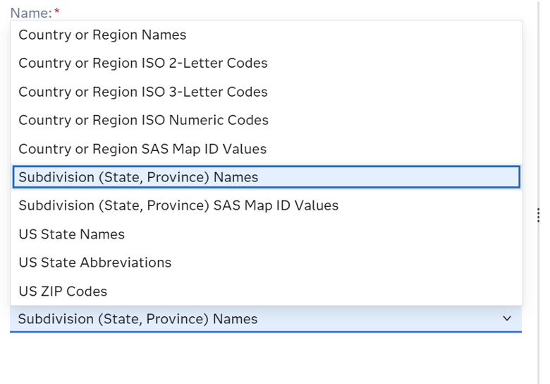
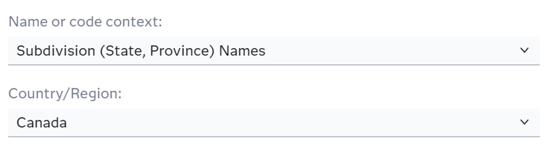
Depending on the user data, the context will change. If the column has full country names, use Country or Region Names. If there are 2 letter state names, use that option. There are quite a few options (Figure 2) but for regions that cover whole states and do not have custom borders/shapes outside of political boundaries, the option of Subdivision (State, province) Names is ideal. When that option is selected, another drop-down will appear for the country that the data refers to, giving worldwide options for region shapes (Figure 3).
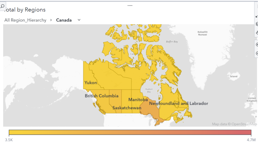
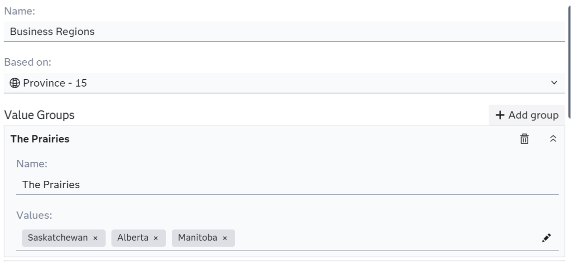
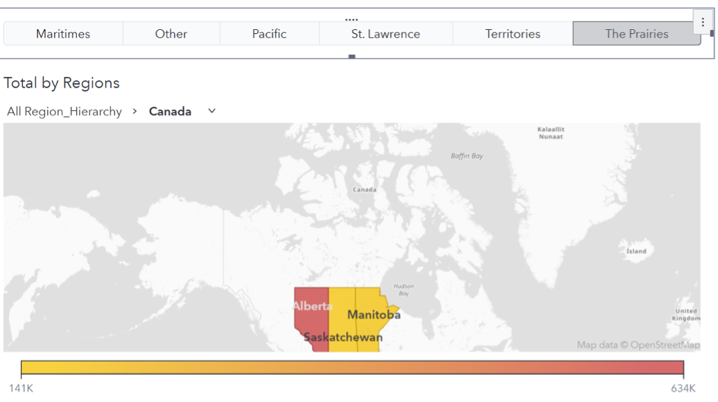
The user can now visualize the provinces/states for individual countries (Figure 4). But, sometimes these regions are tied together. To combine these predefined provinces, the user can create a custom category. In the data tab, create a custom category. Add the geography item created before to be “Based on”. Then add each of the provinces to individual groups for each region (Figure 5). Then add a button bar or filter to individually select the regions to display (Figure 6). A data tip value can be added so when hovering over the map, the business region will appear.
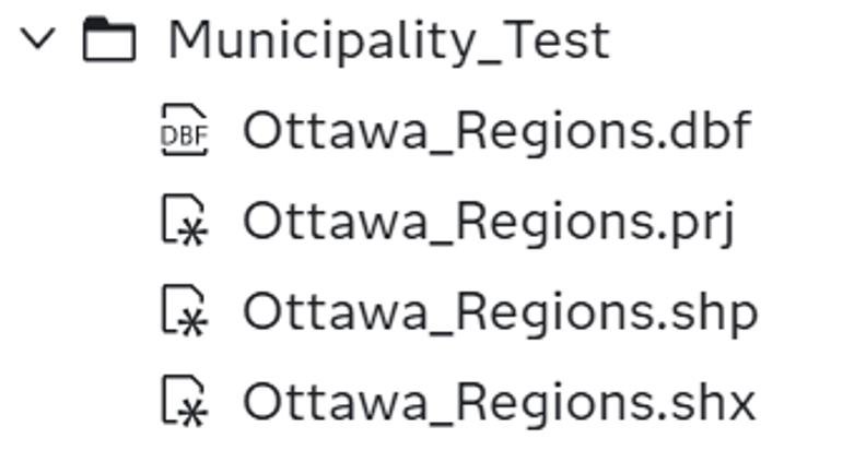
Now, if the region has custom borders, there is a process for this. To start this process, the user must have Geographic permissions from the admin of the Viya environment (Full admin permissions also work). Once that is completed, they can begin. To start, the user needs to have a shapefile of the region they wish to bring to SAS. The files required for this process to properly run are .shp, .shx, .dbf, and .prj files (Figure 7). These files are used to turn a shapefile into a dataset SAS can read.
Once those files are in SAS, a SAS macro will need to be run. This macro (Figure 8) has <> brackets where the user will need to fill out. The shape file path is the path to the .shp file location. The .shp file must be stored with the other 3 files in the same folder. The ID column is the column with the names of the regions in the shapefile dataset. This file is what maps data to the file once in Visual Analytics by mapping the categorical column that contains the region name and joins it with the shapefile names. If the id column is unknown to the user, I have found a way that if the code is run with the other blanks filled, the code will run with errors but the columns in the .shp file are revealed with the rows. To do this, give the <insert ID Column> a random name and once the name of the column is discovered, replace the ID and rerun the code. The outtable is the name that the SAS dataset will take on after the code is run. The cashost and casport are values found in Manage Environment in the Servers tab, just copy those values over. Lastly, the caslib selection is which library the SAS dataset will be outputted in (Public or casuser typically).

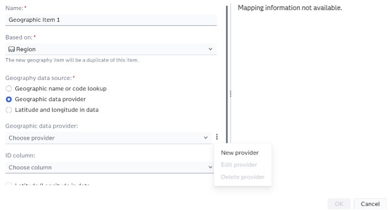
Once the macro has run successfully, the user can navigate to Visual Analytics. This is where the shapefiles are connected to the dataset. Make sure the user’s data containing the region values is included in the report. Then select “New Data Item” in the data pane and “New Geography Item”. Select the region column that has the region names for the “Based on” item. Then select “Geographic data provider”. This is where the new region shapes are created. If the user has created these regions before, they can use a provider in the drop-down menu. In this case a new provider is needed, so click on the three dot icon. Select “New provider” (Figure 9).
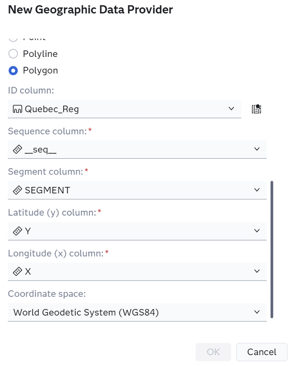
The new geographic data provider menu will appear. Enter a Name and a Label; these can be the same or different. This determines how the provider will appear the next time the user wants to use these shapes. Leave Type and Server the same, unless the shapefile macro was saved elsewhere. Select the Library to where the macro in Figure 8 had caslib pointing to (Public in this case). Select the outtable created for the table selection. Select Polygon for geometry. Change the ID column to the value used in id for Figure 8. Then have _seq_, SEGMENT, Y, X for the next 4 options (Figure 10). Lastly, the coordinate space is needed.
Depending on where the .shp was found, it could be a variety of different values. WGS84 is the standard I like to work with but when shapefiles are sourced from outside of the user’s ArcGIS then custom options can be needed. If the EPSG value is known, select coordinate space as custom value and then “EPSG <4-digit number>”. The user may not get it correct on the first try so keep trying different numbers as the EPSG value (that are somewhat close to the estimated value. Googling the value is an option as well). A wrong EPSG value may put the shapes all over the map but as the guesses get closer, the shapes will appear closer to their actual location.
Once this is complete, the provider will be created. Now returning to the geography item page, select ID column as the same as the “Based on” column. Then the regions are complete. Select a geo-region map in the objects pane and select the new geography item as the geography (Figure 11).
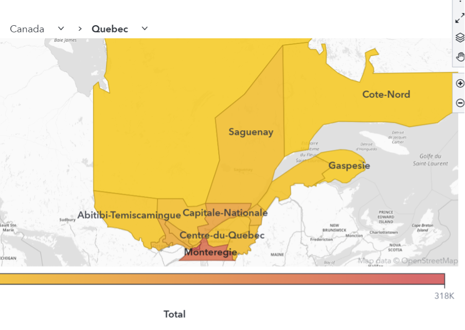
The new shapes are properly uploaded into SAS and can be visualized with data. The users now have the freedom to map any territory they prefer and can customize their mapping reports. By combining SAS Viya’s built-in geographic options with the ability to upload custom shapefiles, users can accurately represent business-specific regions that go beyond standard political boundaries. Whether you are grouping existing regions or bringing in fully custom shapes, this process gives you the flexibility to create precise, meaningful maps that better reflect how your organization views and analyzes geographic data.