Designing interactive reports can be a fun and unique challenge. As user interface experience designers can attest, there are several aspects that go into developing a successful and effective self-service tool. Granted I’m not designing the actual software, but reports require a similar approach to be sure that visualizations are clear and that users can get to the answers they are looking for. Enter prompts.
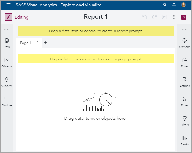
Reports prompt users to better understand trends, how their data points compare to the whole, and to narrow the scope of data. Being able to pick the placement of these prompts quickly and easily will open the possibilities of your report layouts! I’m specifically speaking about Report and Page level prompts. Traditionally, these global prompt controls were only able to be placed at the top; see the yellow highlighted areas below.
Let’s take a look at an example report with the traditional Report and Page prompt layout. The Report prompts are extremely easy to pick out, since they sit above the pages, but the Page prompts can sometimes blend in with other prompts contained in the report body.
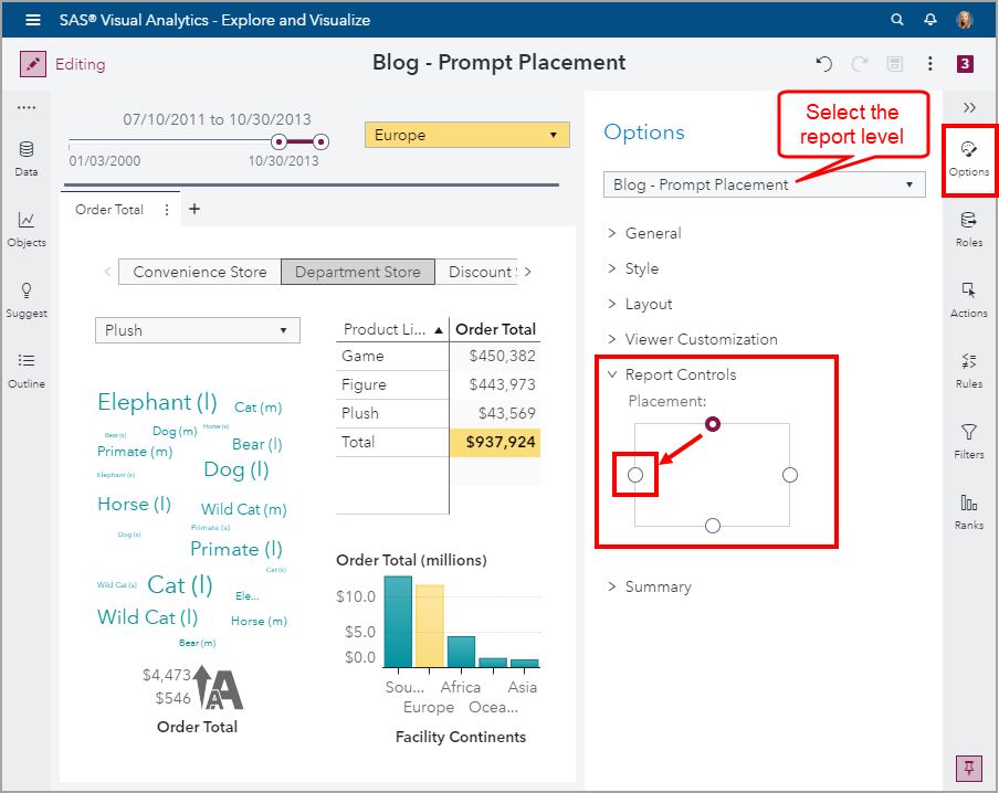
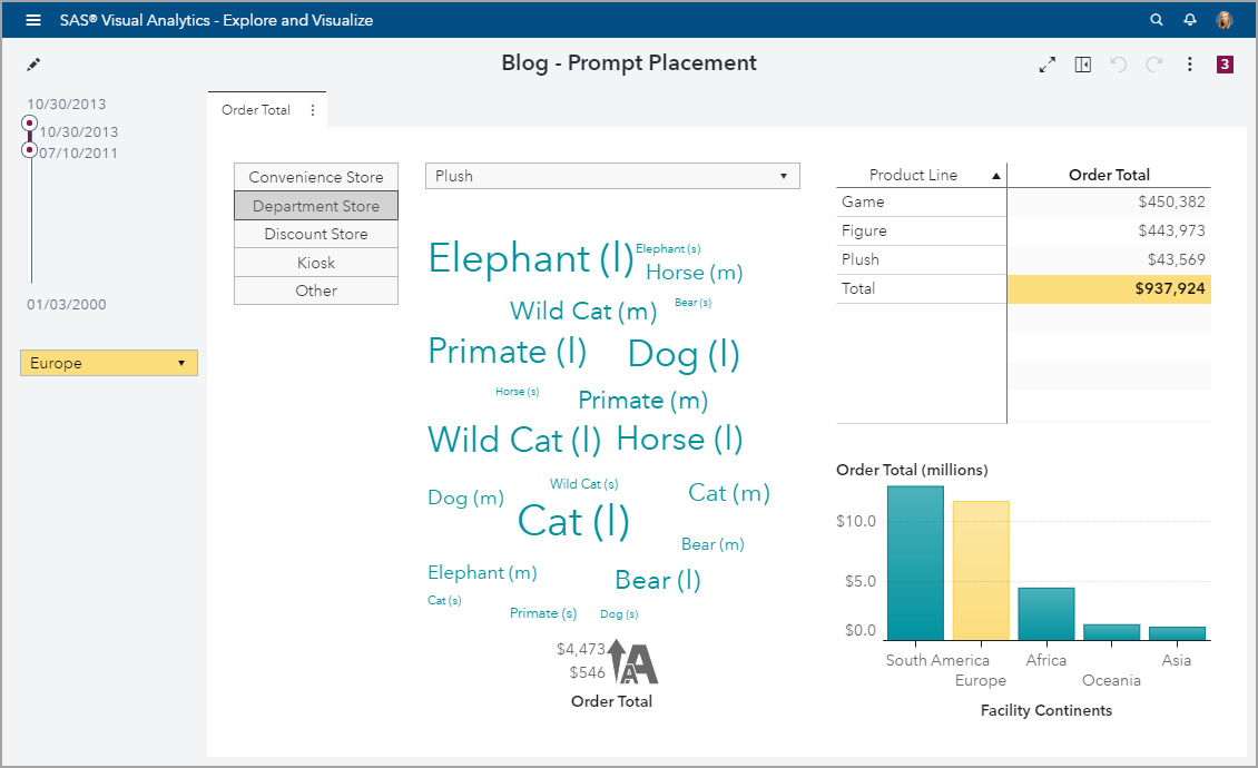
Introduced in the SAS Visual Analytics 8.4 release is the ability to control the layout position of these prompts. Using my example report, let’s change the placement of these prompts. In Edit mode, open the Options pane and use the top level drop-down to select the report name. This will activate the report level, and the report level Options will display. Next, under the Report Controls subgroup, move the placement radio button to the west cardinal point.
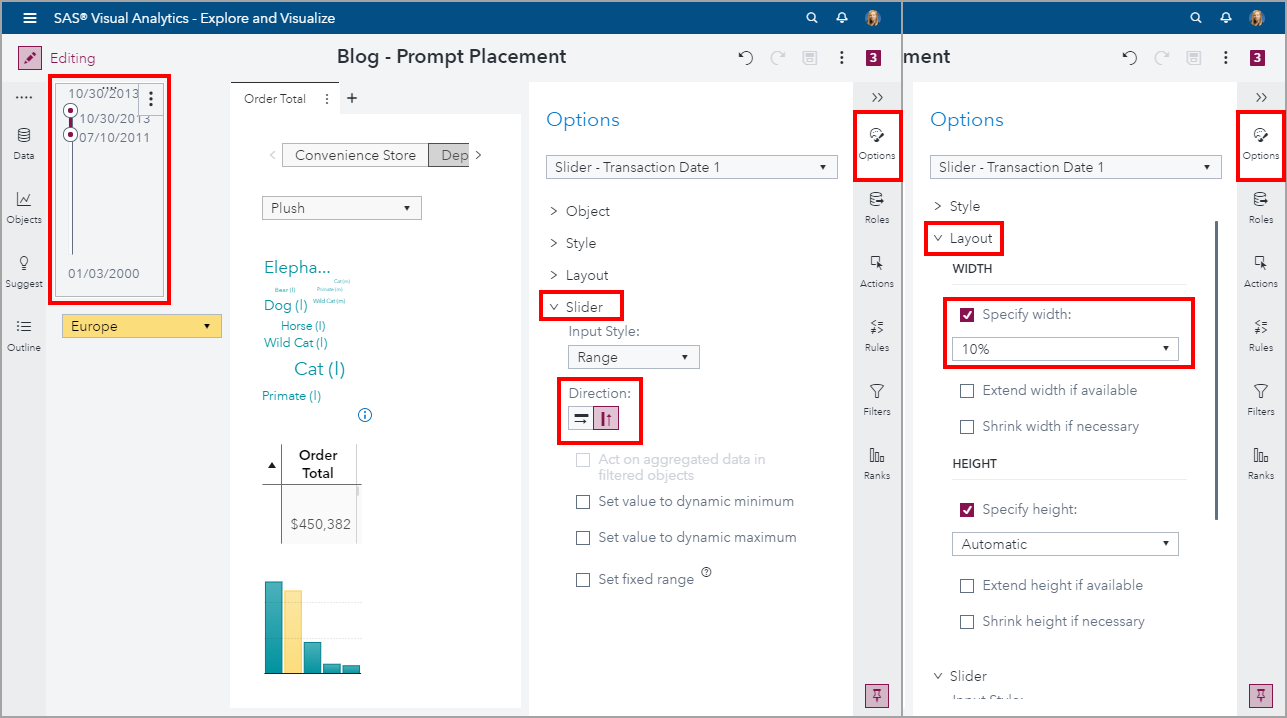
Depending on the type of control objects you are using in your report, you may not like this layout yet. For instance, you can see here that my date slider is taking up too much space.
When you activate the slide control, use the Options pane to alter the Slider Direction and Layout. You can even use the Style option to change the font size. You can see that after these modifications, the Report prompt space can be configured to your liking.
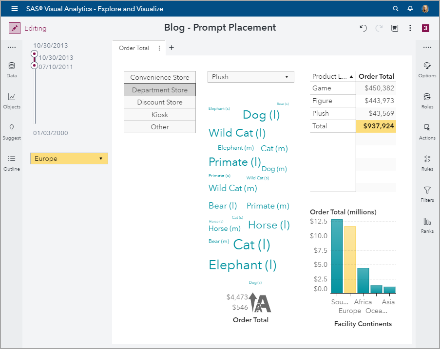
Next, let’s change the placement for the Page prompts, for demonstration purposes. From the Options pane, use the top drop-down to select the page name. This will activate the page level, and the page level Options will display. Next, under the Page Controls subgroup, move the placement radio button to the west cardinal position.
You can see that the direction of the button bar control was automatically changed to vertical. Now we can clearly see which prompts belong to the page level.
If I switch to view mode, and adjust the browser size, you can get a better feel for the Report and Page prompt layout changes.
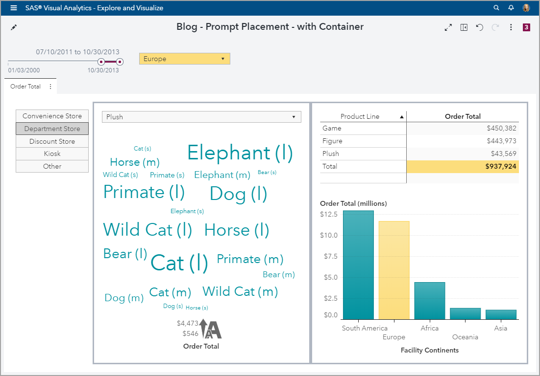
But as with many things, just because you can, doesn’t mean you should. This is where the report designer’s creativity and style can really take flight. Here is the same report, but with my preferred styling.
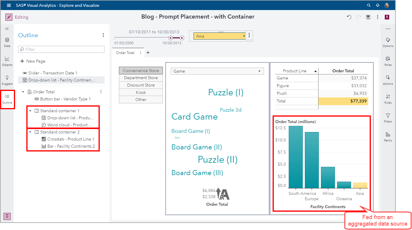
Notice that I kept the Report prompts along the top but moved the Page prompts to the left of the report. I also added two containers and configured a gray border for each container to better separate the objects. This helps the user quickly see that the drop-down will filter the word cloud is only. I also used the yellow highlighting through styling and a display rule to emphasize the selected continent. The bar chart is fed from an aggregated data source which is why the report prompt is not filtering out the other continents.
Feel free to send me your latest report design ideas!
Additional material related to Report and Page prompts:





3 Comments
Hi ,
I can't seem to find the report control placement option in 8.3.
Would you know if it was removed in 8.3.
Thanks
This is a new feature introduced in VA 8.4 and is not available in VA 8.3.
Thank you,
Teri
Cool Thanks