Jazz up your Geo Map or Network Analysis graph by applying icon-based display rule markers instead of color markers on the map. With SAS Visual Analytics, you may have already used display rules by populating intervals or adding color-mapped values for report objects. Now, you can jazz up your Geo Map or Network Analysis object by choosing from a curated set of icons and applying icon-based display rule markers.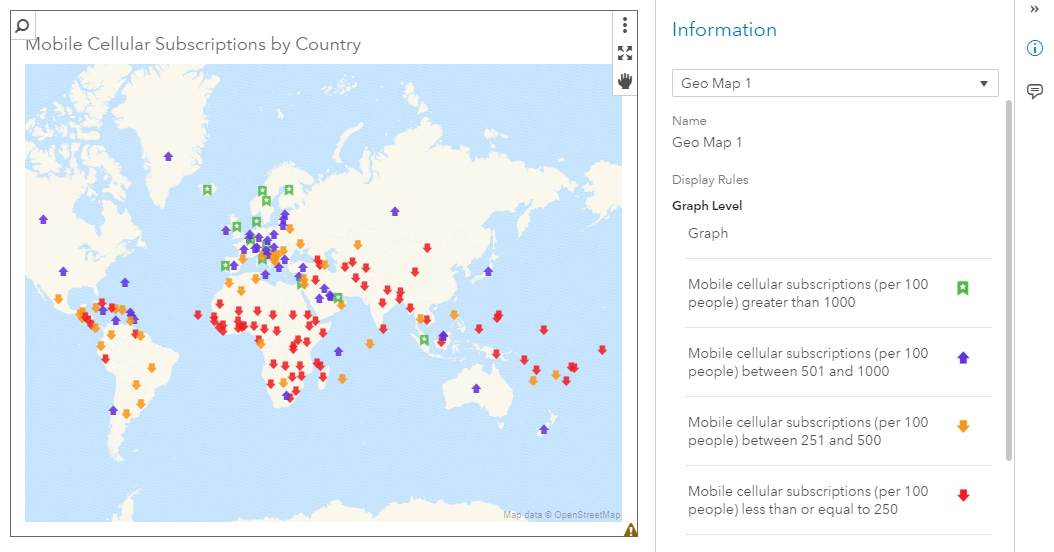
The set of curated icons in SAS Visual Analytics 8.2 are classified into these groups for use with icon-based display rules:
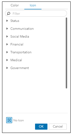
Here is an example of the display-rule icons that are available for Status:
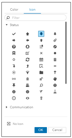
When your mouse hovers over an icon, the name of that icon is displayed.
Applying Icon-Based Display Rules to a Geo Map
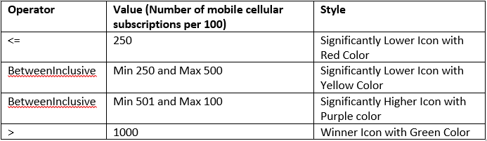
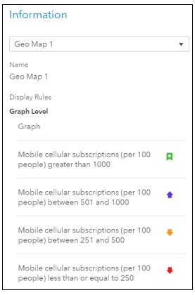
While working with a data source that included a measure for the total number of cellular mobile subscriptions per 100 in each country, I wanted to display the results in a Geo Map. Before creating the display rules, I looked at the data for the mobile cellular subscriptions for various countries, and decided that I wanted to create four display rules, each one associated with the number of mobile cellular subscriptions per 100. The icons that I wanted for my display rules were all available under Status. So here’s how I decided to set up my operators, values, and the icon style and color:
Here are the steps I followed to setup the icon-based display rules.
Create the New Geography Item
1. In my new SAS Visual Analytics 8.2 report, I went to Objects, chose Geo Map (available under Graphs) and dragged it over to the blank canvas.
2. From Data, I searched for my data source and added it to the report.
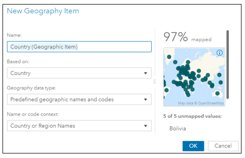
3. In my data source, I highlighted the category (Country), right clicked, and selected New Geography.
4. In the New Geography Item dialog, I entered a name for the new geographic item that I was creating: Country (Geographic Item).
Change Geo Map Type to Coordinates
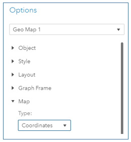
5. I select the Geo Map, go to Options in SAS Visual Analytics and scroll down to Map.
6. By default, the Type is set to Bubbles. I change it to Coordinates (this is a requirement to create the icon-based display rules).
7. The default size for the Marker size is 11. I change it to 14 because I would like my markers to show up slightly bigger in the Geo Map.
8. By default, Legend is displayed for the Geo Map and Visibility is set to On. I chose not to display Legend information for the Geo Map, so I chose Off for Visibility.
Choose Role for the Geo Map
9. I choose Roles, and I am ready to assign the geographic data item to Category. So I choose the Country (Geographic Item) that I had just created, and drag it over to Category. I now see the Country (Geographic) data role applied to the Geo Map.
Create Icon-Based Display Rules for the Geo Map
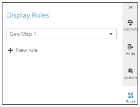
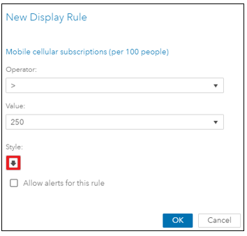
10. I click on Rules and under Display Rules, I click on New rule.
11. In the New Display Rule dialog, I chose <= for Operator and entered a 250 for Value.
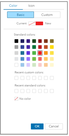
12. I click on Style and choose Red as the color for this display rule.
13. I click on Icon, and I am presented with seven categories for the icons. When I hover an icon, the icon name is displayed.
14. I click on the Significantly Lower icon and click OK.

15. A quick review of what I just created and I click OK.
16. I continue to create three additional display rules for my Geo Map.
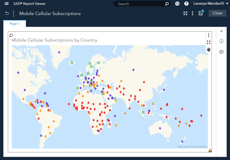
Now, I have completed creating the four display rules. Here’s how they show in the SAS Visual Analytics Viewer:
17. When all of the display rules have been created, the Geo Map displays with the colorful icon-based display rules applied to the various countries.
You’ve just seen how you can create icon-based display rules for a Geo Map. You can also create icon-based display rules for a Network Analysis object as well.

2 Comments
Hello. I have a filter on my Geomap to hide/show particular groups. When the filter changes, the filter keeps the shape and colors in the map, but the legend does not reflect what is shown on the map (legend defaults back to the automatic line/marker settings). How do I maintain these custom icons in the Legend for the Geo Map? I'm using SAS VA 8.3.
Hi Al, thank you for your comment. For a quick resolution to a question like this, I suggest opening a track with Tech Support if you haven't already: https://support.sas.com/en/technical-support/contact-sas.html