Pick your category? If this title seems familiar, that’s because in my last blog, Use parameters to pick your metric in VA Reports, I covered how to use parameters to allow your users to pick which metric they want to view in their visualizations. This is a great technique that offers a solution to many report requirements.
But, what if your users require specific axes labels and titles for your visualizations? What if your users require reference lines? If you encounter these requirements then consider using a stack container to meet these needs.
Let’s take a look; but first, here is a breakdown of the report we will be looking at in this blog. This report does not have any report level prompts but it does have two section prompts. Section prompts filter the data for every object on this section. There is a drop-down list control object that prompts the user for Year, and there is also a button bar control object that prompts the user for Continent.
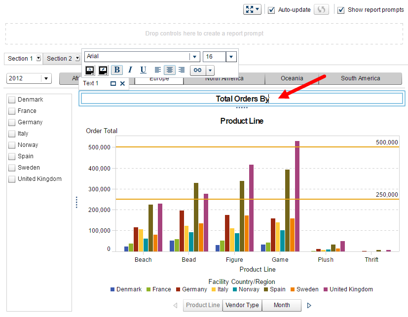
Then in the report body there is a list control object, a text box and a stack container. The list control object prompts the user for Country. The text box provides the first half of the report title. And the stack container provides a way to organize multiple visualizations on your report; it layers or “stacks” the objects as if they were in a slide deck. The stack container provides navigation options to cycle through the visualization objects that were added. In this example, I added two bar charts and one line chart object to the stack container.
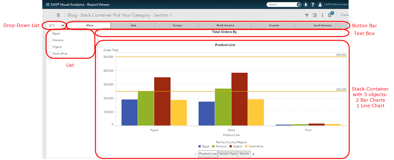
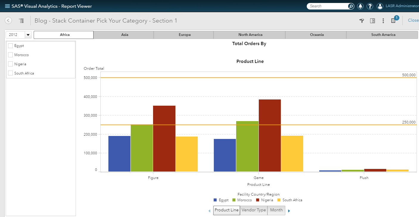
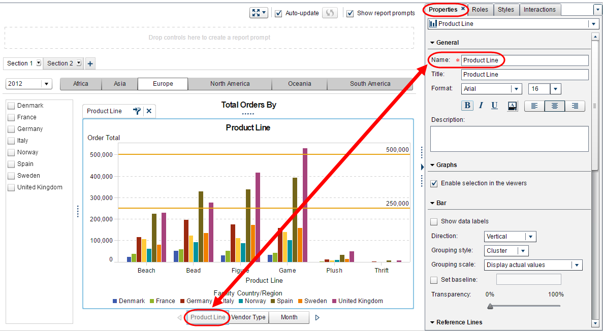
In this first view, I have the Product Line bar chart selected from the stack container. Notice in this bar chart I have two reference lines defined for the Y-axis: one at 250,000 and one at 500,000 for Order Total. Having these reference lines remain static as I select different continents from the button bar section prompt helps to compare these values across the different countries and regions. You can use reference lines to help identify goals or targets, acceptable or unacceptable ranges, previous year average or even previous month average, etc., basically any metric that puts a frame of reference around the values on the visualization.
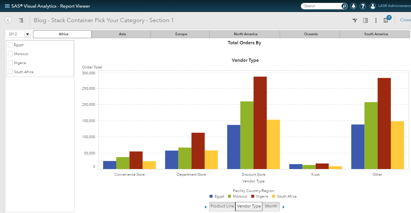
In this second view, I have the Vendor Type bar chart selected from the stack container. Notice in this bar chart I do not have any reference lines.
In this third view, I have the Month line chart selected from the stack container.
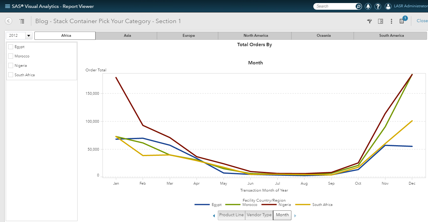
I have used the text box in this report to help with the custom titles. In this case, the title of this report is Total Orders By then each visualization in the stack container uses the category role as its title: either Product Line, Vendor Type or Month to complete the report title.
What can you do with a stack container?
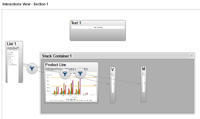
You cannot create an interaction or link to or from the stack container itself, but you can from the individual objects that are inside the stack container.
The way the stack container is used in this report allows the user to focus on the metric Order Totals and then examine these values across several category data items. As you can see, I have created an interaction from the list control object to each visualization in the stack container which allows the report user to filter out outliers or compare specific countries.
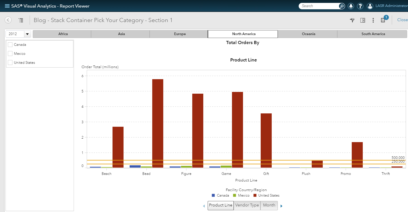
In this screenshot, I have North America selected for my continent. We can see that the values for United States greatly exceed the values for Mexico and Canada. We can also see how far the United States values are from our reference lines.
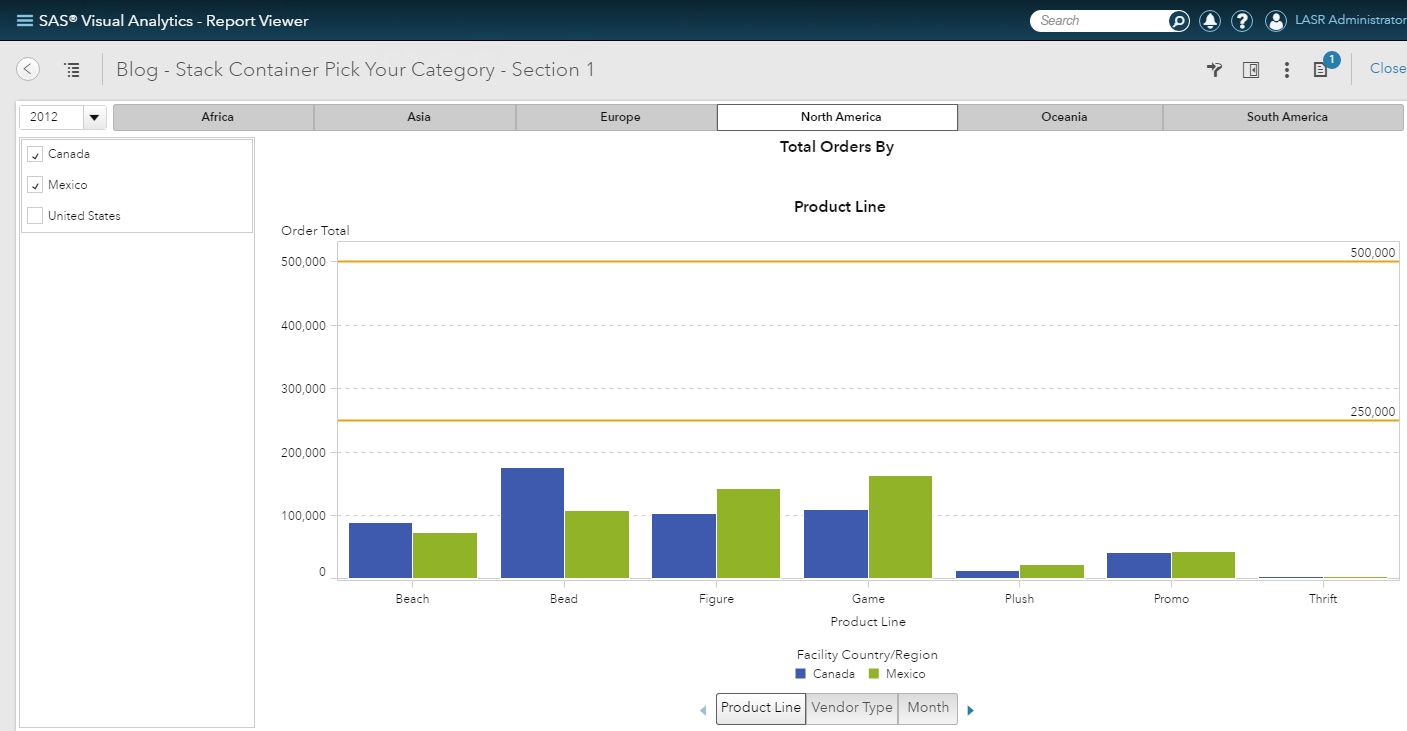
If I remove United States from this visualization - by using the list control to select Canada and Mexico - I can see more clearly how these values compare to each other and to the reference lines.
How is the stack container implemented?
Simply drag and drop the Stack Container object from the Objects tab on to your report. Then, drag and drop the different objects into the stack container. In my example, I added two bar charts and a line chart. From the stack container’s Properties tab you can order the objects you added to the stack container by using the up and down arrows.
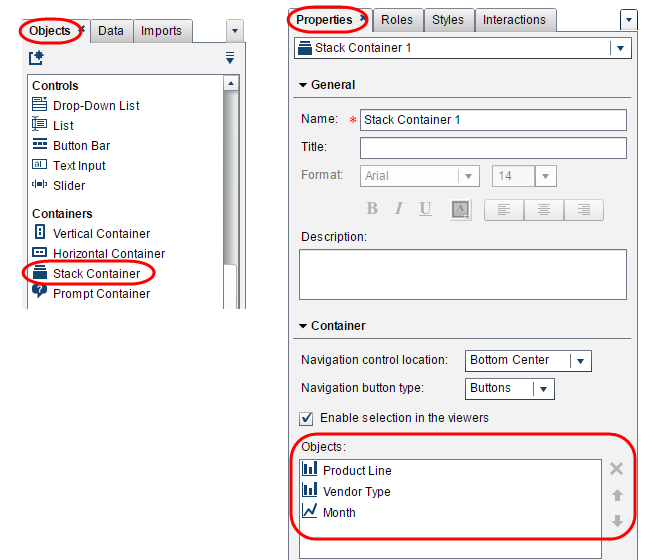
How do you name the stack container objects?
These are the individual Names of each visualization object from the Properties tab. In this screenshot, I have the first bar chart selected, and I named this bar chart Product Line.
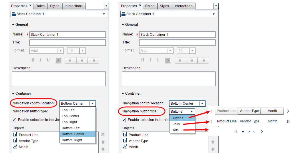
You can also select different navigation properties for the stack container:
- Navigation control location: Top left, Top Center, Top Right, Bottom Left, Bottom Center, or Bottom Right
- Navigation button type: Buttons, Links, or Dots.
Just like in the pick your metric blog, you can use this report technique to allow your report users to pick either different metrics, categories or both!
The stack container is one of my favorite report objects and really provides an interactive reporting experience to examine and explore the data.

1 Comment
Teri, great post! We need more of these. Just wonder if you have any comparison data on the efficiency of the two methods - using parameters vs. stack container, especially for large data volumes.