Michele Ensor recently posted a wonderful blog with a graph of the 2014 Winter Olympics medal count. I'm going to further refine that graph, making it an Olympic graph ... on steroids! :) Here is Michele's graph: First, let's give it a few simple cosmetic changes. I always like to have
Tag: tips and tricks
Sure, you have a great looking table and you produce it with PROC TABULATE. And then, bam! Your boss comes along and decides that since your output looks so good in Word, that he’d like that boilerplate paragraph inserted automatically. Currently, you produce the tables and then pass the RTF
“Dear Cat, In a repeated measures drug study, I am unsure what to do with the baseline measurement. Since it is one of the time points in my study, I feel like I should use it as one of the dependent variable measurements. But I have seen analyses where baseline
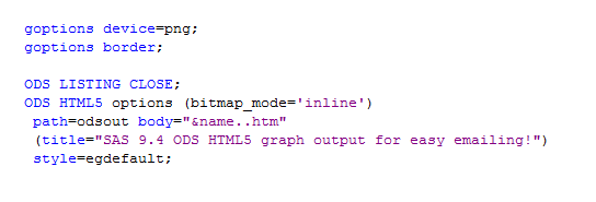
SAS 9.4 allows you to create html5 output with your graph inline (as part of the html), providing a great way to email your SAS/Graph output! Previously, if you used ods html and dev=png to create graphs, you had to deal with two files -- a png file (containing the graph)
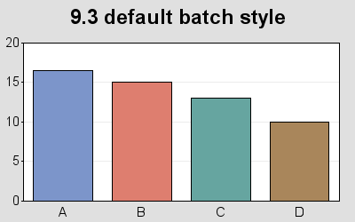
ODS graph styles provide users with an easy way to control things such as the colors and fonts used in a graph, freeing the user from having to specify these properties in their code. A lot of thought was given to picking colors that work well together, and look good. The
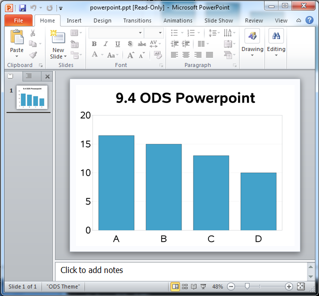
To say that I'm excited about the SAS 9.4 release is an understatement! For example, did you know that in SAS 9.4, you can write SAS/Graph output directly to a Powerpoint slide?!? This is definitely an item that was on my "wish list," and will no doubt make life a
Over the holidays I was having a discussion with my cat, Ms. Trixie Lou. A question that often arises during the first programming class is the following: how do I find the variables that are in common to these two or three data sets? As it turns out, Ms. Trixie
One of my students emailed me, asking how to easily reset SAS system options. He was looking for a one-liner solution, just like you get with graphic options: GOPTIONS RESET; While there isn't a RESET keyword for the OPTIONS statement, you can save your options settings before making changes using
When working with "big data" you usually have too many points to view in a plot, and end up subsetting or summarizing the data. But now, in SAS 9.3, you have an alternative! For example, the following scatter plot of 10,000+ points is just a visual "blob": But using a new
A SAS user (who lives in the the US) emailed me a question about SAS functions. He was reading UTC (Coordinated Universal Time) datetime values from server logs, and to make future calculations and comparisons easier, he wanted to transform the value to local datetime. The INTNX() function worked great, but