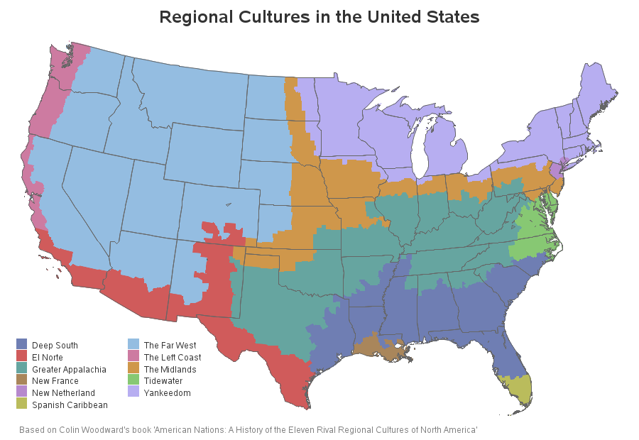
Are you from Yankeedom, The Far West, or somewhere in between? In this blog, I use SAS maps to explore some fun data about regional cultures in the U.S. I recently ran across an interesting article about Colin Woodward's book "American Nations: A History of the Eleven Rival Regional Cultures
Tag: maps
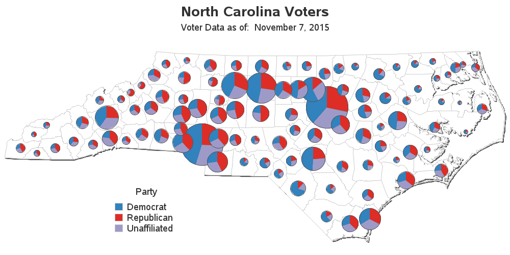
With a major election coming next year, I was wondering if there have been any shifts & changes in the voters in my state. This seems like an interesting opportunity for some data analysis, eh!?! To get you into the spirit of elections, here's an "I Voted" sticker from my friend
I remember being intrigued by the movie In Search of Noah's Ark, when I was a kid back in the 1970s. They claimed to have definitively found the ark ... but of course, since then several other people claim to have found it in other locations. Therefore I don't feel too
Every year, Fortune magazine compiles a list of the 500 largest US corporations - called the Fortune 500. Their list was a bit difficult to digest in text-form, so I thought I'd try using some maps & graphs on the data ... For a map analysis, I thought it would
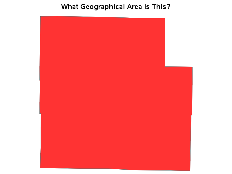
My blog posts focus on visual data analysis, and many of them use geographical maps. Therefore I hope you will have fun with a quick geography quiz, which I created using SAS/Graph ... And what, you might
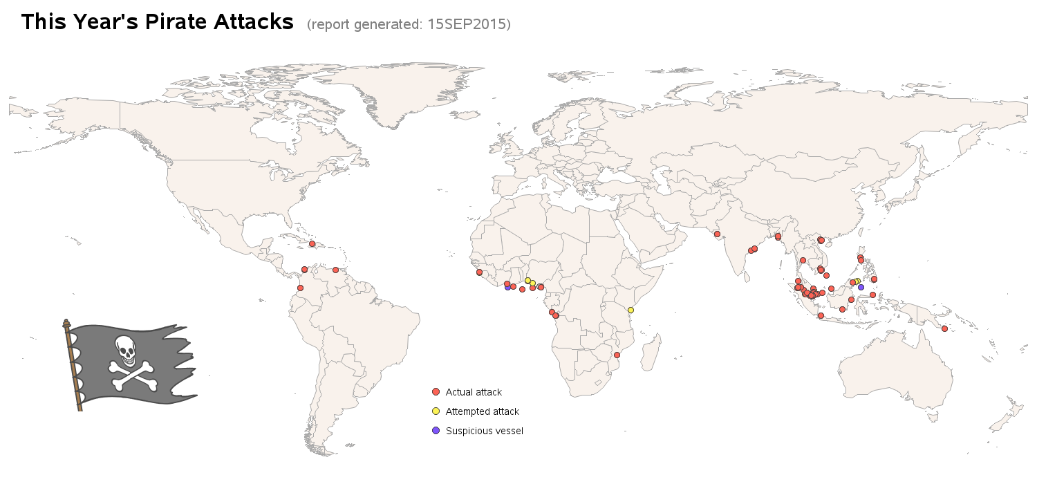
I just returned home from an expedition/adventure boat trip to Cuba, and Talk Like a Pirate day is coming up this Saturday - what a combination for an interesting blog! I hope you enjoy a few pictures, and a bit of data analysis on these topics! A couple of weeks ago,
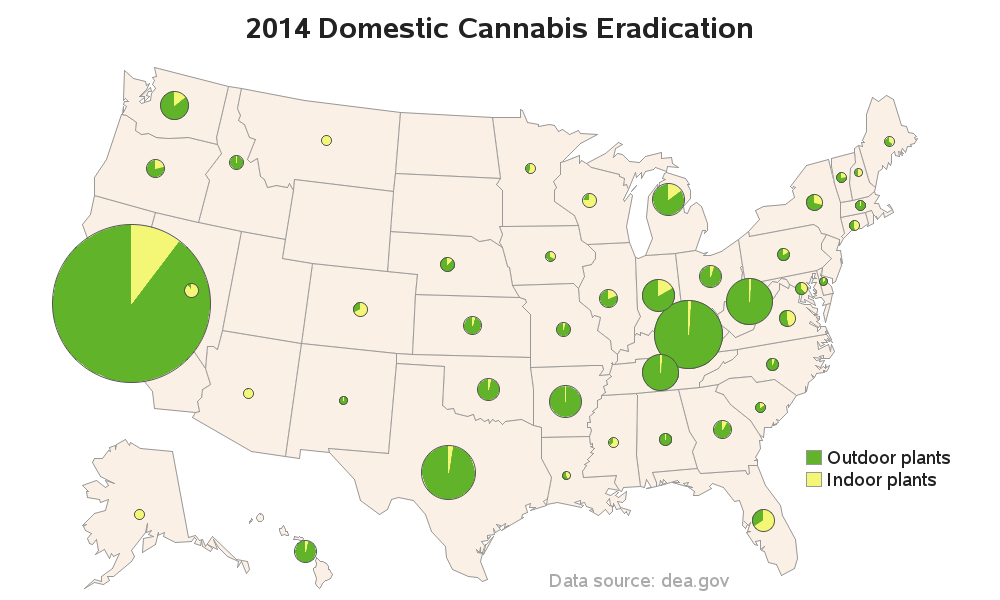
In my quest for interesting data to graph, I found some Drug Enforcement Administration (DEA) data on US domestic cannabis eradication. Does the data say anything interesting? Read on to find out! ... While doing some searches for other data, I happened across a table on the DEA website titled
Bald eagles, the national bird of the United States, came perilously close to becoming extinct here, but are now making a comeback! Let's look at the data with a SAS map! When I was growing up in the 1970s & 80s here in North Carolina, I spent a lot of time
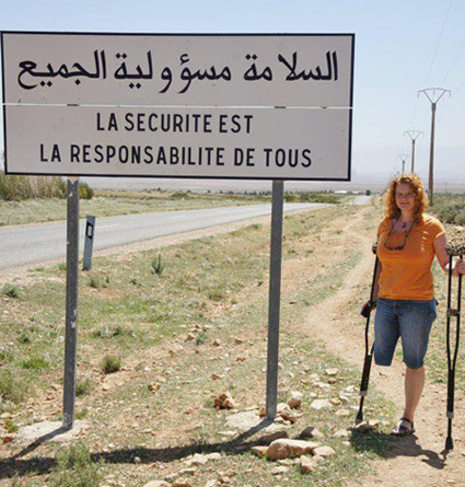
As you travel around the world, do you know where English, French, Spanish, and Arabic are spoken? This blog will help you quickly answer that question, with some cool SAS maps! But first, here's a picture of my friend Joy posing beside an interesting sign during one of her international
A recent study by Bai & Anderson has found that some hospitals charge 10x (ie, 1000%) higher than the standard rates set by Medicare. Many news agencies have posted the list of the 50 US hospitals that have the highest markup. But I am more visually oriented, so of course I used SAS