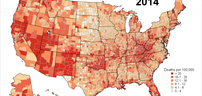
If you're a fan of SAS' ODS Graphics, you probably know that it does pretty much everything except geographical maps. But it's flexible enough that you can "fake it 'till you make it"! This example describes how to fake a geographical (choropleth) heat map using Proc SGplot polygons. In my
Tag: maps
If you give an artist some tools, they can create a pretty picture. Sure, they might have a preferred tool - but they can probably do a pretty decent job no matter what you give them (paint, colored pencils, watercolor, charcoal, etc). And creating pretty graphs in SAS is no
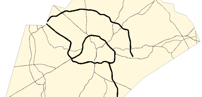
Have you been using the SAS/Graph Gmap procedure to plot your data on maps for years, but never knew you could add roads to your maps?!? Follow along in this blog post, and I'll teach you how... But before we get started, here's a picture of a nice aerial view
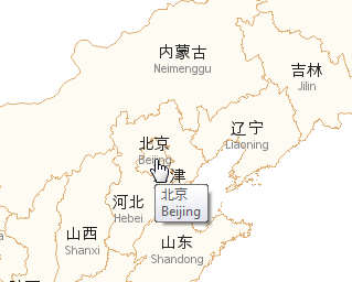
Doing business in a global economy, have you ever found yourself wanting to show Chinese (or Korean, or Japanese) labels on a map? If so, then this blog is for you! Before we get started, here is a photo of some Chinese characters to get you into the mood. This
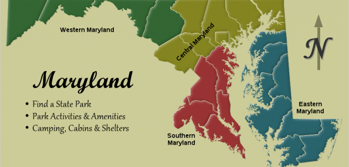
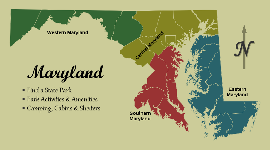
I usually create very technical maps, to display data spatially - and they usually have a certain look. They're clear, crisp, and to the point. I typically only use color to represent the data, and I choose a font that is simple and easy to read (such as arial). But
Parents are always proud of their kids, and think their kids are better than all the other kids. I guess it might be a little bit that way with mapping software ... but I really do think I've got a pretty compelling example to show that SAS maps are better
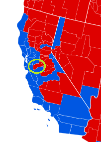
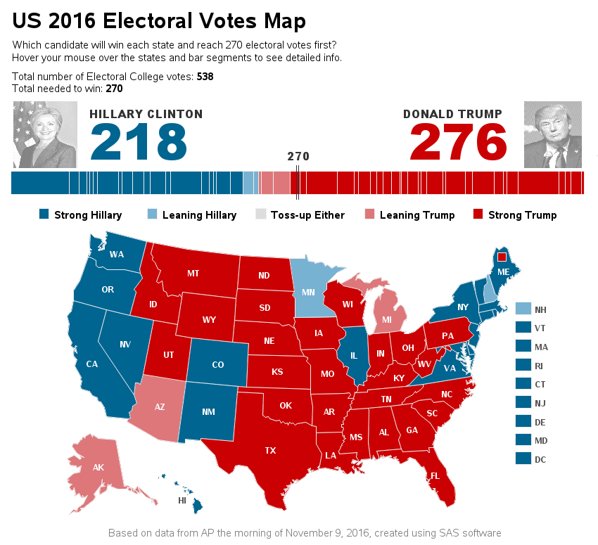
In the US presidential election, each of the 50 states has a certain number of electoral votes, based on the population. Typically, most states cast all their electoral votes for the candidate who wins in their state (all or nothing). But states can split their electoral votes if they want
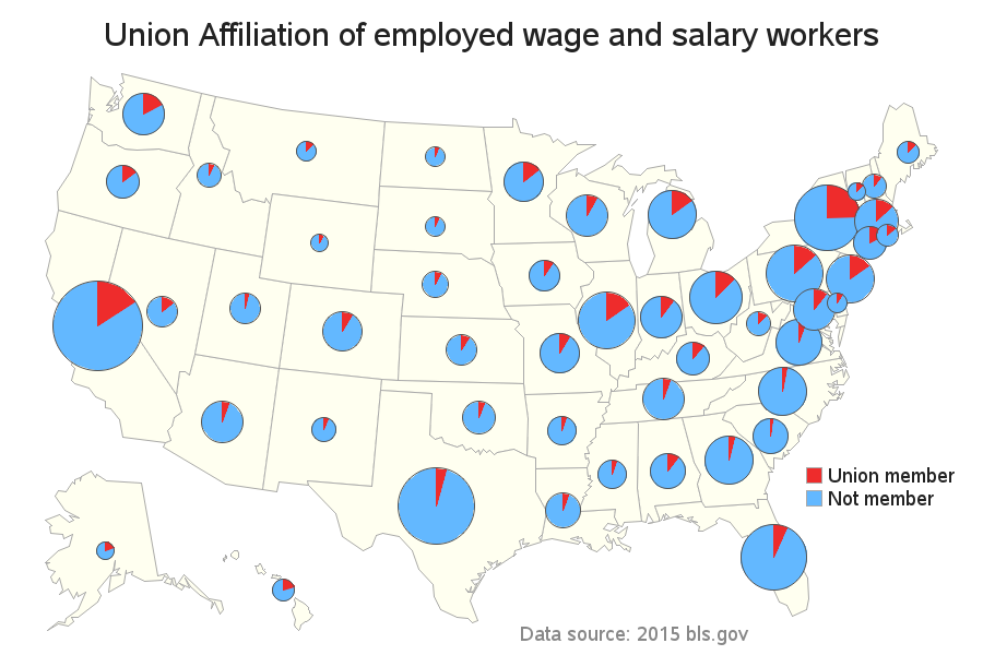
In the past, a large percentage of US workers have been union members, and the unions could exert a big influence on elections. How powerful are the unions these days, an where do they wield the most influence? Let's map it out... In 1954, almost 35% of US workers belonged to
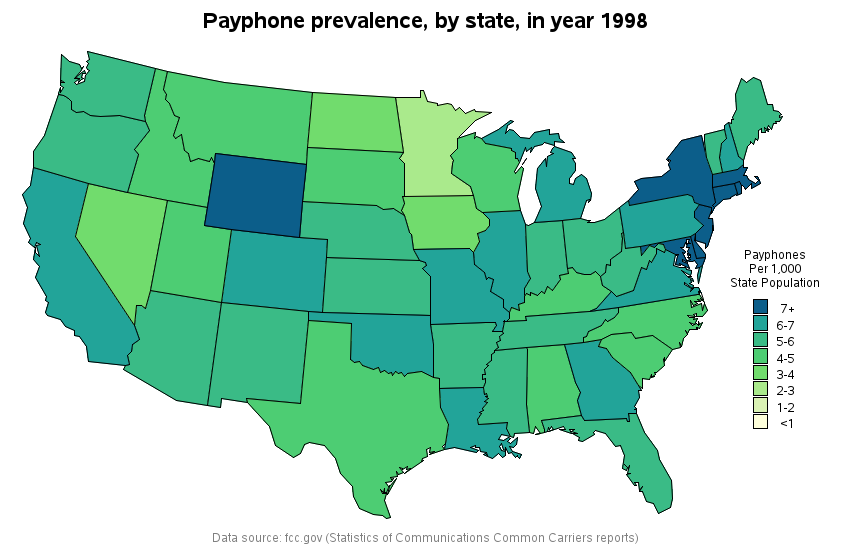
What do people have in common who have used analog clocks, vinyl records, and payphones? They were all probably born before 1980! Now, let's focus on those payphones!... A lot of young kids these days can't imagine a world where everyone doesn't have a wireless phone. My buddy Ed likes
Have you ever wondered how far you live from the closest nuclear power plant? I've crunched the numbers for cities here in the US, and created an interactive SAS map to help answer that question! The average age of US nuclear power plants is 35 years, and there just doesn't