SAS Learning Post
Technical tips and tricks from SAS instructors, authors and other SAS experts.
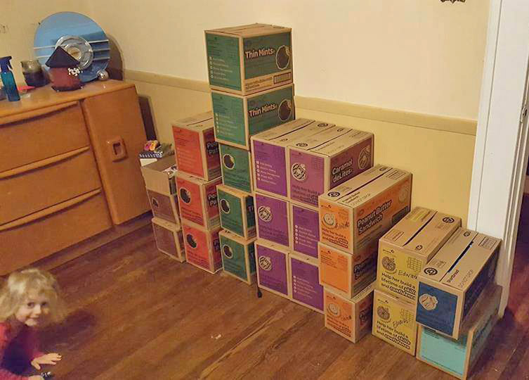
I just found out that Girl Scout cookies haven't changed from when I was a kid. I just moved to a different area, serviced by a different cookie maker! That's what I found out from the cool map in an article on latimes.com! The article explains that there are two different
When I saw Robert Kosoro's cool ZIPScribble map, I knew I had to create a SAS version - and of course I had to add a few enhancements along the way.... I was perusing some of the examples on dadaviz.com, and Kosoro's ZIPScribble map caught my attention. It wasn't a particularly useful
You might be surprised at how many movies and TV shows are made in North Carolina - especially within the last few years. This blog provides a SAS graph that will make the list of films even easier to read! A recent story by the Tar Heel Traveler, and an exhibit
After the legalization of recreational marijuana use in Colorado in 2012, it has been a much more frequent news topic than before - even from a data analysis perspective... I was recently looking for 'interesting' data to analyze with SAS, and I noticed some articles about the increasing potency of marijuana in
Smallpox was declared eradicated in 1979, after an extensive vaccination campaign in the 19th and 20th centuries. This blog post contains a visual analysis of the final years of this disease in the US ... In my previous blog post, I imitated and improved infectious disease graphs from a recent Wall
The Wall Street Journal recently published some graphs about seven infectious diseases, and I tried using SAS to improve the graphs ... it's a veritable infectious disease (graph) bake-off! Let's start with Measles ... here's a screen-capture of WSJ's measles graph: In general, their graph is eye-catching, and I learned a lot