SAS Learning Post
Technical tips and tricks from SAS instructors, authors and other SAS experts.
In a previous blog, Random Sampling: What's Efficient?, I discussed the efficiency of various techniques for selecting a simple random sample from a large SAS dataset. PROC SURVEYSELECT easily does the job: proc surveyselect data=large out=sample method=srs /* simple random sample */ rate=.01; /* 1% sample rate */ run; Note:

We are a few months away from SAS Global Forum in Orlando. You might think that the conference kicks off Sunday night at opening session, but there are plenty of weekend activities before then and I’d like to highlight one of them: SAS certification exam sessions. Isn’t now a great

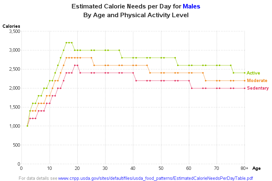
"They'll eat you out of house & home! Their food bill will put you in the poor house! ... And they never gain an ounce!" - That's what my friends say about their teenage sons. They're probably exaggerating a little, but since it's a recurring theme, there's probably some truth


