SAS Learning Post
Technical tips and tricks from SAS instructors, authors and other SAS experts.
How do the North American amusement parks compare in popularity? If this question was to come up during a lunch discussion, I bet someone would pull out their smartphone and go to Wikipedia for the answer. But is Wikipedia the definitive answer - how can we tell if Wikipedia is wrong?

You might not know it by looking at me (I’m rounding up when I tell people I’m 5’8”) but I’m a huge basketball fan. I’ve been following the sport since I was 10, coaching it for the last decade and playing on teams throughout my life, still dedicating my winters

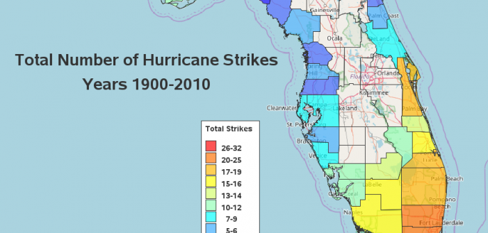
With Hurricane Irma recently pummeling pretty much the entire state of Florida, I got to wondering where past hurricanes have hit the state. Let's get some data, and figure out how to best analyze it using SAS software! I did a bit of web searching, and found the following map

