SAS Learning Post
Technical tips and tricks from SAS instructors, authors and other SAS experts.
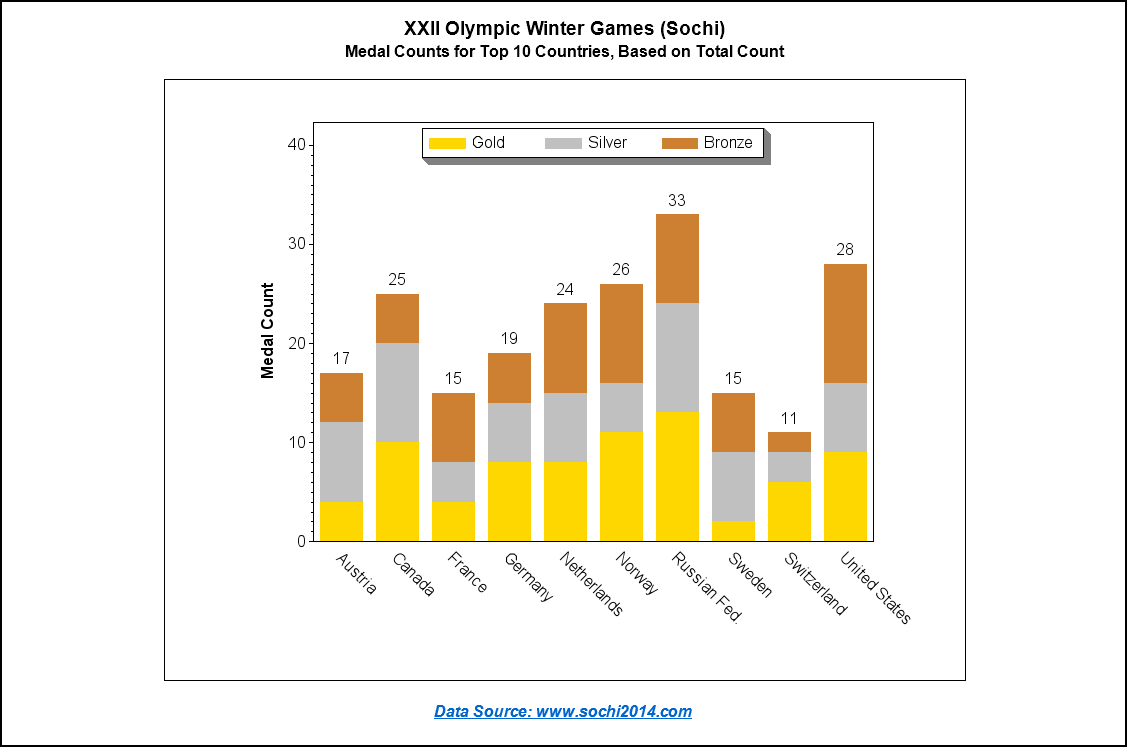
Michele Ensor recently posted a wonderful blog with a graph of the 2014 Winter Olympics medal count. I'm going to further refine that graph, making it an Olympic graph ... on steroids! :) Here is Michele's graph: First, let's give it a few simple cosmetic changes. I always like to have

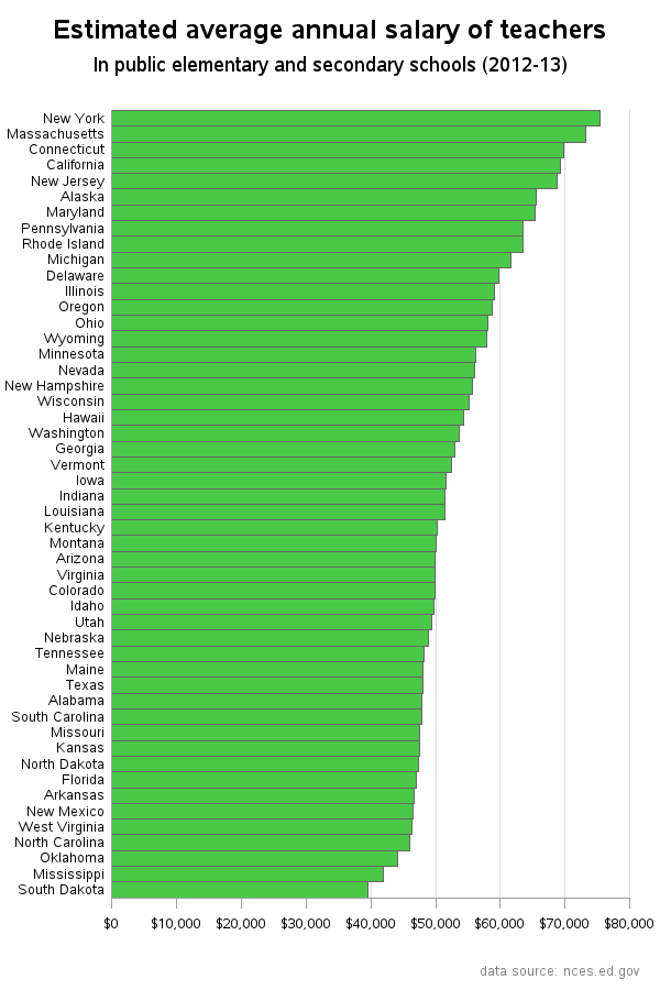
Teacher pay, and the possibility of a raise, has been a hot topic in North Carolina lately. So I decided to look around and see if I could find any good data related to teacher salary, and then try to determine the best way to present that data graphically. I found that

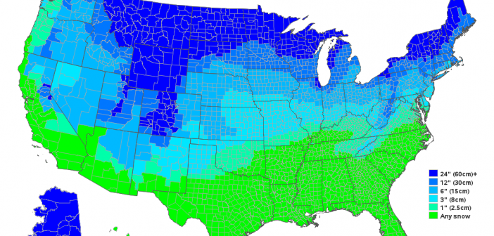
We get very little snow in Wake County, NC (SAS Headquarters) - therefore when we do have snow, it's a big deal and they close the schools. Which made me wonder ... how much snow does it take to close schools in the rest of the US? Last week we got our
