SAS Learning Post
Technical tips and tricks from SAS instructors, authors and other SAS experts.
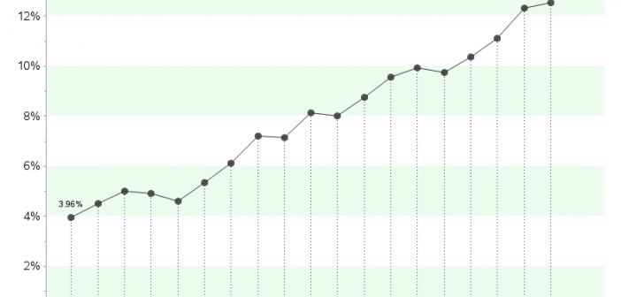
After the legalization of recreational marijuana use in Colorado in 2012, it has been a much more frequent news topic than before - even from a data analysis perspective... I was recently looking for 'interesting' data to analyze with SAS, and I noticed some articles about the increasing potency of marijuana in

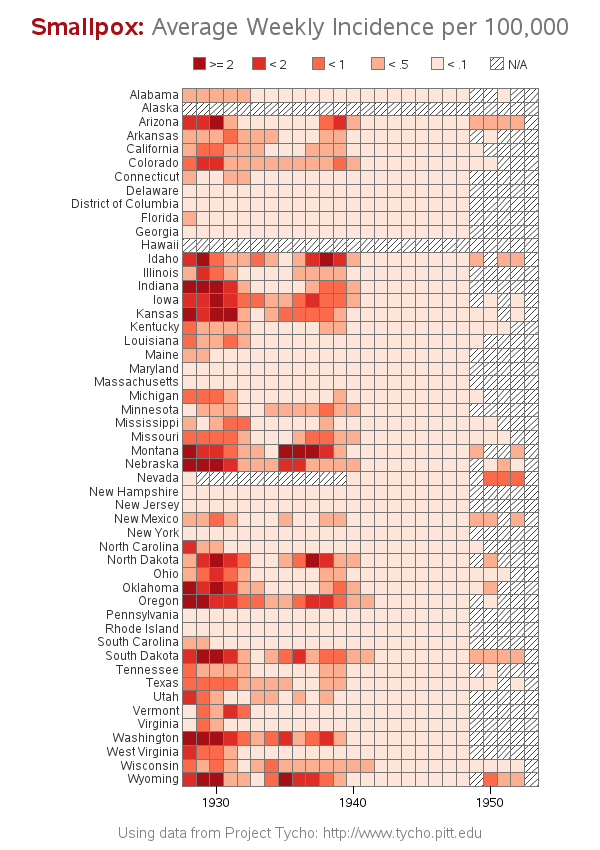
Smallpox was declared eradicated in 1979, after an extensive vaccination campaign in the 19th and 20th centuries. This blog post contains a visual analysis of the final years of this disease in the US ... In my previous blog post, I imitated and improved infectious disease graphs from a recent Wall

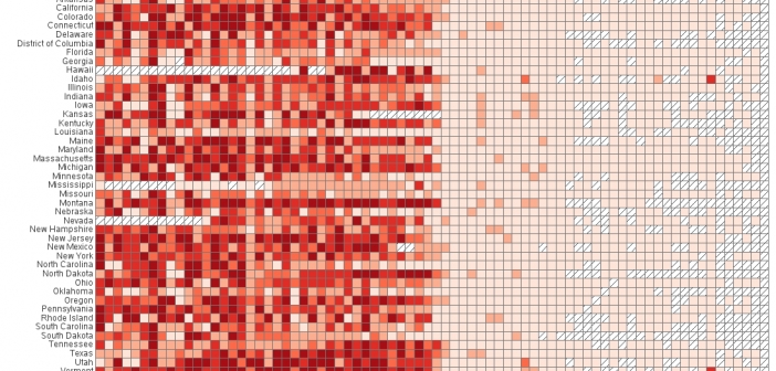
The Wall Street Journal recently published some graphs about seven infectious diseases, and I tried using SAS to improve the graphs ... it's a veritable infectious disease (graph) bake-off! Let's start with Measles ... here's a screen-capture of WSJ's measles graph: In general, their graph is eye-catching, and I learned a lot
