SAS Learning Post
Technical tips and tricks from SAS instructors, authors and other SAS experts.
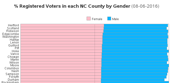
Since this is an election year, I've been scrutinizing the voter registration data. One thing that surprised me is there are more female voters registered in NC than males. I wondered if this was consistent across all 100 counties, and created some charts to help visualize the data... First I went

There's an old expression "if you can't measure it, you can't manage it" - and while that expression probably isn't universally true (as pointed out in this interesting article), I think having a way to quantify your stress could be useful. I recently read an interesting article about the Holmes-Rahe Life

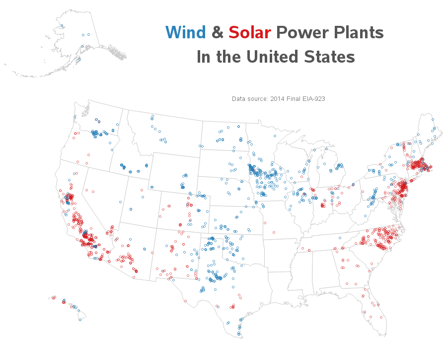
Where is solar and wind power generated in the US? Let's visualize this data on a map... I recently saw the following map on the metricmaps.org website. It caught my attention because it looks like North Carolina has a lot of solar power plants, whereas our neighboring states have very few.
