SAS Learning Post
Technical tips and tricks from SAS instructors, authors and other SAS experts.
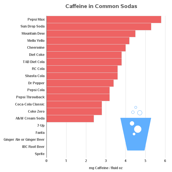
A friend and I were recently debating how much caffeine is in various drinks. I felt like my hands were tied behind my back, since I had no graphs to show them. Of course, the first thing I did when I got to work was create some caffeine graphs! They turned out

Editor's Note: SAS' e-book, Your guide to becoming a modern marketer, provides additional guidance on the skills you need to become a modern marketer. This e-book provides a plan of action and documents lessons we've learned at SAS while modernizing our marketing organization. Today, the need to take an analytical approach to business challenges no

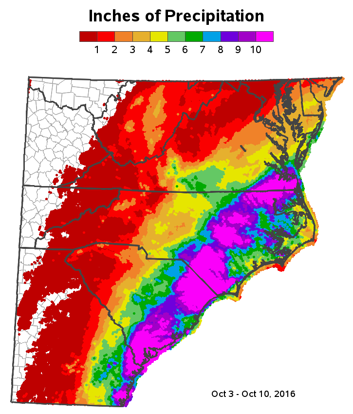
This past weekend, Hurricane Matthew came through the Carolinas. Some areas had record flooding, while other areas didn't. I was anxious to get back to work today, so I could use SAS software and create a custom map showing who got how much rain. But before we get to the official

