SAS Learning Post
Technical tips and tricks from SAS instructors, authors and other SAS experts.
Living to 100 isn't as simple as just paying a certain amount of money for your healthcare. But that is an interesting aspect of longevity, so let's have a look at the data ... In my previous blog post, we analyzed how much people from various countries spend on healthcare.

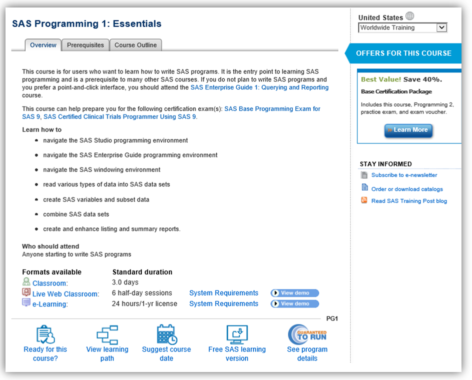
As an instructor for SAS, I receive a wide variety of queries before, during and after delivering my courses. Most frequently, I am asked questions such as: Should I learn SAS programming or a point and click tool instead? I know lots of code, should I go straight to the

With the US Affordable Care Act (ACA) and other health topics in the news lately, I wondered how much people spend on healthcare in various countries. Of course spending varies from person to person, so I decided to take a look at the average per capita spending in each country (it's

