Facebook has millions of users, and therefore when people share an interesting graph on Facebook it can "go viral" and millions of people might see it. Some of the graphs are obviously a bit biased - especially ones that are trying to sway your opinion one way or another on a topic
Uncategorized
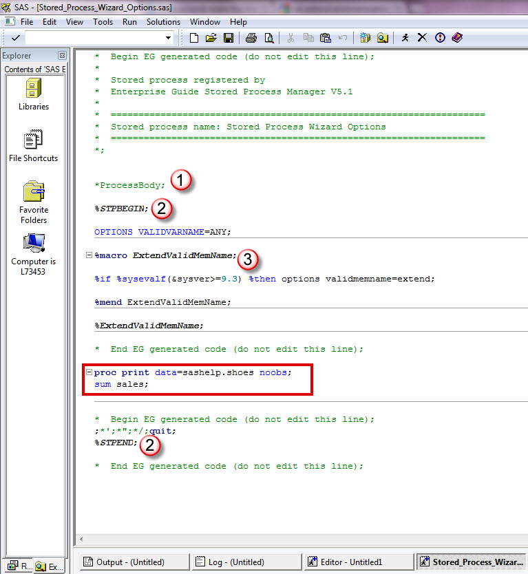
One of my students emailed me, asking how to easily reset SAS system options. He was looking for a one-liner solution, just like you get with graphic options: GOPTIONS RESET; While there isn't a RESET keyword for the OPTIONS statement, you can save your options settings before making changes using
In the course of my job, I get to have a lot of conversations with authors about their books. One of the aspects of those conversations I enjoy most is learning about their areas of expertise and knowledge—that could be certain SAS software or programming techniques, particular fields of analytics,
Do you use SAS for analytics and Microsoft Excel for graphs? Why not use SAS for your graphs too?!? Then you could completely automate the entire process in one SAS program, with no manual steps! A lot of people use Excel to create their graphs because "it's what they know." What if somebody
The SAS System provides users with the ability to create, store and access custom functions using the Function Compiler (FCMP) procedure. Once defined with PROC FCMP, a user-defined function can be used, or called, just like any other SAS function in the SAS System. This powerful capability gives users the
Everyone in the world has their attention turned towards the Olympics this week, so what better topic to tie in to a SAS/GRAPH blog than that?!?! I had seen a graph on the guardian website that I thought was interesting, so I decided to try to create my own (slightly different)
Hopefully you know that a gif animation can be used for more than just showing a cartoon animal doing cute tricks! Being a savvy data-meister, I'm sure you are also aware that you can use gif animations to see how data changes over time. But perhaps you didn't know you could
When working with "big data" you usually have too many points to view in a plot, and end up subsetting or summarizing the data. But now, in SAS 9.3, you have an alternative! For example, the following scatter plot of 10,000+ points is just a visual "blob": But using a new
I was recently following a post where a user asked what the earliest SAS PROCs (procedures) were. Since I started using SAS in 1970, I knew I could find a copy of the old documentation that we used at that time. This “user’s guide” was something that you printed out on
In Paul Allison’s own words, “It’s about time!” The first edition of his book on logistic regression came out in 1999, and since then, “there have been an enormous number of changes and enhancements to the SAS procedures for doing logistic regression and related methods.” Allison has incorporated those changes