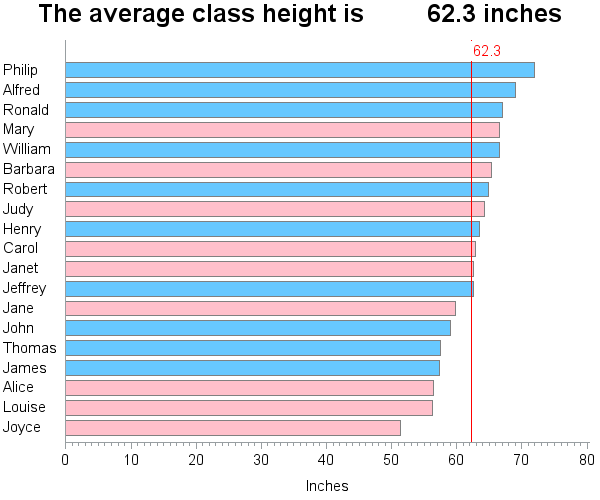
SAS macro variables are a great way to store a calculated value, so you can use it later in your code. They are not just limited to the data step -- you can also use macro variables in title statements, axis statements, etc. By default, the macro variable will be padded with
Author
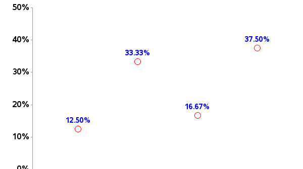
Being that 2013 is the International Year of Statistics, I wanted to make sure everyone knows how to handle my favorite statistic - percent (%) - in SAS! I often see data in spreadsheets/csv/etc that purport to represent "percents"... but you have to be a bit careful when working with
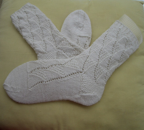
In the spirit of the new year – the International Year of Statistics – I thought I’d share some different ways to use statistics. Can statistics help you in your everyday life? Certainly! And here's an example to prove it... Let's say you have a dresser drawer full of white socks.
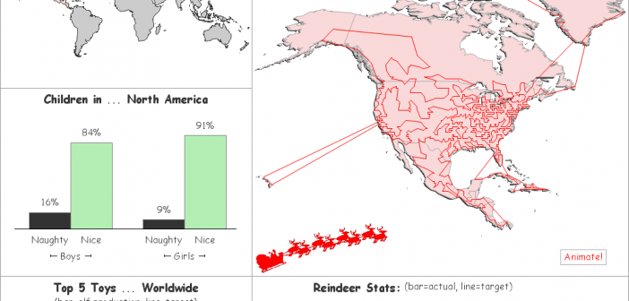
'Twas the week before Christmas, and all through the world ... dot-matrix printers were humming as Santa's naughty/nice list was unfurled... Can you imagine what it must have been like years ago when Santa had to maintain his naughty/nice list by hand, with a feather quill pen?!? Or even these
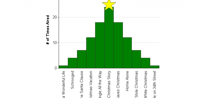
While I'm waiting for the next "data intense" event to show up in the news (so I can blog some SAS graphs about it), I thought I'd share a few fun SAS graphs in the spirit of the holiday season! Please don't hold me to too high of graphical "best practices"
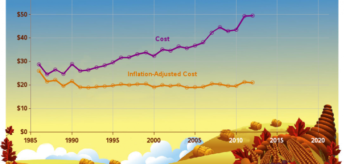
Have you heard the expression "Talk Turkey"? Well then, what better (tongue-in-cheek) thing to do around the Thanksgiving holiday, than talk some turkey using SAS Graphs! ;) I don't usually decorate my graphs with images and pictures (they typically make the graph more difficult to read), but when it comes
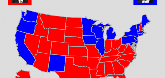
In the U.S. we have a presidential election every 4 years - and as luck would have it, 2012 is an election year! I see a lot of election maps & graphs in the news, and I'm always subconsciously critiquing them in my mind and thinking to myself, "How would I graph this
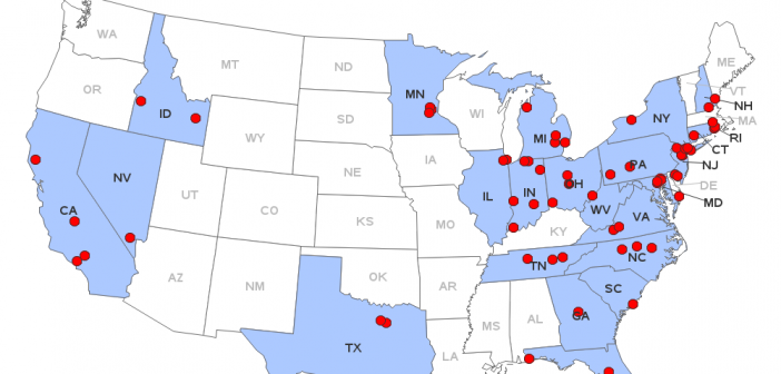
You've all heard about the recent meningitis outbreak, right? Being a data-guy and a map-guy, I went looking for maps related to the outbreak. I found the following map on the Centers for Disease Control (CDC) website. It shows the states that received the recalled drug used in epidurals (for back
SAS/GRAPH gives you the ability to customize your graphs (or even create totally new types of custom graphs) ... and it is my firm belief that it gives you a competitive advantage by allowing you to "make sense" of your data in ways your competitors can't. Most of the examples in
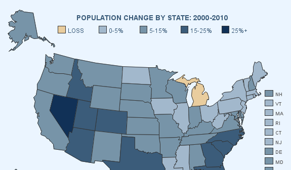
By now, most of you probably already know how to add drill downs and hover text to your SAS graphs. But did you know you can add pop-up images and graphs? Here are a couple of examples ... In this first example, when you hover your mouse over each state, you