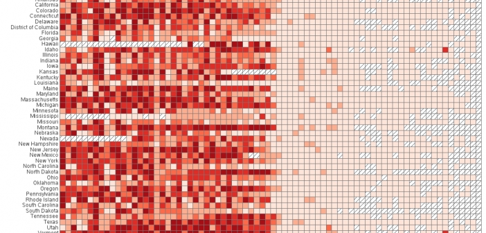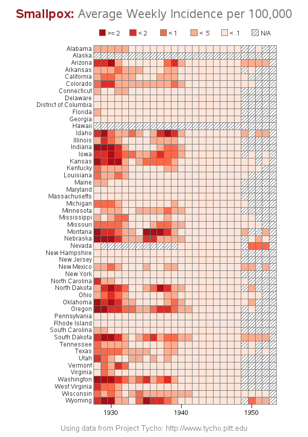
Smallpox was declared eradicated in 1979, after an extensive vaccination campaign in the 19th and 20th centuries. This blog post contains a visual analysis of the final years of this disease in the US ... In my previous blog post, I imitated and improved infectious disease graphs from a recent Wall
Author
The Wall Street Journal recently published some graphs about seven infectious diseases, and I tried using SAS to improve the graphs ... it's a veritable infectious disease (graph) bake-off! Let's start with Measles ... here's a screen-capture of WSJ's measles graph: In general, their graph is eye-catching, and I learned a lot
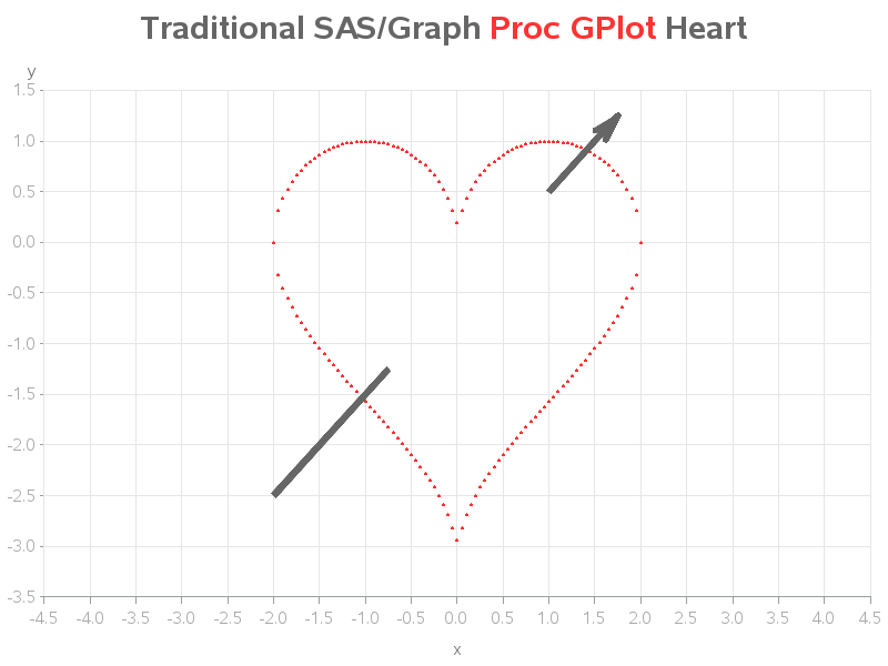
Nobody puts an arrow through a heart any better than Sam Cooke & Cupid ... but SAS/Graph comes close! If you've been following my blog, you know that my favorite of all the SAS Procedures are the traditional SAS/Graph Procs, such as GPlot and GMap. They're rock-solid reliable, and flexible
I'm ramping up my visualization skills in preparation for the next big election, and I invite you to do the same! Let's start by plotting some county-level election data on a map... To get you into the spirit of elections, here's a picture of my friend Sara's dad, when he was
North Carolina is one of those lucky states that has a huge variety of scenic destinations, such as mountains, piedmont, coastal plains, beaches, and 'outer banks' islands. We have state parks in all of these areas, but can you guess which state park has been trending the most during the past
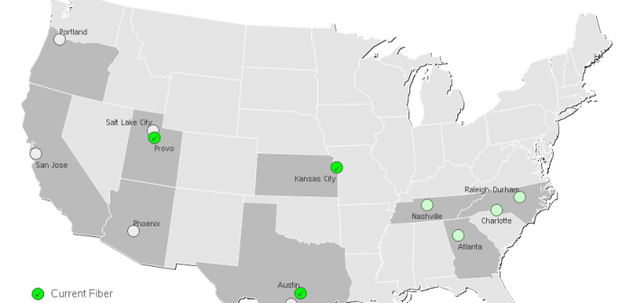
Google recently announced that they will be adding Google Fiber high speed network and TV to my area. This was great news, because it will give us more choices ... and a little competition among providers tends to make them all 'try harder' to please the customer. :-) I was curious what other
This week, I finally ate some liver, for the first time in over 20 years - and I realized it's a lot like prepping data (which I'll explain in this blog post). Here are a few of the similarities: They're both good for you. Thinking about them makes you go
Have you ever thought about retiring in another country, where your money might go further? Well here's some quantitative data to help you make an informed decision! ... First, to get you in the mood, here's a picture of my friend Erik checking out the prices at a pedal-powered food
Have you ever wondered whether the area where you live is a good location for producing solar power? Let's create a SAS map to help find out! To get you in the right frame of mind, here is an awesome picture of some Arizona sunshine, that my good friend Eva
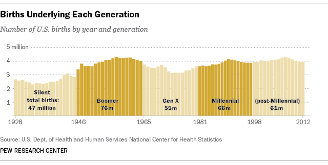
To get into the mood for this blog post, you should first listen to the music video of The Who singing My Generation... I guess everybody has 'their generation' and here in the U.S. the most famous generation has been the Baby Boomers. Many companies have tried to design products they