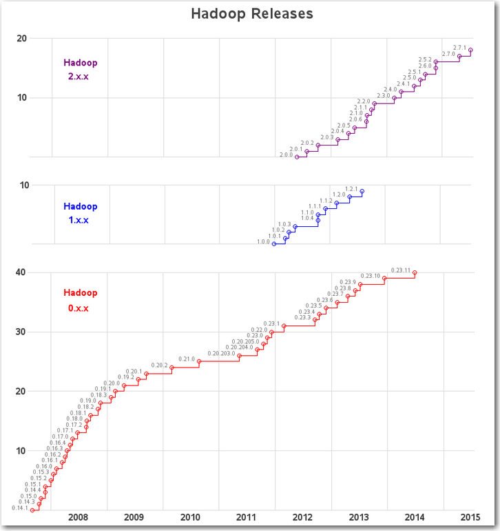
There's a lot of buzz about Hadoop these days. I started checking into it, and there seemed to be a gazillion releases. So, being The Graph Guy, I decided to create a graph to make it a little easier to digest! During my search for Hadoop information, I found the
Author
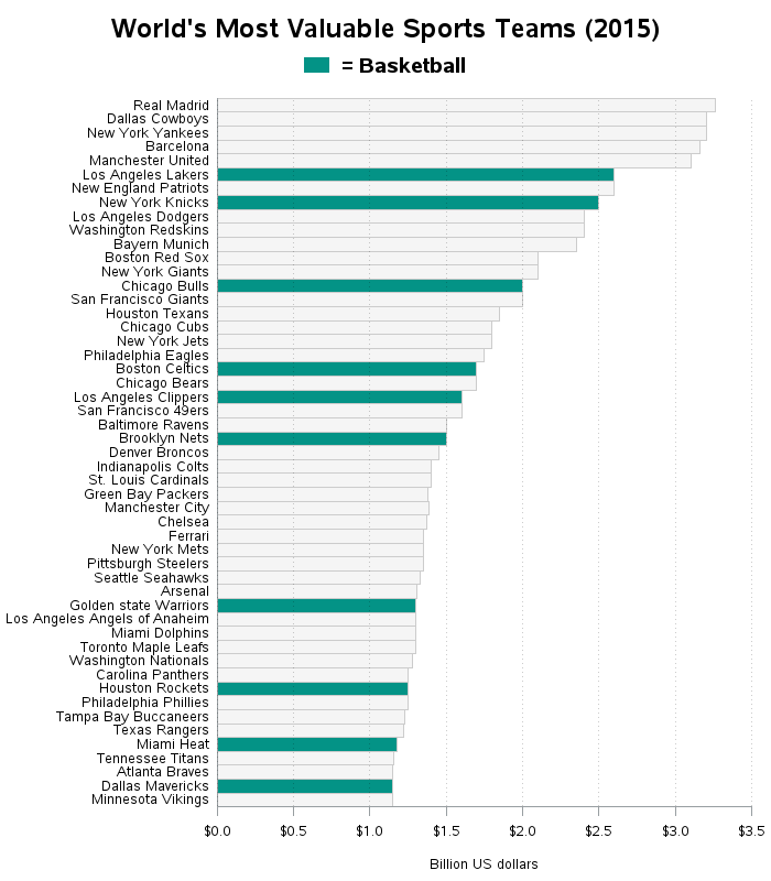
There's big money in professional sports these days - we're talking billions of dollars! Do you know which teams are the most valuable? The graphs in this blog will show you... I recently saw a bar chart on dadaviz.com showing the world's most valuable sports teams. It was the right kind
I've heard lots of people quote statistics about marriage & divorce, but the experts don't always agree on what the data means. So I decided to run the data through a SAS graphical analysis, and see what the numbers say ... Before we get into the numbers though, let's have a
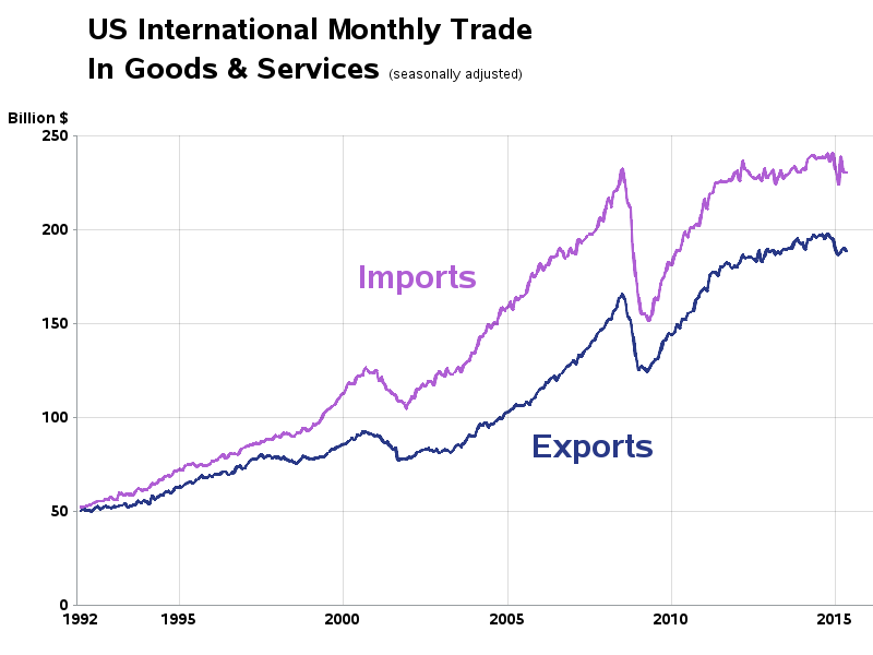
I recently saw a cool graph showing the US import/export trade deficit. But after studying it a bit, I realized I was perceiving it wrong. Follow along in this blog, to find out what the problem was, and how I redesigned the graph to avoid it. I was looking through dadaviz.com
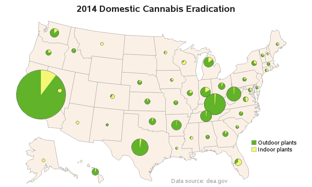
In my quest for interesting data to graph, I found some Drug Enforcement Administration (DEA) data on US domestic cannabis eradication. Does the data say anything interesting? Read on to find out! ... While doing some searches for other data, I happened across a table on the DEA website titled
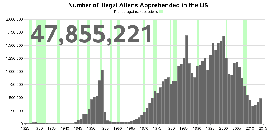
There's been quite a bit of controversy about the number of undocumented immigrants in the US lately - for example, Ann Coulter claims that number is 30 million, whereas others claim it's about 11 million (readers of my blog are data-savvy, and would dig into the details of such claims,
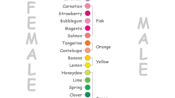
I saw the dress photo as blue & black. If you're a female, even if we perceived the exact same color, you might might not have said 'blue & black'. That's because women have a larger color vocabulary than men, and you might have elaborated on exactly which blue and
When I was a kid, I remember a motivational poster on my dentist's wall that said "You don't have to brush all your teeth -- only the ones you want to keep." That poster really made me think, and brush my teeth! And now that I'm a data-analyst adult, I think
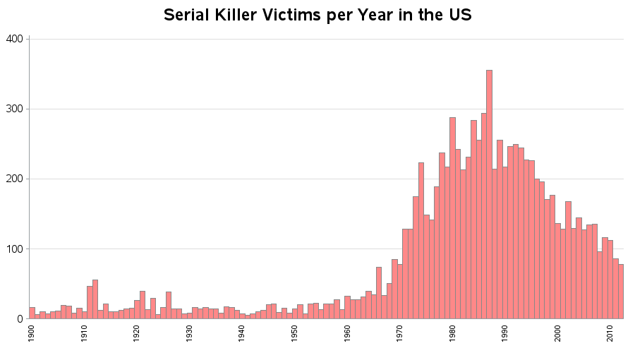
I recently came across some very interesting data on serial killings ... but it was in tabular/text form. This seemed like an invitation for me to create some graphs that make it easier to understand the data. It seems many people have a morbid curiosity about serial killers. For example, some
Bald eagles, the national bird of the United States, came perilously close to becoming extinct here, but are now making a comeback! Let's look at the data with a SAS map! When I was growing up in the 1970s & 80s here in North Carolina, I spent a lot of time