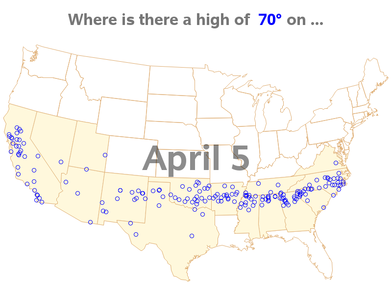
Endless Summer is both a surfing movie, and the idea that "if one had enough time and money it would be possible to follow the summer around the world, making it endless." Summer temperatures are fine if you're swimming & surfing, but I prefer slightly cooler temperatures - perhaps an
Search Results: animation (33)
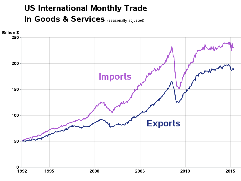
I recently saw a cool graph showing the US import/export trade deficit. But after studying it a bit, I realized I was perceiving it wrong. Follow along in this blog, to find out what the problem was, and how I redesigned the graph to avoid it. I was looking through dadaviz.com
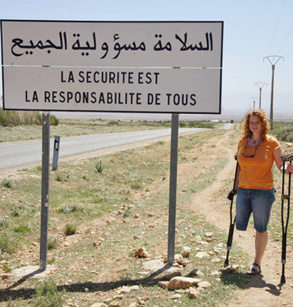
As you travel around the world, do you know where English, French, Spanish, and Arabic are spoken? This blog will help you quickly answer that question, with some cool SAS maps! But first, here's a picture of my friend Joy posing beside an interesting sign during one of her international
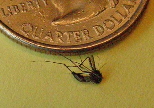
Have you ever been bitten by a mosquito? What are the odds it carried the West Nile virus? ... Perhaps a lot higher than you thought! Here's a picture of a mosquito that kept 'bugging' me around my computer desk at home - good riddance, I say!
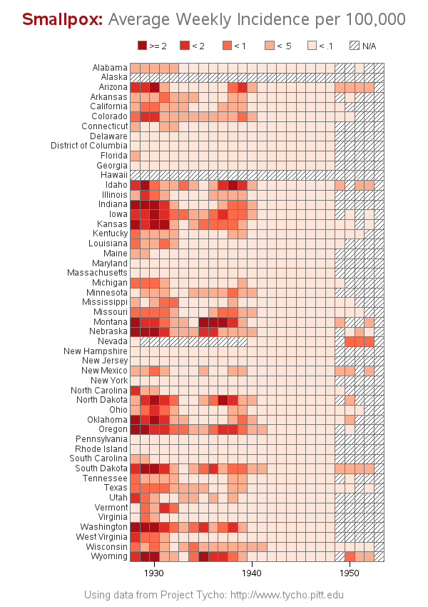
Smallpox was declared eradicated in 1979, after an extensive vaccination campaign in the 19th and 20th centuries. This blog post contains a visual analysis of the final years of this disease in the US ... In my previous blog post, I imitated and improved infectious disease graphs from a recent Wall
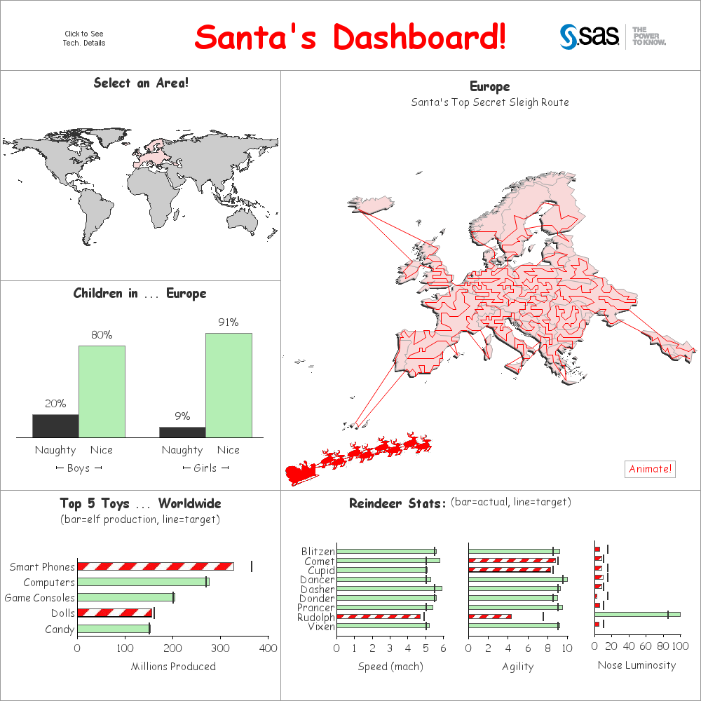
How does Santa keep track of everything on his big night? I can't confirm or deny that he uses SAS software -- but if he does, it would look a lot like this! ... A couple of years ago, I blogged about a prototype dashboard that I wrote for Santa. This
There are 2 kinds of people in the world -- those who dread change, and those who look forward to it. Which kind of person are you, when it comes to upgrading your SAS software?!? With most software (such as Windows OS, Facebook, Gmail, etc) I tend to fall into
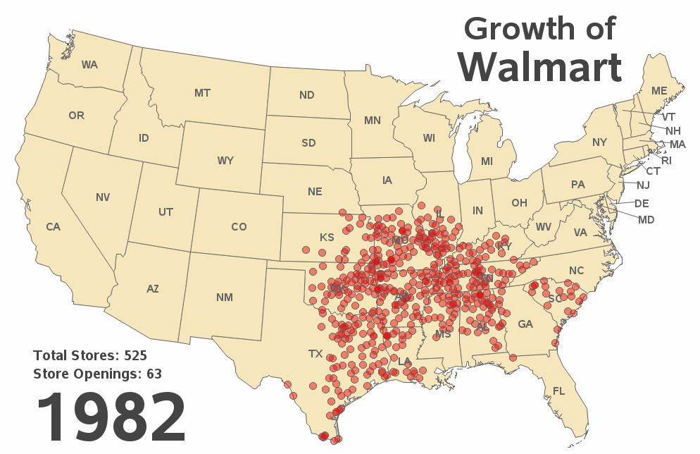
SAS has been used to track the spread of many things, such as wild animals, tornadoes, and money launderers -- but this time I'm using it to track the spread of Walmart stores across the U.S. over time! Since its start in the 1960s, Walmart has grown to be the largest
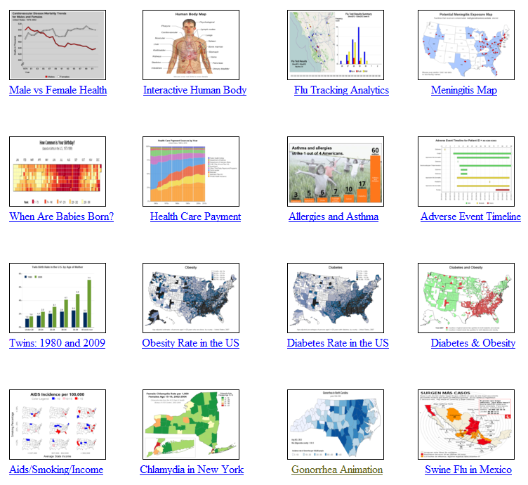
"It slices, it dices ... it helps test laboratory mices!" In a joking way, this is a perfect description of SAS software, don't you think!?! :) And to prove it, this blog contains a collection of 32 examples, showing a variety of ways SAS can be used to graph data
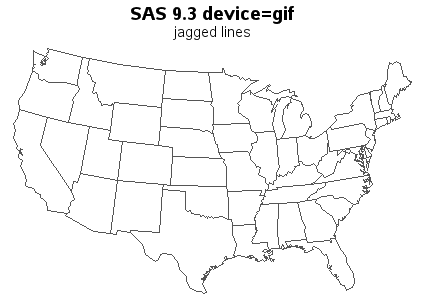
SAS 9.3 already has smooth (anti-aliased) lines in SAS/GRAPH device=png output, and in SAS 9.4 you will also get smooth lines in your device=gif output (and gif animations)! Woo-hoo!!! Here are a couple of simple examples to demonstrate: The first example is device=gif Proc Gmap output. If you look very closely, you'll notice that