President Donald Trump - people seem to either love him or hate him. Which makes for an interesting data-analysis topic ... tracking Trump's approval rating. Follow along as I explore some data!
I'll start with what I consider the 'best' approval-rating graph I've found so far. Here's a screen-capture of FiveThirtyEight.com's graph. They combine the ratings from several different survey pollsters, assign weighting factors, and draw a trend line and confidence intervals.
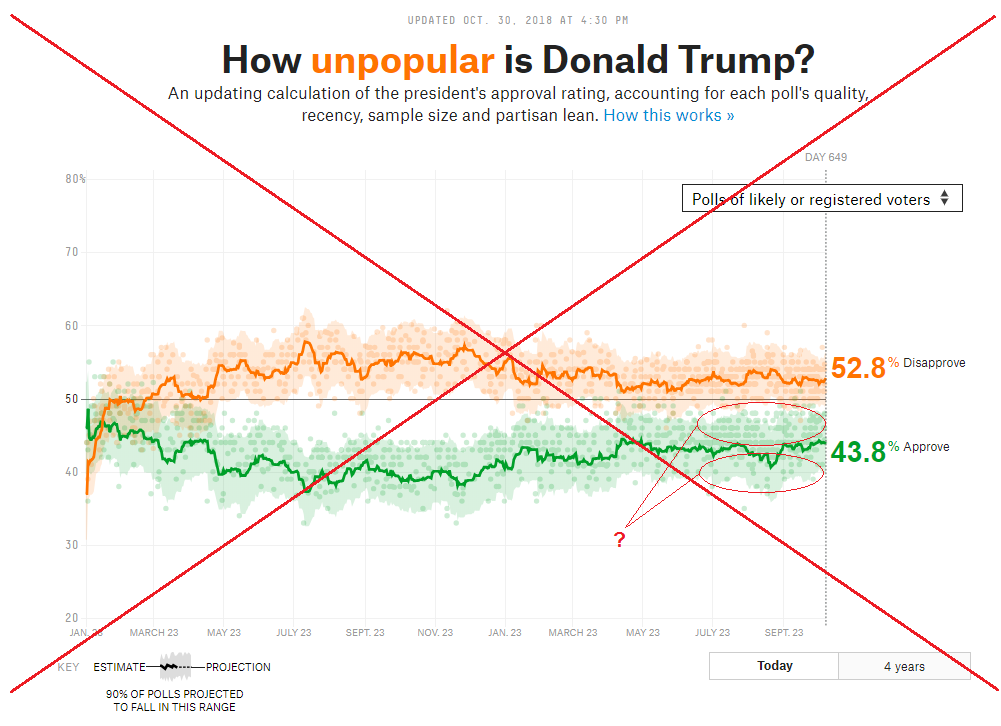 It's an interesting graph, and I look at it daily to see how things are going. But I do have a few complaints and concerns:
- Based on their articles, I consider FiveThirtyEight to be somewhat biased against Trump, and therefore I wonder if that bias might also affect their weighting factors, etc.
- Showing both the approval rating and disapproval rating in the same graph is a bit confusing, and I don't like how the animated title switches between approval/disapproval (I would rather have a color legend that is visible all the time).
- I don't like how they selected 20-80% as their axis range, when the actual values could go from 0-100%. Choosing a subset of the possible values visually amplifies the changes.
- There's no mouse-over text to find out what polling organization an individual plot marker came from.
- And also there appear to be many more green plot markers (surveys) above the approval rate line than below. I guess this indicates they're weighting the lower values more heavily than the higher values. See the markers I have circled in red in the plot above, for example.
Thankfully, FiveThirtyEight provides the data they used online, therefore I was able to download it and experiment with creating my own graphs. I downloaded the approval_polllist.csv file, and then used SAS' Proc Import (with guessingrows=all) to analyze the file and determine all the variable names, lengths, and formats. I then copy-and-pasted the code generated by Proc Import (in the log file), and used that code in future runs of my SAS program rather than running Proc Import again (that makes the job run much quicker!) Here's a link to my code, if you'd like to see the details.
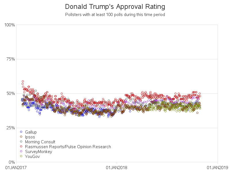
In my first plot of the data, I limited it to pollsters that had at least 100 polls during the ~2 years Trump has been in office - this narrowed it down to just six pollsters, which is a manageable number of colors in the legend. Also, I only plot the approval rate, rather than both the approval and disapproval rate.
Next I annotated some reference lines, showing various events and milestones that might have affected Trump's popularity (for example, when he repealed the Obamacare individual mandate). It's a little difficult to see the small/angled labels, therefore I added HTML mouse-over text to them - click the image below to see the interactive version. I also added HTML mouse-over to the plot markers (see below), and you can click on the markers to drill-down to see the pollster's actual survey/data!
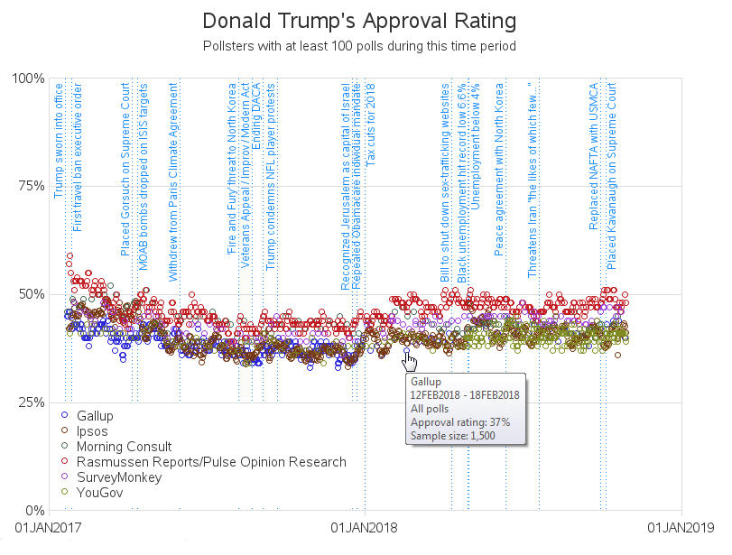
Looking at the data from all the pollsters plotted together (above) does give you a general sense of when Trump's approval rating increased and decreased, but that's a pretty thick line to try to follow. I think it's much better to plot the data from each pollster separately. I like to assume that each pollster's new polls are somewhat consistent with their previous polls, and therefore when you look at the data from a single pollster, you get a good feel for whether Trump's approval rating is increasing or decreasing.
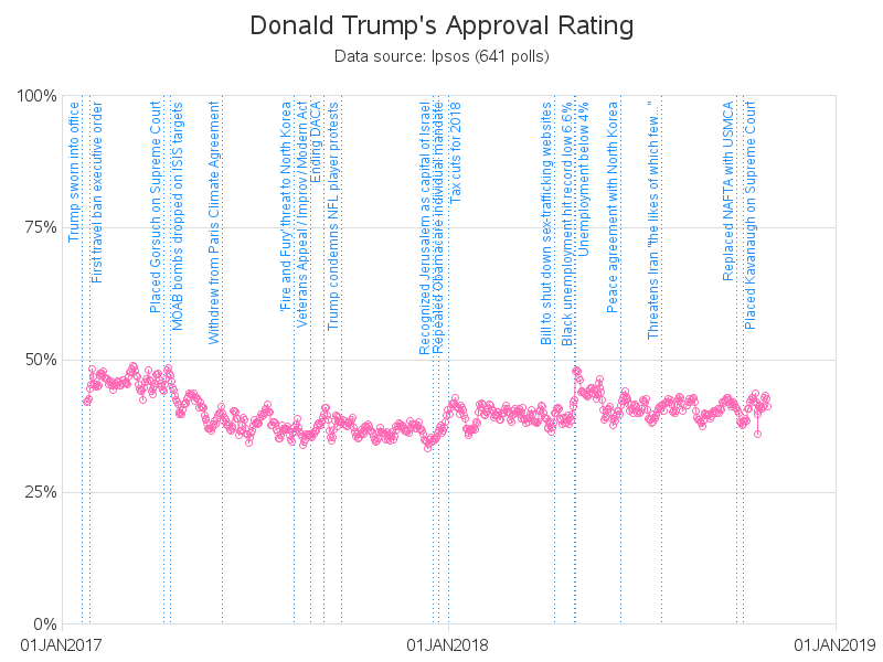
Below is my graph for the Ipsos poll results (the ones Reuters uses). The Ipsos polls seem to be the most responsive to the milestone/refline events I added.
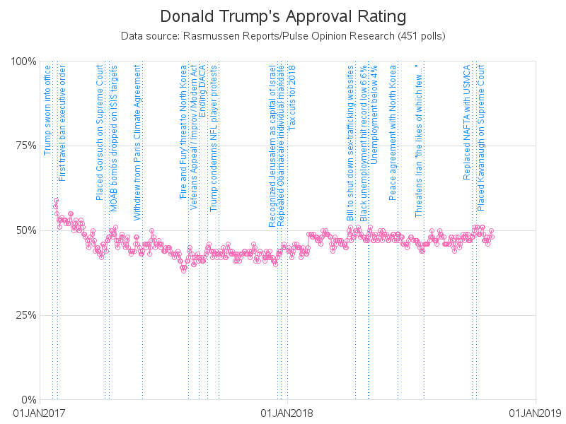
And here's my graph for the Rasmussen poll results - their polls tend show the highest approval rating for Trump, out of the six pollsters I graphed.
Click here to see the full set of interactive graphs, for all six of the individual pollsters.
Which of these six pollsters do you agree/disagree with the most? Are there other milestone labels I could add to the graph that might help explain increases/decreases in Trump's popularity?
And of course, I feel compelled to mention "buyer beware!" My gut feeling is that these polls probably show when Trump's popularity is generally increasing or decreasing, but I recommend not putting too much trust in the absolute number (such as a "48.2% approval rating"). Remember - these are just surveys - and if we learned something from the 2016 election, it's that a lot of the people who voted for Trump apparently do not respond to surveys!


5 Comments
Robert,
Since 0 and 100% approval ratings are out of the reasonable range I would use the SAS approach (see meanplot) and (1) set the range to 40 - 60 or 35 to 65 if you want to be daring; (2) get rid of pastel colors; (3) drop the markers except for the events listed; and (4) divide the time line into quarters. I believe that overall you would have a much clearer graph. Given the fact that composite models do better than individual (see hurricane tracking) giving a single line would also be preferable.
Ok - give it a try, and post up your results! :)
Thanks for the post, and appreciate making available your well-documented code. Rgds
These are great data visualizations--Thanks for sharing them.
Thanks!