I usually create very technical graphs, that just focus on conveying the information in a concise and straightforward manner (no wasted colors, and nothing to distract you from the data). But sometimes, depending on your audience and the purpose of the graph, you might need to create a graph that leans a bit more towards the artistic/eye-candy side of the spectrum. In this blog post, I describe how you might create such a graph ...
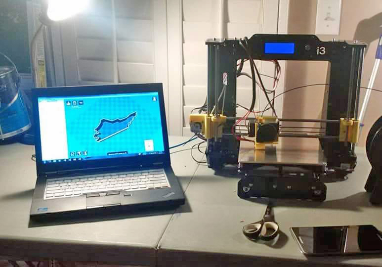
But first, let me get you in the mood for the data topic - 3d printing. These printers have become popular in recent years, and you can design an object on the computer, and the printer will create it by depositing dots of melted plastic in rows and columns, until it has built up the 3d object. Here's a picture of a DIY 3d printer my friend Annie put together back in 2016 (she's a clever one, that Annie!)
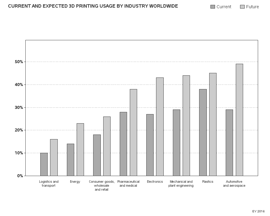
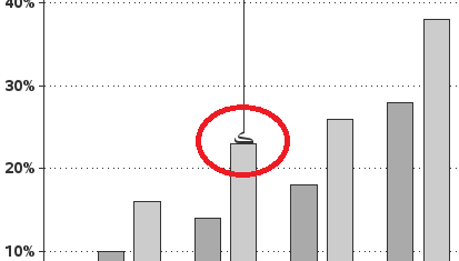
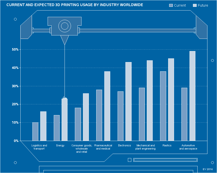
And on the topic of 3d printing, I recently saw a cool infographic by Raconteur on this topic. Here's a screen-capture of the main graph from their infographic. The graph is about 3d printing, and they've added a simulated mechanism around the graph, that looks like it is 3d printing the bars of the graph - very clever and attention-grabbing, imho. And the color motif and background is set up to look like a technical drawing or blueprint. It's a bit more decorated than the graphs I usually recommend, but it works in this case, and I kinda like it.

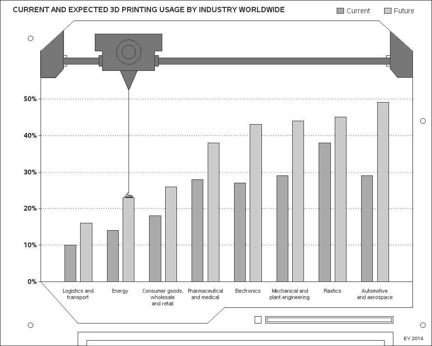
Therefore, of course, I decided to see if I could programmatically create a similar graph using SAS software... I estimated the data values, and entered them into a dataset, and quickly had the basic grouped bar chart. I used the space and width options to get the bar spacing like the original graph, and used the 'split' option on the axis to split the text labels onto multiple lines, where needed. Here's what the basic graph looked like:
I then used simple annotate commands to draw lines, polygons, and circles to simulate the 3d printing mechanism above the graph, the other lines, and the registration dots, to make it look like the blueprint layout. For anything that needed to line up with the axes of the graph, I used xsys/ysys='1' for the coordinate system. For the 3d printer head and the molten plastic coming out of it, I lined that up using the data's coordinate system (xsys/ysys='2'). And for the other things that I wanted to line up based on the whole page, I used xsys/ysys='3'. This way, I could re-use the annotation with different data.
Actually, I lied a little in the previous paragraph - I didn't use lines/polygons/circles for everything. I did use something else for one little detail in the graph ... the little "melted plastic blob" on top of the bar. Here's a comparison of the original graph's blob and my blob. How did I re-create it?!?
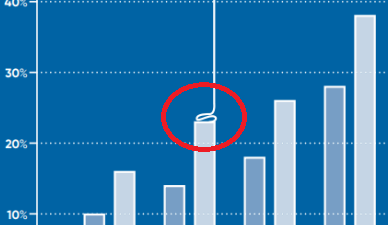
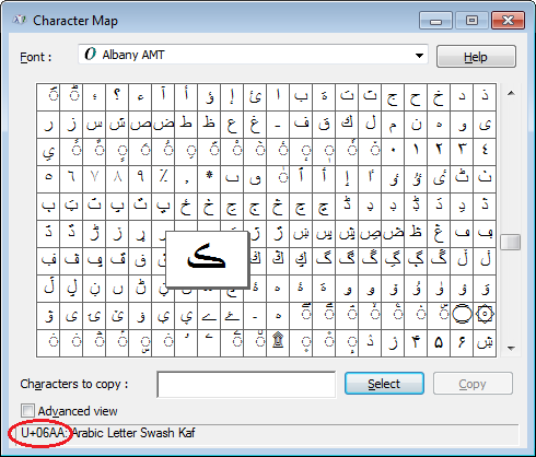
If I didn't use annotate graphics primitives, what did I use? I found a font character that resembled a blob of molten plastic, and used that! Which character did I use, and how did I find it? ... I brought up the Albany AMT font (which ships with SAS Software) in the Windows Character Map, and perused the characters until I found a character that suited.
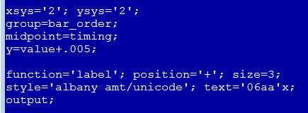
I then used the label function to annotate that character at the top of the desired bar. Here's a bit of the SAS code:
And finally, for the finishing touch, I specified colors for the background, axes, text, and bars, so they would look like the blueprint motif used in the original infographic. (Click the image below, and then click the 'expand' button in the top/right corner to see it full-size, so you can better read the small text.)
So, what's your opinion of 3d printing - what are the advantages and disadvantages? Is it a fad, or a great idea for certain things, or will it be the way all manufacturing is done in the future? Do you own anything that was 3d printed? Feel free to discuss in the comments section!


4 Comments
Brilliant! I was wondering if we can actually draw some thing like "melted plastic blob" using annotation?
You could probably use annotate to draw the plastic blob, or you might want to use Proc Gfont to create a font character that looks like a plastic blob. Here's an example that shows how to use Proc Gfont to create a wine glass ... http://robslink.com/SAS/democd44/ex_18_info.htm
Clever use of a font.
Thanks! - We're probably only starting to tap the possibilities, of this fairly recent capability! :)