I recently read an interesting article that claims "a single cremation emits as much carbon dioxide as a 1,000-mile car trip." This got me wondering about cremation data, and I ended up on the Wikipedia page about cremation rates. They had a map of the US cremation rates by state ... but the more I studied their map, the more it seemed implausible. Follow along as I dig into this data, and come up with my own map!
Here's a screen-capture of the Wikipedia page. The first thing I notice is that there are several dark green states in the map (seemingly) labeled as 75-100% cremation rate, but only two of the states in the table beside the map had a cremation rate of over 75%.
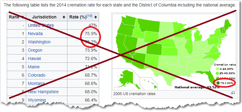
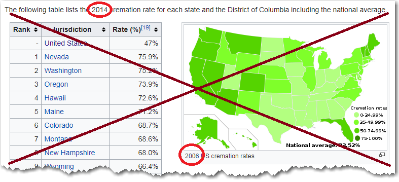
As I scrutinized the page, I noticed that the map and table were not from the same year - the map used data from 2006, and the table used data from 2014. Hmm ... aha! - maybe this is why they didn't agree(?) But I have read that US cremation rates are on the rise, therefore I would think the 2014 table would have higher rates than the 2006 map. So, why is the map (seemingly) showing so many states in the dark green 75-100% cremation rate?
I decided to dig deeper ... So I clicked on the Wikipedia map, and then clicked the 'More details' button. It listed the data source for the 2006 map, so I hoped I could go to that page and verify what the actual data values were.

That page is a dead link now, but I was able to find an archived copy on the Wayback Machine. (It's true, nothing really 'goes away' once it's on the Internet!) Here's a screen-capture of the archived page:
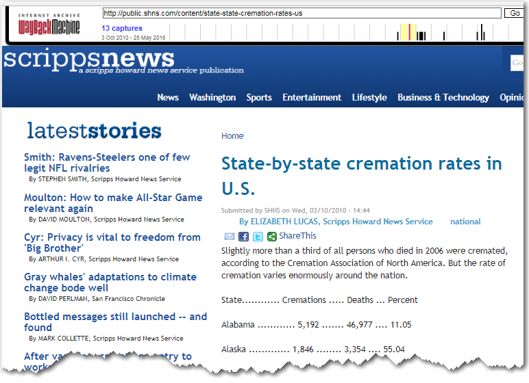
Looking at the 2006 data in the table, I didn't see any states with a cremation rate over 75% - but yet the Wikipedia map of the 2006 data (seemingly) showed several states in dark green (75-100%). This had me perplexed.
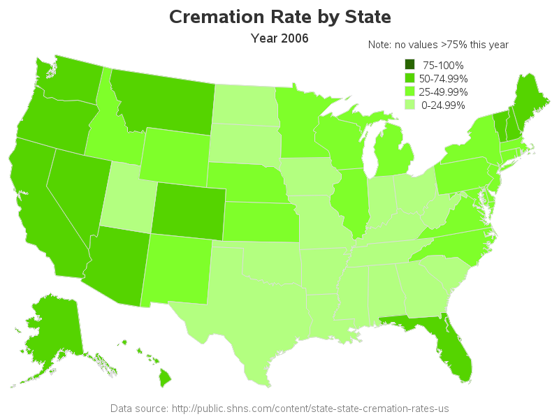
So I decided to import the data into SAS, and create my own map, to see if I could figure out what was going on with the Wikipedia map. I set up custom legend color bins just like the Wikipedia map, and used the Pixeur tool to determine the rgb hex codes for the colors they had used. Here's a screen-capture of my map. Note that my mouse-over text shows the value of dark-green Nevada as 68.4% - so why is it dark green? Aha! - actually, none of the states in the map are dark green!
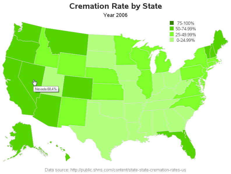
I guess they chose those legend ranges so they could compare this map to other maps that do have values of >75%(?) ... even though the Wikipedia page where it's shown is only displaying the one map.
If that's the case, I would recommend adding a note above the legend indicating that none of the states have a value >75% this year. And maybe use colors that are easier to distinguish. Here's my updated version of their map, with the note over the legend, and a slightly darker shade for the 75-100 range's green:
Now that we've laid that issue to rest, how about some discussion on the topic. Why do you think different parts of the country have different preferences? Do you prefer burial or cremation? (... or perhaps you have other plans/preferences?) What are the advantages/disadvantages? Feel free to discuss in the comments!


4 Comments
Very interesting to see the differences across the country. If you want to choose a green option, both cremation and burial as currently practiced in the US (with the chemicals used for embalming, among other things) are wanting. I recommend watching the documentary "A Will for the Woods." Sad, inspiring, and full of good information about green burials.
You've urned your keep again with this blog post. Maybe a gray-scale map would be more "ash" friendly.
Thanks Mike! - It was quite an undertaking!
Thanks Robert,
Your work on the data is stellar. I would comment on the subject. While you can take multiple 1000+ mile trips, the chances of cremation reoccurring are much lower. I don't think we need to map that.