As the Research Triangle Park becomes more popular, we're getting a lot more traffic on the roads. And with flexible work hours, of course I try to pick a time to drive to work when there's less traffic. I recently saw a cool infographic showing the most popular times when people commute to work ... but I was skeptical about their data, and decided to put it to the SAS test!
Here's their original infographic. At first glance, it's cute and seems to be a straightforward presentation of the data. The bars look like roads (which is acceptable and clever, in my opinion).But what jumped out at me was the tallest bar - if the graph is to be believed, almost 1/4 of the people commute to work between 9:30am and noon. Wow, I'm jealous of all those people sleeping in much later than me! But the more I think about it, the more unlikely that seems ...
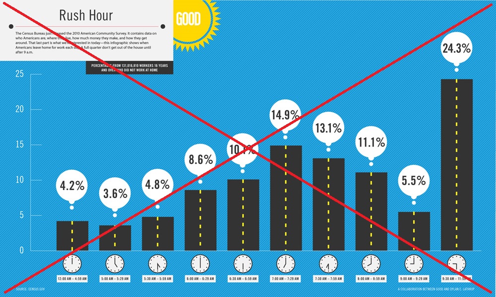
Now that I was suspicious of their graph, I looked a little closer, and found that the bars don't represent equal time slices. The first bar represents 5 hours, the next 6 bars represent 30 minutes, then there's a 1-hour bar, another 30-minute bar ... and the last bar represents 2.5 hours (if you can trust the label). Perhaps that explains why the last bar is so surprisingly tall? Time to find out what the data says...
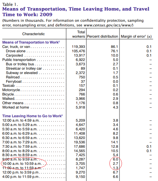
I did some digging and found the ACS commute-time data on the census.gov website. They didn't have an exact 9:30am-noon time slice (for the tall bar), but the three time slices from 9am-noon (circled in red below) only added up to 10% ... nowhere near the 25% value of the tall bar in the original graph. The only thing I can figure is that the original graph is mislabeled, and shows 9:30am-midnight, rather than 9:30am-noon (with an extra 12 hours of commuters, no wonder the bar is so tall, eh!?!)
Now that I understood the data a little better, I tried creating my own infographic. I would have preferred each bar represent the exact same time slice, but the data were not available that way. Therefore I use a red band on the clocks to show the time slice represented by each bar, and also add a footnote indicating that the bars don't represent evenly-spaced time slices. And I decided to leave out the noon-midnight data. How did I make the bars look like roads? ... Simple - I annotated a yellow dashed line up the middle of each black bar!
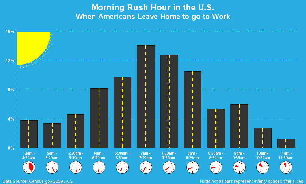
I think my version is as cute as the original, but is a much more true representation of the data. And at the very least, my graph doesn't have a mislabeled tall bar. Another infographic success for SAS software!
So, which city have you lived in with the worst rush-hour traffic? If you think you've had the longest commute time, post the city & time in a comment (along with any 'tricks' you have for getting through the worst traffic).


9 Comments
I've done DC and LA a few times. It's horrible, even in the carpool lanes.
You used PROC GCHART here. Do you have any bar charts with the new procedures (i.e. SGPLOT)? I'm trying to make a chart with annotations and about 300 subgroups and my color choices are being limited to 255 with the pattern statements.
DC and LA have 'legendary' traffic! :)
255 colors sounds a bit suspicious. Are you sure you want to have that many subgroups & colors in a single chart?!?
I'm making a chart of NCAA tournament performance by conference, year, and team. Subgroups are annotated by year and team (e.g. "2012 Purdue") and colored by team color (NC State red, Carolina blue, etc.) You can see it here: https://i.imgur.com/EcGYEi8.png
It might not be the prettiest thing, but it does exactly what I want until the last two bars where the subgroup count goes above 255 and I can't control the colors any more.
Hmm ... that's too many different colors for my visual tastes, but if you really want >255 colors, perhaps there's a way.
Rather than hard-coding 255+ pattern statements, perhaps you could let ODS supply the colors. Based on the ods style that is in effect, it will run through all the colors, and then when it runs out of colors, it will repeat the color list using a slightly different shade (lighter/darker). Here's an example that generates a Gchart bar chart with 300 subgroup colors (perhaps not the exact colors you want, but at least a way to get >255 colors):
data foo;
do bar = 1 to 10;
do segment = 1 to 30;
segment_number+1;
output;
end;
end;
run;
ods html style=sasweb;
goptions reset=pattern;
proc gchart data=foo;
vbar bar / discrete levels=all type=freq subgroup=segment_number nolegend;
run;
I actually only need 90 different colors. For example, I want 2012 Duke and 2017 Duke to be the same color blue, but I want their bars in two different places.
Getting the team colors exactly right is preferable to having many ODS-supplied colors. I looked into making a custom style with PROC TEMPLATE, but it looks like you can't supply more than a couple dozen colors.
I was able to eke out a few more accurate bars by using "repeat" in some pattern statements where there are consecutive bars of the same color.
Thanks for the help. I got started by looking at your presidential age chart(/democd89/us_presidents_age_bar.htm)
Hey Brian,
Given your use case, you'll want to use a discrete attributes map to bind the correct colors to the correct college. That way, the correct color will be used, regardless of data order. And, this map can be as large as you want. I created a simple example below. You can also find out more about attrmaps in this blog article: https://blogs.sas.com/content/graphicallyspeaking/2012/02/27/roses-are-red-violets-are-blue/
data attrmap;
retain id "college" linecolor "black";
length value $ 14 fillcolor $ 8;
input value $ 1-14 fillcolor $;
cards;
NC State cxcc0000
North Carolina cx4b9cd3
Duke cx001a57
Wake Forest cxa67f31
;
run;
data attendance;
length college $ 14;
input college $ 1-14 attendance;
cards;
NC State 39135
North Carolina 31614
Duke 17575
Wake Forest 8093
;
run;
title "Attendance Numbers for 2018";
proc sgplot data=attendance dattrmap=attrmap;
vbar college / response=attendance group=college datalabel
attrid=college groupdisplay=cluster;
run;
Thanks for the help Dan! - I think your technique will be especially appropriate, because it makes it easy to map the school colors directly to the school, in a data-driven way!
Thanks, Dan. I can now color the bars perfectly. Now I just need to investigate SG annotation for labeling stacked bars with character text.
Thanks again Dan. I was able to combine the discrete attributes map with SG annotations to get the chart I wanted. Here's what it looks like: https://i.imgur.com/g5DeJxv.png