Information Dashboards were the hot topic a few years ago, but the hype seems to have died down lately. A good dashboard is still a very useful way to summarize, analyze, and share data - so I thought I'd re-visit the topic, and try to improve an old dashboard.
Did you notice I said *good* dashboards are useful? ... That's the key! Unfortunately there are a lot of *bad* dashboards out there that are just haphazard collections of KPIs, widgets, and graphs stuffed together on the same page. Stephen Few did a good job of helping educate us about bad practices to avoid in dashboards, in his book Information Dashboard Design. Here's one of the bad examples he pointed out (p. 72):
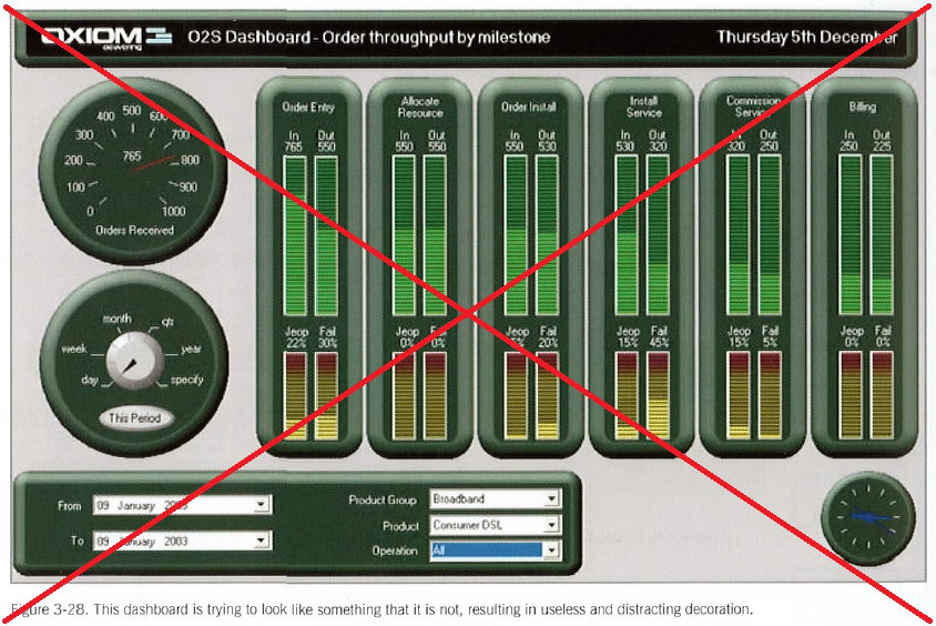
I do some DJing as a hobby, and the "LED-meter look" of the bar charts in the bad dashboard caught my eye. In DJ gear, similar meters are great for monitoring all sorts of things at a glance ... so perhaps they could also be a useful in monitoring a business(?) Follow along as i try to fix this bad dashboard.
But first, speaking of DJing, here's a picture of my friend DJ George. He is hands-down the best 80s/90s dance party DJ I know in the RTP area. If he can use his DJ "dashboard" to keep track of all his music/microphones/lights/effects, I bet we can also put DJ LED-meters to good use in a dashboard to help run a company!

So, what's wrong with the dashboard above? (Where do I start! LOL) Here are a few of the many problems that jump out at me:
- The round speedometer gauge in the top/left graphically shows something that is already being graphically shown in the first bar chart. There's no point in showing the same thing graphically twice, and the speedometer gauge is difficult to read, and consumes a lot of space.
- The time period selector gauge (bottom left), and the pull-down select lists, take up a lot of space in the dashboard. I think it would be better to have all the data-selection interface on a separate page, and once you've selected what data you want to see, then have that dashboard brought up full-screen. (I would also make them all selection lists, rather than making one of them a gauge.)
- The gauge in the bottom/right. Umm... what the heck is that? ... Maybe a clock? Whatever it is, I don't think we need it.
- The LED-meter bar charts don't have any scale, so I don't know what the min & max values are. Also, I would like to see more contrast between the lighted and unlit bar segments.
And here's the new/improved version I created with SAS:
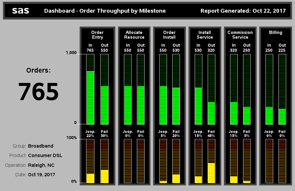
My improvements:
- Rather than the difficult-to-read speedometer, I used a simple (large) text number to show the number of orders. In the dashboards I've created for internal use at SAS, the managers really like having a big overall summary number like this on the dashboard.
- I don't show the select lists used to choose the data shown on my dashboard (those would be shown on a previous screen).
- I added a scale to the bar charts, and my lighted bar segments are much brighter, with higher contrast to the background. It's very easy to see the bars now.
- I also made my text a bit larger, and easier to read (this is more visible when you click the image below, to view the full size dashboard).
- When you view the full size version of my dashboard (click the image above), you'll also notice that the bars have HTML mouse-over text.
And here's my challenge to you ... find an old dashboard you created years ago, and see if you can make some improvements to it, using the tips & tricks you've learned since then. You might surprise yourself at what you come up with! :)