SAS software has long been used to help analyze 'risk' - what about using it to help determine your risk of being attacked by a vampire?!?
On a previous Halloween, I was the victim of a Vampire attack. Here's the photographic proof...
Being the most common O+ blood type, I thought I was at low risk of attack (with vampires allegedly preferring the more rare blood types, according to this report) -- but I guess a really hungry vampire will lower her standards from time to time.
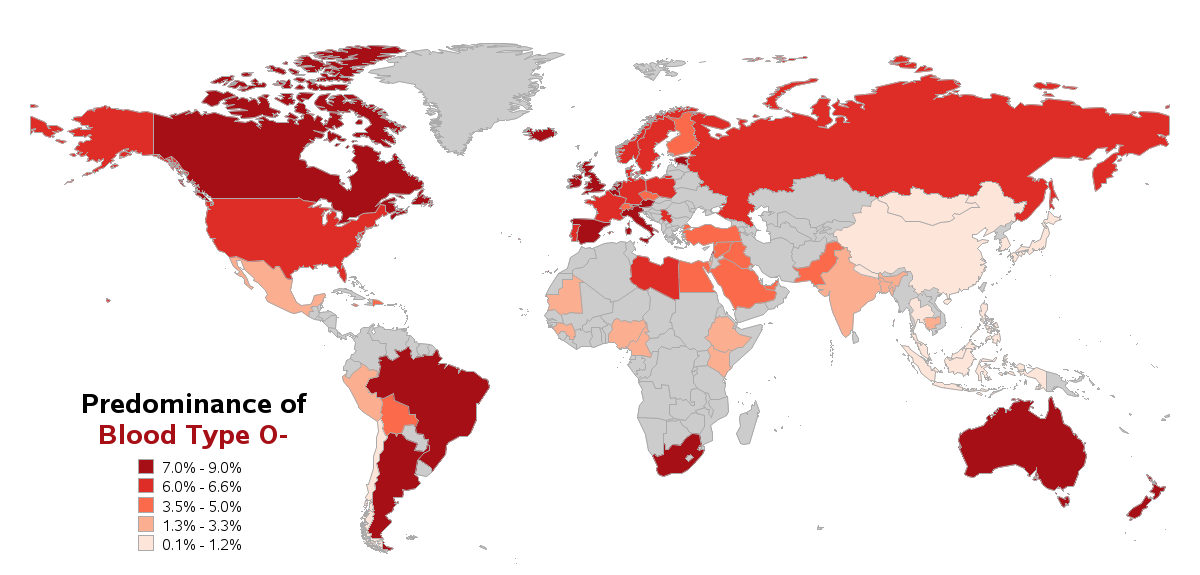
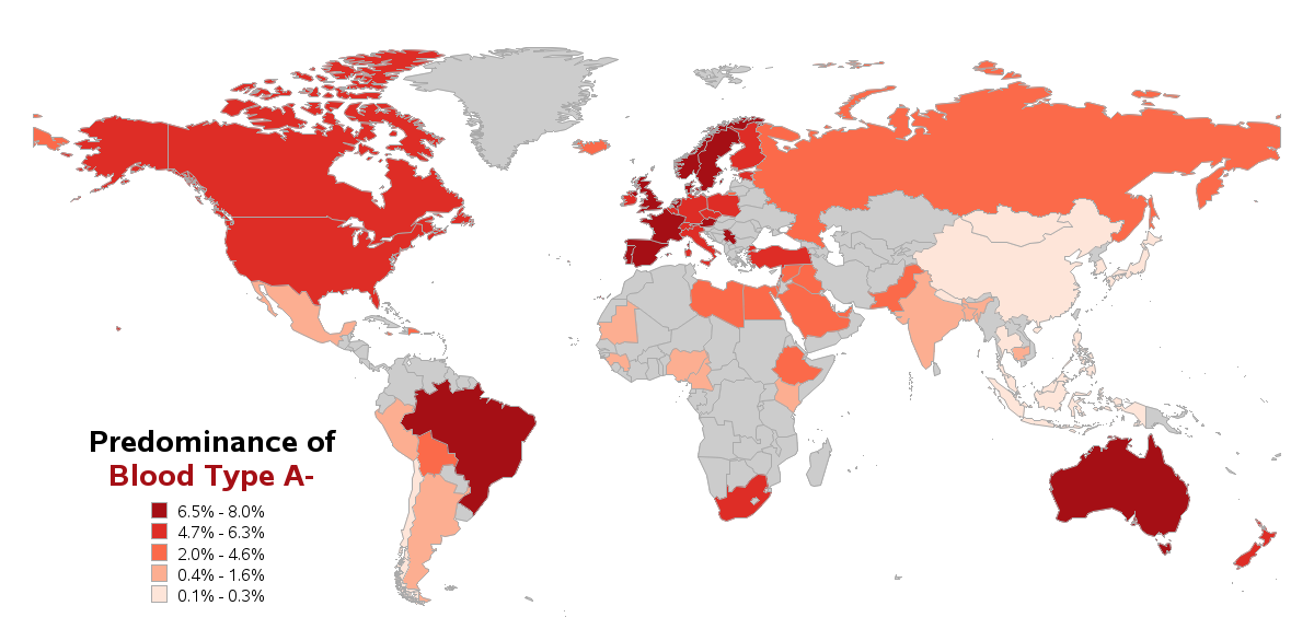
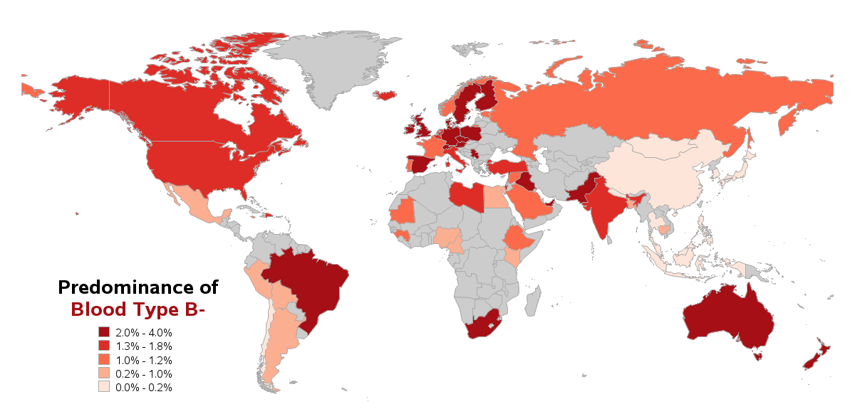
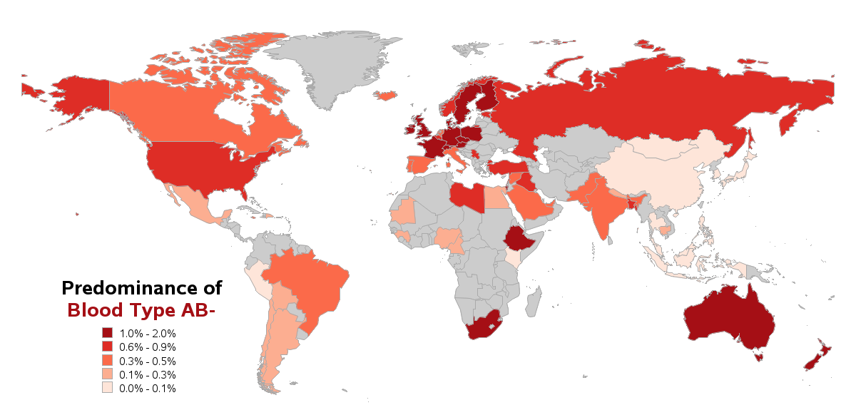
So, what is your blood type, and how common or rare is it in the human population? Assuming that vampires prefer the more rare blood types, what is your risk of a vampire attack? And if there is geographical clustering of the rare blood types, might vampires be lured to those areas (assuming they use analytics to determine such things)?
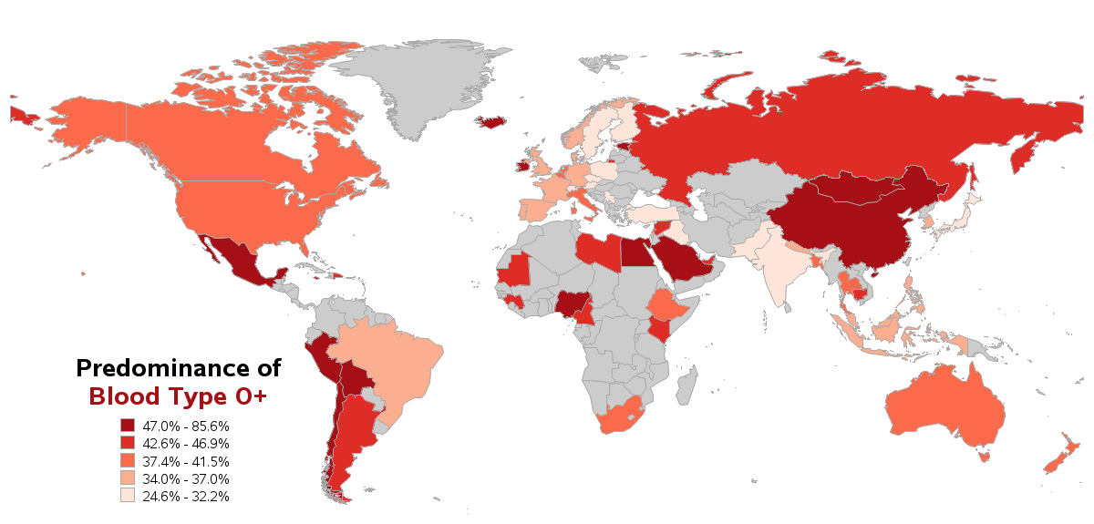
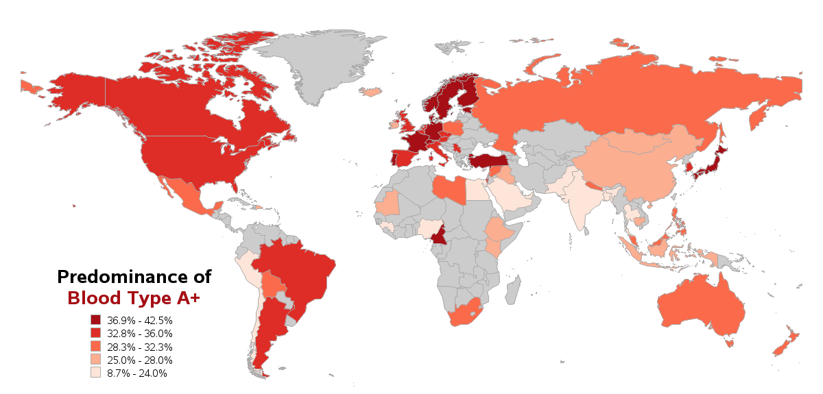
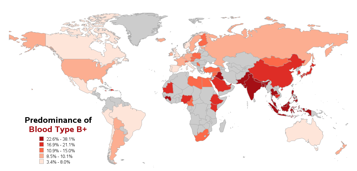
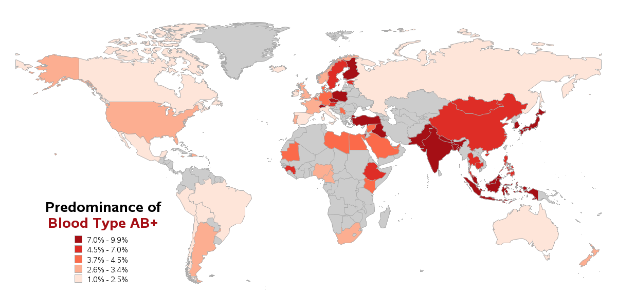
I found some data about blood types by country, and plotted the values on a world map. Perhaps you can analyze these maps to help determine the rarity of your blood type, and whether you live in a vampire-prone area of the world. I've included small thumbnails of my maps below, and you can click on them to see the full size maps with html hover-text for each country:
WANT MORE GREAT INSIGHTS MONTHLY? | SUBSCRIBE TO THE SAS LEARNING REPORT





16 Comments
Pingback: How to scare up a few good graphs for Halloween - SAS Learning Post
Here's a very interesting article about rare blood types:
http://gizmodo.com/inside-the-blood-factory-that-keeps-track-of-the-worlds-1659939881/+laceydonohue
Pingback: ABO-veriryhmän alleelifrekvenssit | R-ohjelmointi.org
Pingback: The distribution of blood types by country - The DO Loop
You have figured us out!!!
Please don't drink my blood... There are people who donate blood, you don't need to hurt or attack anyone. If you really need blood, without hurting anyone, just pretend to be injured and get a blood transfusion, but steal some blood if u need too.
Oh my god. I love these comments. Again, great graphs and post to go along with it.
Robert
Fun maps but it would also be nice to add a little infographic showing which countries produce the largest quantity of anti-vampire protection measures.
The three most popular are:
1. Garlic (China is the world's largest producer http://en.wikipedia.org/wiki/Garlic#Cultivation); or
2. If you can't stand the aroma of garlic make your way to Mexico, the world's largest producer of silver for an abundant supply of the raw material for silver crosses https://www.silverinstitute.org/site/supply-demand/silver-production/ ; and
3. If you prefer to take the fight to the vamps head for the USA where it's position as the world's largest producer of timber makes wooden stake production a piece of cake http://www.mapsofworld.com/world-top-ten/countries-with-most-timber-producing-countries.html
Incidentally I discovered another interesting little factoid in that Alaska is the only state in the USA where no garlic is produced at all. I knew there had to be another reason why the bloodsuckers made for Barrow in the film 28 Days of Night......
Chris
Thanks for the info Chris - that could help with a full-blown Vampire Dashboard! And I promise not to let anyone know that you're a secret Vampire Hunter! ;)
My old eyes have a hard time reading the legend, so my first thought was the deeper the color, the higher my risk of vampire attack. But upon (very) close inspection, it looks like the deeper the color, the higher the percentage of that blood type, so *lighter* colors are at higher risk.
Lucklly for me, Bath & Body Works has a special garlic bubble bath and body wash. I also have some toothpicks in my purse (portable mini-stakes) just in case!
I guess it also depends on several factors, such as whether the vampires are evenly distributed across the world, or whether they migrate to the areas that have the highest concentration of the rare blood types! :)
Two graphics are labeled for B-. Should one of them be for A-?
Good catch Suzanne - you've got a sharp eye! Looks like I had a code typo for my A-negative map (I included an extra des= and name= line in my code), which produced the incorrect/extra B- map.
proc gmap data=blood_data map=my_map all;
id idname;
choro A_negative / levels=5 legend=legend1
coutline=grayaa cdefault=graycc
html=A_negative_html
des='' name="&name";
des='' name="&name";
run;
I'll correct the problem, and push out the new map shortly. Thanks for the correction!
This has now been corrected!
When multiple maps are presented together, it's confusing that the same color represents different percentages in each map if you want to compare prevalence between blood types - as suggested by the blog title. Would a different color set for each blood type be worse?
Good point. To truly compare all the different blood types, it would probably be good to use the same legend/scale for all of the maps (but then many of the maps would be very-very light shades of red). As always, it would probably be best to plot the data in several different ways, to get the best and most complete picture.