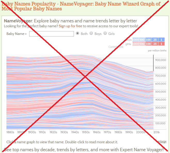
I'm sure that most of you have seen the really cool interactive Baby Name Voyager, right? If not, go have a look and try it out (be sure to plug in your name, and the names in your family, and so on). Here's a screen-capture:
That's a pretty cool application! ... But it made me curious about the most popular names, and I had questions that I could not answer using their interface. Well, of course that's not a problem for a SAS user!
I quickly found that the source of the baby name data was the U.S. Social Security Administration, downloaded their data zip, and extracted & read it into a SAS data set.
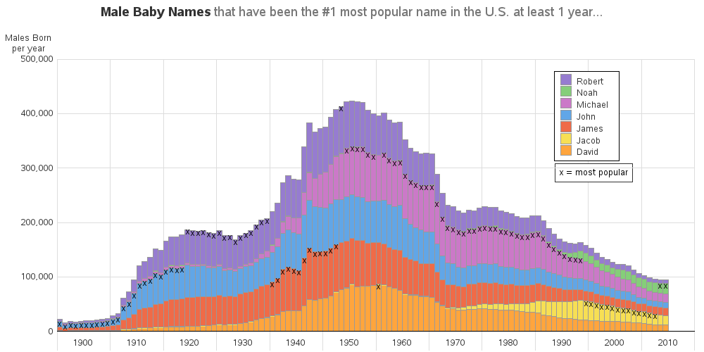
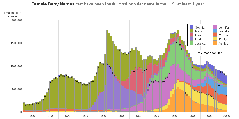
Now I could answer my question ... "What were the #1 most popular names each year, and how popular were those names over all the years?"
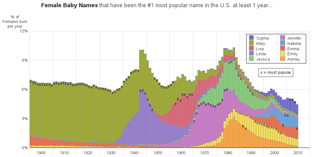
I used Proc Sql to do my heavy-lifting, and then plotted the results using Proc Gchart. The chart shows all the names that have been #1 for at least one year, and I annotate an 'x' on the year where it was #1. I create a separate chart for boys & girls. Click on the images below to see the full-size charts, with mouse-over text.
The left side of the charts was a little difficult to read, because there were so few people living in the U.S. in the early 1900s (compared to now). Therefore, to make the charts more readable, and the values easier to fairly compare, I calculated the numbers as a % of each year's total babies and plotted it again. I think looking at the data in both ways gives a lot more insight than looking at the data plotted just one way.
There's a lot going on in these charts!
With your inside-knowledge of names, history, movies, politics, etc - can you explain any of the trends and oddities?



3 Comments
Pingback: What's the most popular baby name in your state?
Hey Robert, is it possible that you could post the sas code for these charts too? Much appreciated.
Here's a link to the SAS code:
http://robslink.com/SAS/democd63/popular_names_info.htm