Editor's note: This blog post is part of a series of posts, originally published here by our partner News Literacy Project, exploring the role of data in understanding our world.
“Numbers don’t lie” is a phrase we often hear to support the idea that something must be true if you can cite data or statistics about it. But even accurate numbers can paint a misleading picture, particularly if people don’t know what to look for. Several common ways to report metrics and statistics can easily mislead readers. Let’s explore how statistics can be misinterpreted.
Mean vs. median
Mean and median are two statistical concepts that often get muddled. Both are measures of central tendency, meaning the values are intended to represent the “middle” of the data. But this can be done in different ways, which is important to understand.
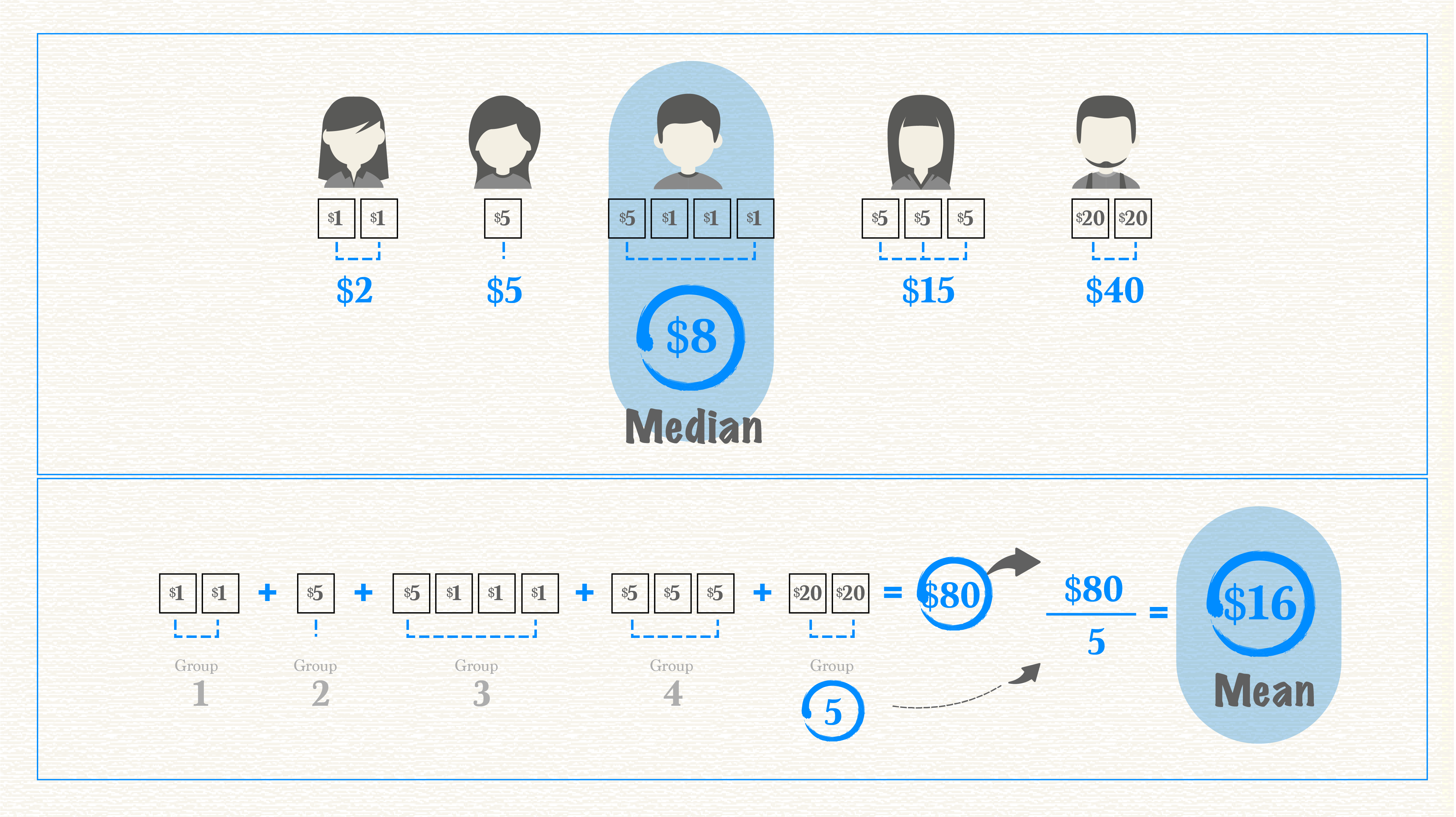
To find the mean, or average, add together the value for every member of a group and divide it by the total number of members. Say you and four friends were trying to figure out the average amount of money in your wallets. You’d count up the total amount of all your money and divide it by five. Median, on the other hand, represents the value in the very middle. In this case, you’d arrange each person’s money from the least amount to the greatest. The median is the amount in the middle. Two people have larger amounts, two people have smaller amounts. The person with the median amount of money is smack in the middle.

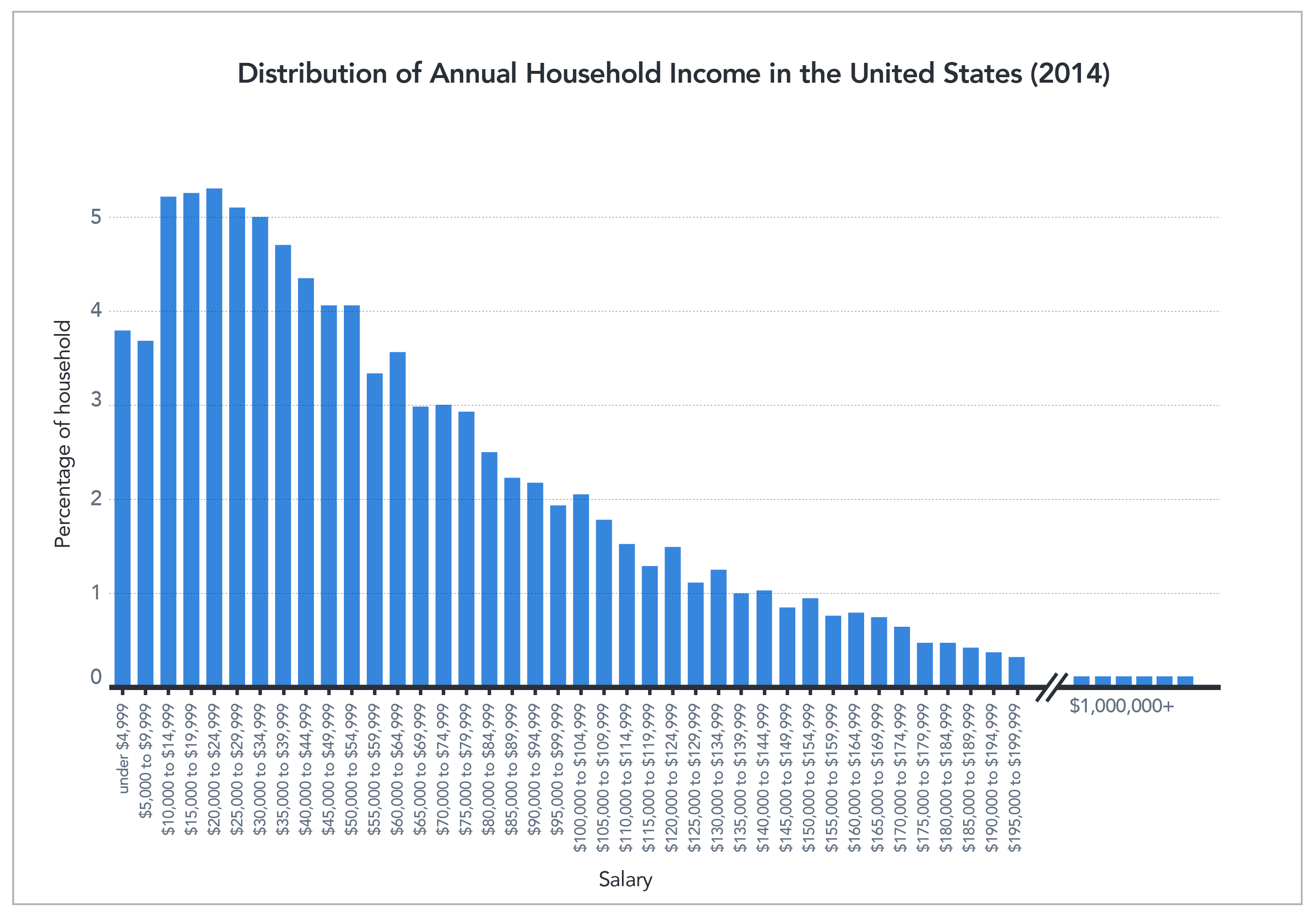
As you can see in the image above, the average and the median are not always the same. In fact, with heavily skewed data, they can be quite different. When we talk about skewed data, we’re referring to data with a heavy concentration of values on one end and only a few values on the other end. This often happens when discussing income, which is easily skewed because most of us have middle- or low-income levels while only a small percentage have very large incomes. Take U.S. income data from 2014, for example.

Don’t be misled
The median income in the U.S. is approximately $33,000, while the mean (average) income is approximately $50,000. This data shows half the U.S. population makes $33,000 or less. However, if you consider the total of 2014 incomes across the population and divide by income-level breakdowns, the average salary is $50,000. This average salary might lead you to believe that the “average American” is doing better than he or she actually is. In reality, people who make the median salary would love the 50% raise the average salary represents. The value reported can make a big difference in how people understand information.
Impact on decision-making
A solid understanding of these metrics is especially important when statistics influence decision-making. Consider how life expectancy is often reported. Though we rarely see the term “average” used, that is what the data show. The average age at death in the U.S. is around 79, but the median age at death is about 83. This difference has a big impact on decision-making, such as retirement planning. It is quite different to say, “the average person dies at 79” compared to “half of adults live 83 years or longer.” Our retirement funds would likely be more of a priority in the second instance than in the first.
So, which measure is the best one to give when explaining data? Whenever possible, the answer is both. Knowing both mean and median gives the reader a better understanding and clearer picture of the data at hand and helps them draw accurate conclusions. But having people apply this thinking is not always in the best interest of the person reporting the numbers. You’ll notice that lottery tickets often advertise the “average winnings,” which can be enticing, compared to the “median winnings,” which are usually $0.
Percent change
Changes, when given as a percentage, are another type of statistic commonly misused or misinterpreted, and can cause confusion.
One particularly confusing case arises when the value that is changing is, itself, a percentage. Suppose a local politician is performing “fairly well” with an overall approval rating of 50%. Then, this politician opposes a bill to fill all the potholes in town, and with that, the politician’s public approval plummets. If the politician’s approval rating dropped by 20 percent, that is 20% of the initial 50%, giving the politician a 40% approval rating. The narrative changes if the politician’s approval rating drops 20 percentage points. This brings the rating of 50% down to 30% — 20 points lower. The language sounds very similar but the resulting numbers are quite different.
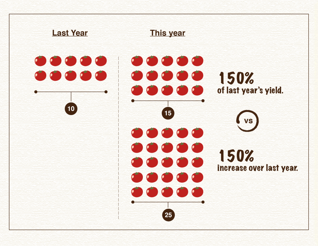
Another common source of confusion arises when something increases over 100%, or doubles. Imagine we’re talking about a garden and how many more tomatoes were grown this year compared to last. If 100% more tomatoes were grown this year compared to last year, that means the yield doubled — 10 tomatoes became 20. What if the yield went from 10 tomatoes to 15? The yield increased by 50%, but the total yield is 150% of the previous year. Confusing? Yes! That’s why statistics can be difficult to interpret.
Avoiding confusion
Sometimes authors confuse the two and report that something increased 150% when it only increased 50%. Say the garden produced 25 tomatoes this year, an increase of 150%. But someone might interpret that to mean the garden had 150% of the yield and only had 15 tomatoes. It’s often confusing, and when reading someone else’s reporting it can be hard to tell if the correct percentage is being cited since these terms are often and easily misused accidentally, or perhaps by design. If reporting an increase, an easy way to solve this problem and help the reader fully understand the metric being used is to provide all the numbers up front. One could report, “the garden’s yield increased from 10 to 25 tomatoes. That’s a 150% increase!”

Another tricky area when interpreting data involves the unit an author chooses to present. Sometimes, the same information can look very different depending on the unit presented. For example, during the COVID-19 pandemic we’ve seen different sources report new cases, total cases and cases per capita, all of which have very different patterns of behaviors across states and countries. Authors also might talk about total deaths, deaths per capita or deaths as a proportion of positive cases. This post provides more detail about the differences these numbers represent and how those differences in reporting can impact how we understand data.
A significant influence
The types of statistics and metrics authors use to communicate data can have a significant influence on how information is interpreted, especially if the author is not careful to fully explain the reasoning behind them. Authors can also make mistakes when presenting and interpreting statistics because of nuanced differences in language and calculations.
To ensure you understand data you encounter, carefully consider whether the metric used is the relevant one, given what the author is trying to communicate. If you don’t feel it is, try to find more information about what might be missing. If you are presenting your own data, the safest route is to carefully explain the metrics being used and the motivation behind those metrics. Working through this explanation helps you as well, providing the opportunity to confirm you’re reporting information in the best way possible.
Ready to test your ability to make sense of data and statistics? Take our data quiz here!
