 The data I was analyzing was about “trust.” Maybe that’s what got me thinking about Stephen Sondheim, the Broadway composer and lyricist of musicals like Sunday in the Park with George and Into the Woods and the lyricist for West Side Story.
Trust is a heavy emotional topic. Developmental psychologists like Erkison thought that the first challenge of our lives is whether we can learn to trust the people around us. As adults, we know that you can't have friendships or business partnerships or a marriage or an international treaty between nations without it. Maybe I thought of Sondheim because trust is the kind of issue he often explores in his musicals.
But I think it was more that Sondheim excels at doing something we often need to do in data visualization: Tell a story that's already been told in a way that makes it new or provides another perspective.
From the GatherIQ reports here.
GatherIQ's trust project
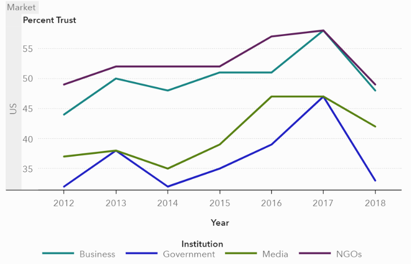
This GatherIQ project is part of our partnership with the Global GoalsCast podcast project. Our most recent visualizations on GatherIQ are based on data about one or more of the United Nations’ 18 Sustainable Development Goals.The “trust” data came from the Edelman Trust Barometer Global Report, including trend data from 2012 to 2018.
Edelman’s annual international Trust Barometer survey asks people across the globe about the degree to which they trust four institutions:
- Government
- Business
- Media
- Non-governmental organizations
For 2018, this large scale survey includes responses from more than 30,000 people in 28 countries. Edelman publishes an extensive analysis of the data, including technical documentation of the sampling method and metric scoring.
Our goal at GatherIQ wasn’t to replicate the analysis Edelman’s research team had already done. Our goal was to create something new by telling the story a different way ... like a Sondheim musical.
As with the GatherIQ visualizations we've done for the Sepsis Awareness Alliance, the World Wildlife Fund and the International Organization for Migration, our goal was not to use the visualizations to make a particular point or demonstrate a statistical finding. Our goal at GatherIQ is different: To publish visualizations that add to the conversation by presenting data from another perspective, a new way of looking at the issue. As Sondheim might say:
“Stepping back to look at a face
Leaves a little space in the way like a window,
But to see-
It's the only way to see.”
~ Finishing the Hat from Sunday in the Park with George
Analytics backstage
If you're familiar with SAS, you won't be surprised to know that in developing these visualizations, our team has already done text mining and topic discovery for witness reports, run a forest model to determine which kinds of demographic variables drive awareness of Sepsis, and conducted other statistical analyses for GatherIQ projects. We've shared that work directly with our partners offline.
Those analyses have informed our visualizations so that, in our efforts to do something different, we don't distort the underlying truth(s) in the data. But we are trying to create visualizations that will speak to the largest possible audience, including many people who might not understand those kinds of technical details.
Our goal with GatherIQ visualizations is not to demonstrate how powerful our servers are, or how efficient our autotuning algorithms are for machine learning modeling. Our goal is to create a different way of seeing some of the data our partners use to reach their own goals. That's why you won’t see variance components or model fit metrics or even (in most cases) statistical estimates in the GatherIQ visualizations that are published right now.
For many users of SAS Visual Analytics, the software driving our GatherIQ platform, this is standard practice. The statistical work driving the visualization is not front-and-center in the final representation, but the visualization wouldn’t be useful without it. The latest version of SAS Visual Analytics makes it simple to drag and drop a machine learning model right into a bar chart report. That will be incredibly useful for many users, but that’s not our audience with GatherIQ.
GatherIQ data visualizations take center stage
If you haven't had the chance to browse the visualizations on GatherIQ, I encourage you to do so, starting with the reporting on Trust. Some of the visualizations will look familiar, like the multi-line chart with time on the X-axis and a lattice structure on the Y-axis to allow users to compare different countries. Other visualizations might seem a bit unusual.
For example, survey respondents’ trust in different institutions is captured as different variables. Ordinarily, different variables would be represented using a bar chart, but here we treat these four highly-correlated variables as a histogram, typically reserved for continuous data, and animate that to show changes over time. We have a heat map with time as a categorical variable on the X-axis. That’s different. We've tried similar experimental approaches to traditional graphs on other reports on GatherIQ (in particular, regarding the use of word clouds).
If you haven't visited GatherIQ in a while, try a Chrome browser from your desktop to see our new, more responsive HTML design with scrolling reports. And when you get to the animated bubble plot with 28 bubbles that move only on the Y-axis, at least you'll know that we knew what we were doing.
As Sondheim would say, sometimes an unusual way of looking at something is the only way to see.
Explore the data in GatherIQ now