More than 3.5 percent of the world’s population is on the move, considered international migrants. That’s more than 250 million people living in a country different than their country of birth or nationality. To put that another way, if all migrants lived in a single country, their population would be the 5th largest country in the world! A recent podcast from globalgoalscast.org highlighted the movement of migrants, and we created a visualization to let users see for themselves where migrants are moving.
What countries are migrants moving to? Of all the migrants moving to a specific country, where do they come from?
Planning the visualization
We wanted to allow users to easily explore these questions, so we created an interactive visualization using SAS Visual Analytics. We analyzed migrant data from the United Nations (UN Department of Economic and Social Affairs - Population Division) and started building reports. But what is the best way to display this data?
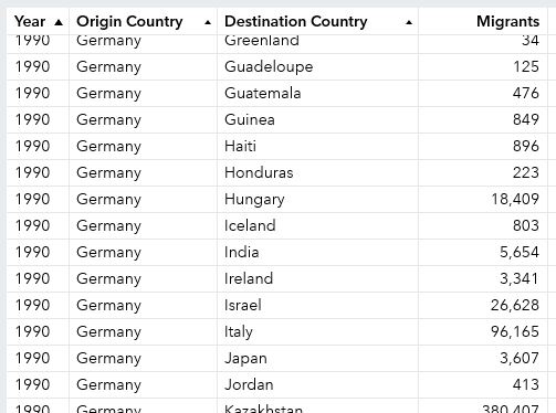
There were many variables in the data, but the key variables were year, country origin, country destination and number of migrants (see example below). Other variables in the analysis, like gender and region, were omitted from the following screen shot due to space considerations.
Visualizing movement on a map
Since we are dealing with geographic data we wanted to display the visualization on a map. We filtered the map to just a single origin country. Not sure which way might show best, we tried two of the standard ways to display geo maps (shown below).
- Bubble Plot – the larger the bubble, the more migrants that moved to the destination country.
- Regions – the darker the shading of the country, the more migrants.
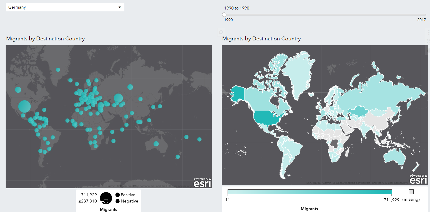
At a glance, you can see which destination country has more migrants. But where are they coming from? The map doesn’t easily show that. That got us rethinking how to display the movement of migrants in another way. But how?
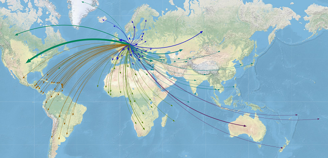
You can find the answer in a place you may not think to look: a network analysis object. If you haven’t used this object before, your first thought might be that they look like a spider web (many of them do). The object below is a network analysis of the same UN data presented on the above maps, filtered to a single origin country. The size of the node represents the number of migrants to the destination country.
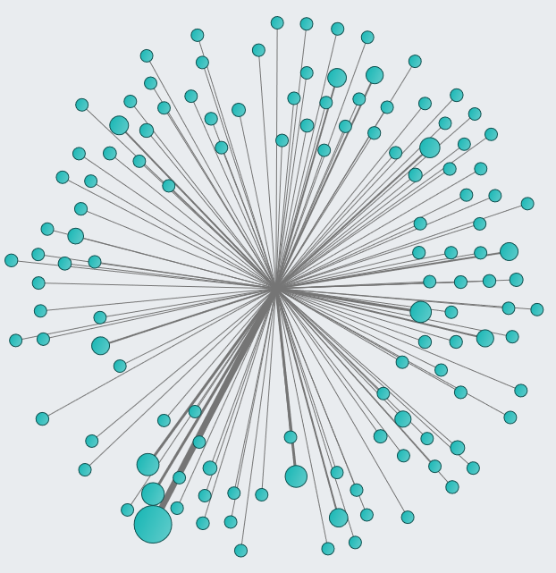
This initial view makes it difficult to quickly understand what we're looking at. Instead, let’s add a map background to the network analysis. [Note: the map background option only becomes available if both your source and target are set as geographic items. If you are using a network analysis object and not able to add a map background, most likely it is because your source and target are not defined as geographic objects.]
Believe it or not, the following map is the same default network analysis object as above, but with a map background. It even looks very similar to the bubble chart shown earlier, except it adds links between the nodes (and a different map service was selected). So why choose this object?
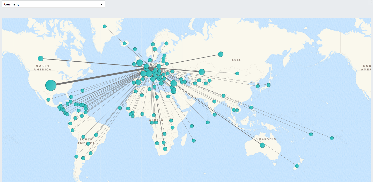
After a few quick option changes we get a more useful object:
- Change the node size to 0 to eliminate the bubbles.
- Add arrows in the destination direction.
- Change the link curvature to 50% to avoid straight lines.
- Change the map background to add your own style. SAS provides a wide selection of options.
- Add a link color – in this case by destination region.
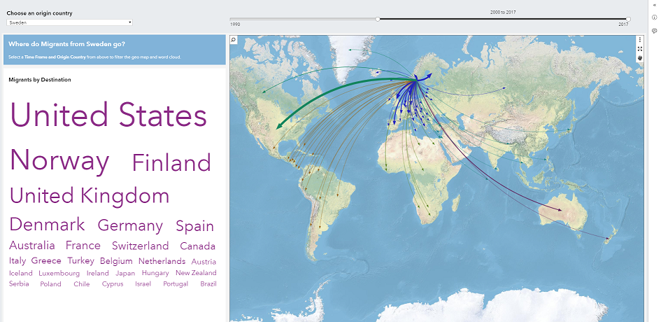
The following map reflects these changes. It includes the same information as the previous maps, but it tells a much more dynamic story. The network analysis shows the origin of the migrants, the thickness of the lines compares the volume and the color represents the destination region. At a glance you can tell where migrants are moving from and where they are going!
To bring this all together, we added a word cloud based on the migrant destination. Now when you filter by migrant origin, you can quickly see the migrant volume on the map and in the word cloud.
The World is on the Move – Explore for Yourself
I’ve walked through the thought process of creating a SAS Visual Analytics report using a network analysis object. Now, explore the data yourself.
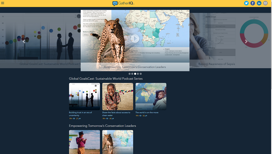
This report is included in GatherIQ, a free crowdsourcing app from SAS with the sole purpose of using data for good. It takes data about some of the most pressing global issues and makes them personally relevant to people through interactive visualizations. The app promotes a more data-driven culture and encourages you to start discussions based on that data. The interactive reports were created in SAS Visual Analytics and embedded into GatherIQ (a custom app made possible by the SAS Mobile SDKs).
You can access GatherIQ from your desktop as a web app, or as a mobile app (iOS and Android). In the app, open the migration report titled, “The world is on the move.” Start exploring what countries migrants are moving to. Or look at it the other way. Pick a country and see where migrants to that country are coming from. These migration reports, as well as other topics are waiting to be explored in GatherIQ.
What data visualizations will you build?
A network analysis object displays the relationships between data item values as a series of linked nodes. While this feature has been available in SAS Visual Analytics for years, it may not be an obvious choice when you think of creating geographic maps. Give it a try. Interact with it in GatherIQ. Think about how network analysis can help tell your story.
Explore more visualizations for a cause in GatherIQ