In an industry full of word people, it's not uncommon to hear journalists lament, “Data, what are you doing here!?” But today, data is a tool in the newsroom, and reporters often need to know how to analyze and present data to readers as part of their role in communicating information to the public.
Amanda Farnsworth, Head of Visual & Data Journalism for the British Broadcasting Corporation (BBC), has somehow managed to bring together a team of online journalists, online designers, coders, TV coders, TV designers and TV picture editors – people from both sides of the fence, so to speak – with unprecedented success. She gave SAS Global Forum attendees the scoop in her April 3 presentation in Orlando. The large room was so full that latecomers were turned away, and Amanda was compelled to give an encore presentation on the final day of the conference!
BBC is recognized around the world for its trustworthiness and impartiality. But with a nickname like “Auntie,” which Farnsworth says is how the British refer to the news outlet, you don’t expect trendy looks, cut-to-the-chase charts, and data for days.
Farnsworth set out to change that with compelling data journalism. “You do something modern and ‘data-ery’ and suddenly you’re cool and ‘with it,’” she said.
The incredible @farnsa sharing how to tell great stories with data @ #SASGF @SASsoftware pic.twitter.com/mvuV9e7UGI
— Chris Blake (@cj13579) April 3, 2017
So what is data journalism exactly?
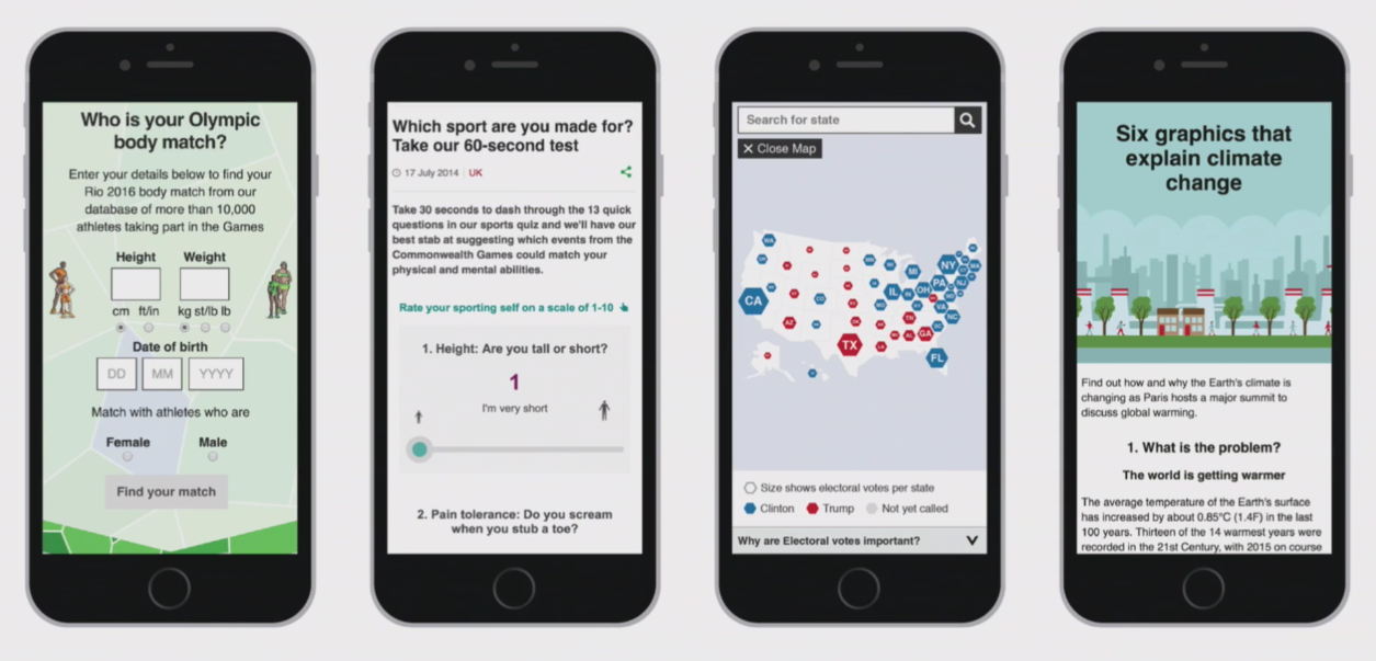
For Farnsworth, data journalism is about sourcing public datasets, finding stories in them and visualizing them for their audiences. Her team looks to data made available by governments, international organizations, companies and other reputable sources. “This is like a whole new world that we never had access to before.”
Her team studies the data to look for outliers; that’s where the juiciest stories hide. “We look at the datasets for the biggest or the smallest, the best or the worst,” Farnsworth said.
Then they make it available to the BBC audience in such a way that they don’t know any of what has gone on behind the scenes. “They just have something super accessible that they can interact with once we’ve done a little work behind the scenes,” she said.
It may sound simple, but one of the examples she showed – the Personal Relevance Calculator, which offers a test to determine your social class – garnered 8 million participants. In online news site speak, that amounts to a chunk of change.
When she began in the new position in 2013, the BBC was still very much desktop-focused. Now its viewers prefer smaller, hand-held devices and scroll instead of clicks for information. “It’s a very different world,” she said. “We have to adapt and sometimes unlearn things we used to know about what we do.”
Guiding principles you can use too
Farnsworth set forth three guiding principles for the newly formed team:
- Distinctiveness: 70 to 80 percent of the stories they report are also covered by other news outlets, so visual graphics help them stand out.
- Liveliness and modernity: The visual graphics resonate with audience members who don’t gravitate toward the BBC’s more traditional news bulletins, namely younger people who get their news from smartphones rather than desktops, TV or radio.
- Understanding: In an instant, a well-visualized piece of data conveys some information.
Quick-turnaround, daily graphics have become standard for BBC news coverage, both on television and online. In the case of breaking news, her team is poised to have a related map, chart or other graphic available and online within 20 minutes using data generated by the journalist and then simply reconfigured by the visual journalism team. “We’re only gathering data once,” Farnsworth said.
That data also feeds a daily Go Figure graphic, which combines a big running story with just one important number or related fact and is shared on social media. “It is a highly-visual, interesting graphic that allows people to go to the water cooler and say, ‘Hey, did you know…,’” she said. “And where you can, adding a little bit of humor and a little bit of animation goes a very, very long way,” said Farnsworth.
No doubt, that nudge of humor had something to do with one Go Figure graphic reporting: “The average British garden could be home to 20,000 slugs. Each with 27,000 teeth.” Or this one: “What should you do when faced with 100 profiles on a dating site? Mathematicians suggest you read and reject the first 37 profiles then pick the first one from the rest that’s a better match.”
Excuse me while I make my way to the water cooler.
Your team of analysts might not be sharing news, and you have a very different audience, but there's a lot to take away from the data journalists at BBC. What if your goal were getting people at work to talk about data around the water cooler? How might that improve decisions throughout the organization?
Watch and share the full archived video below, complete with colorful examples and clips, or read more from Farnsworth about data visualization.