I’m a huge Apple fan. I woke up at 3 AM EST a few weeks ago to order my new iPhone 6. Ever since this new device was announced, I’ve been intrigued with Apple Pay as well. The new iPhone 6 uses NFC (Near Field Communication) to enable contact-less payments. You just hold your iPhone 6 near the payment reader with your finger on TouchID, and a little vibration and beep let you know that your payment was successful. It sounds amazing, but that’s all I really knew about it. How could I quickly find out more about who was using it, where they were using it, and what people thought about it? I turned to Twitter.
Rather than analyzing tweets one by one, I decided to import a few thousand tweets into SAS Visual Analytics. I knew that I could build a word cloud, but I wanted to go one step further and get a feel for what people actually thought about Apple Pay and where it’s being used. SAS Visual Analytics 7.1 provides sentiment (an attitude that is expressed about an item) by document (a text based data item) and topic (a grouping of important terms in a document collection). It conveniently color codes these and allows you to see the results in drop-downs and at the top right of the word cloud, as shown below:
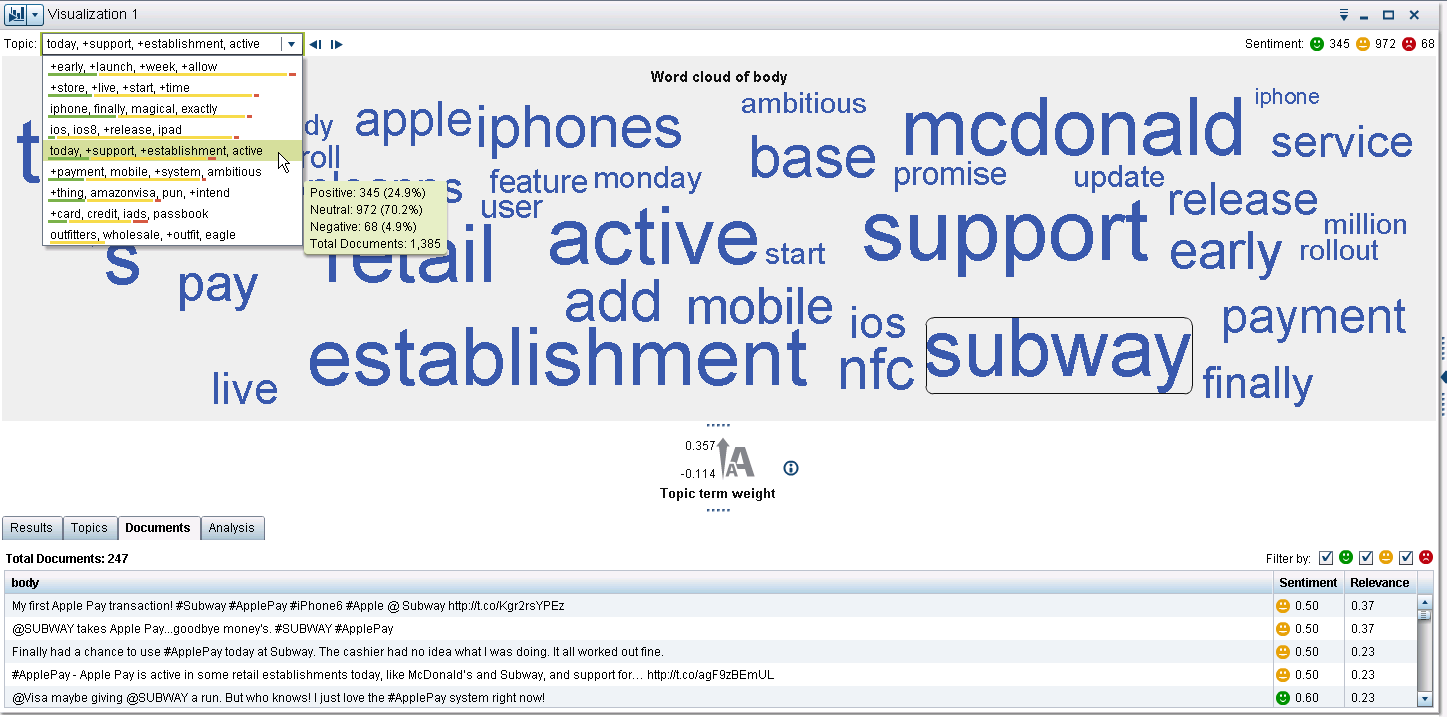
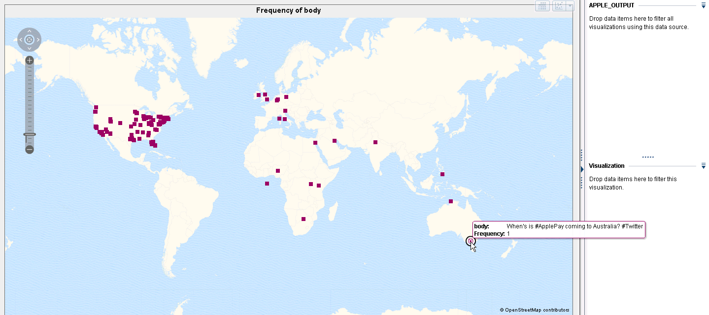
This handy feature immediately allowed me to see that most tweets were neutral or positive, not a lot of negative sentiment about Apple Pay. Good to know, but I also wanted to know where I could use it. Turns out, Subway was one of the very popular places to use it. I also found out that the Amazon Rewards Visa card now works with Apple Pay and many people that tweeted about this were happy with that. From a location standpoint, most of the tweets I analyzed came from the US, with a few Twitter users asking when they could expect Apple Pay in their respective countries.
Of course, I only pulled a few thousand tweets and did not analyze the entire Twitterverse. However, it took me all of ten minutes to find out a few places where I could use Apple Pay, figure how people on Twitter felt about Apple Pay related topics, and figure out which geographical locations the tweets I pulled in were coming from. Although I know that SAS Visual Analytics can handle much larger data sets, it was quite fun to know that I could have a few small questions answered as well by a simple word cloud with sentiment, and a geographical map based on the word cloud data. Pretty helpful, for just ten minutes of my time.

1 Comment
Sentiment analysis within the word cloud visualization is a great feature enhancement. Your example shows how quickly an open answered survey question, and many other unstructured text data items, can be easily analyzed.