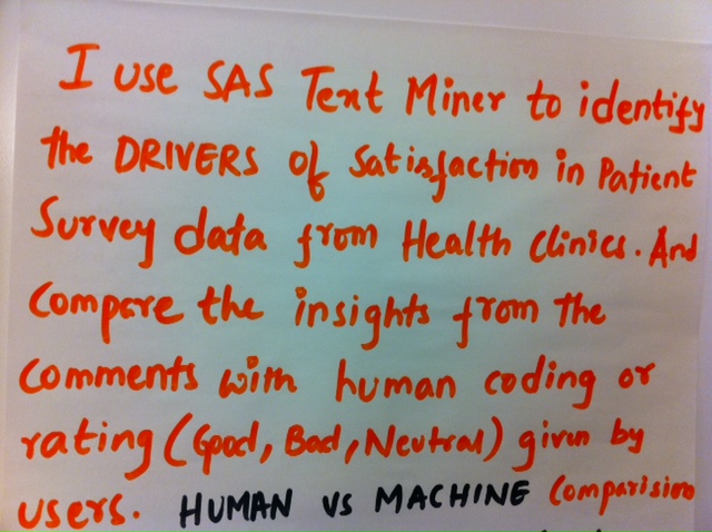
Friday's Innovation Inspiration - Mining customer satisfaction

How are you determining customer satisfaction? How do you move the needle? This SAS user mines the unstructured data in patient surveys with SAS Text Miner.