English

Rick Wicklin 0
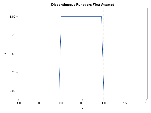
How to plot a discontinuous function

It is easy to use the SGPLOT procedure in SAS to plot the graph of a well-behaved continuous function: just create a data set of the (x,y) values on some domain and use the SERIES statement to connect the points. However, to plot the graph of a discontinuous function correctly

Data Visualization
Sanjay Matange 0
Custom Box Plots

A frequent question we get from users is how to create a box plot with custom whiskers lengths.  Some want to plot the 10th and 90th percentile, while other want the 5th and 95th percentiles.  The VBOX statement in the SGPLOT  procedure does not provide for custom whiskers.  Also, unlike GTL,

Chris Hemedinger 0
Applied data science in college basketball

Revenge of the Nerds was so 1980s. Now it's a new world order: math geeks and athletes are working together. I'm not talking just about what happens when data nerds observe, analyze, and predict sports outcomes -- as they do in March Madness with their "bracketology". That's compelling, but your