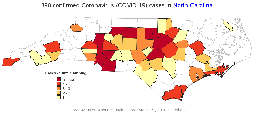
인류의 건강을 위협하는 문제, 특히 코로나바이러스(COVID-19)처럼 빠르게 전파되는 질병이 확산되는 초기 단계에는 예상할 수 없는 많은 변수들이 존재합니다. 이러한 단계에서 데이터 시각화를 활용하면 빠르게 추세를 파악하고 단편적인 데이터들로부터 유의미한 결과를 도출할 수 있습니다. 바이러스 경로 시각화는 사람들에게 경각심을 일깨우고 바이러스의 영향력을 알림으로써, 궁극적으로 질병 예방 활동에 도움이 될 수 있을
Everyone's thinking about the Coronavirus Disease 2019 (COVID-19), and wondering if there are any cases near where they live. I recently used SAS Software to create a dashboard with a world map showing which countries had reported cases. And now that the virus has spread around the world, a world/country-level
In the early days and weeks of any widespread global health concern, particularly in a fast-moving outbreak like the coronavirus, there are many unknowns. Data visualization can be a good starting point to understand trends and piece data points together into a meaningful story. The ability to visualize the spread