De SAS a Viya 4: 50 Años de Innovación en Analítica para la Era de la IA

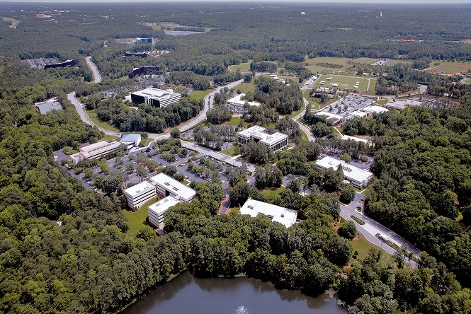
SAS: Un pionero que sigue liderando Desde su inicio como proyecto académico en la North Carolina State University en 1976, SAS se ha consolidado como un líder global en analítica e inteligencia artificial. Durante casi cinco décadas, la compañía ha capacitado a las organizaciones para transformar datos en información estratégica,
AgTech | Banking | Communications | Education | Energy & Utilities | Government | Health Care | Hospitality | Insurance | Life Sciences | Manufacturing | Retail | Sports & Entertainment | Travel