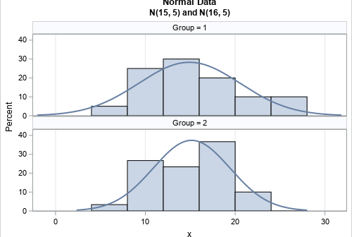
A previous article about standardizing data in groups shows how to simulate data from two groups. One sample (with n1=20 observations) is simulated from an N(15, 5) distribution whereas a second (with n2=30 observations) is simulated from an N(16, 5) distribution. The sample means of the two groups are close
Tag: Statistical Thinking
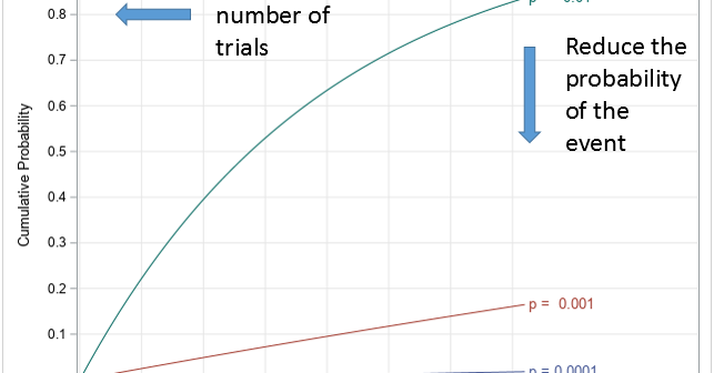
Testing people for coronavirus is a public health measure that reduces the spread of coronavirus. Dr. Anthony Fauci, a US infectious disease expert, recently mentioned the concept of "pool testing." The verb "to pool" means "to combine from different sources." In a USA Today article, Dr. Deborah Birx, the coordinator
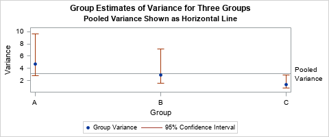
The first time I saw a formula for the pooled variance, I was quite confused. It looked like Frankenstein's monster, assembled from bits and pieces of other quantities and brought to life by a madman. However, the pooled variance does not have to be a confusing monstrosity. The verb "to
Every day we face risks. If we drive to work, we risk a fatal auto accident. If we eat red meat and fatty foods, we risk a heart attack. If we go out in public during a pandemic, we risk contracting a disease. A logical response to risk is to
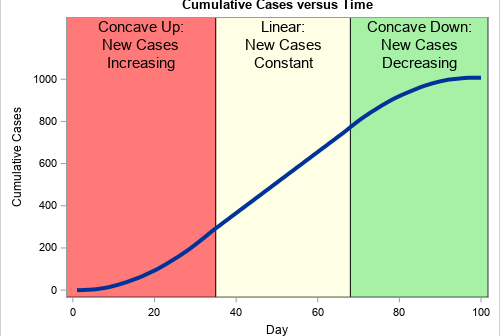
During an outbreak of a disease, such as the coronavirus (COVID-19) pandemic, the media shows daily graphs that convey the spread of the disease. The following two graphs appear frequently: New cases for each day (or week). This information is usually shown as a histogram or needle plot. The graph
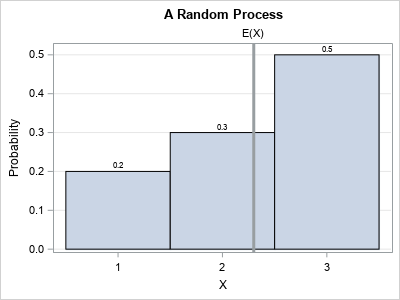
Books about statistics and machine learning often discuss the tradeoff between bias and variance for an estimator. These discussions are often motivated by a sophisticated predictive model such as a regression or a decision tree. But the basic idea can be seen in much simpler situations. This article presents a
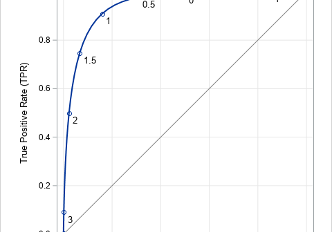
The ROC curve is a graphical method that summarizes how well a binary classifier can discriminate between two populations, often called the "negative" population (individuals who do not have a disease or characteristic) and the "positive" population (individuals who do have it). As shown in a previous article, there is
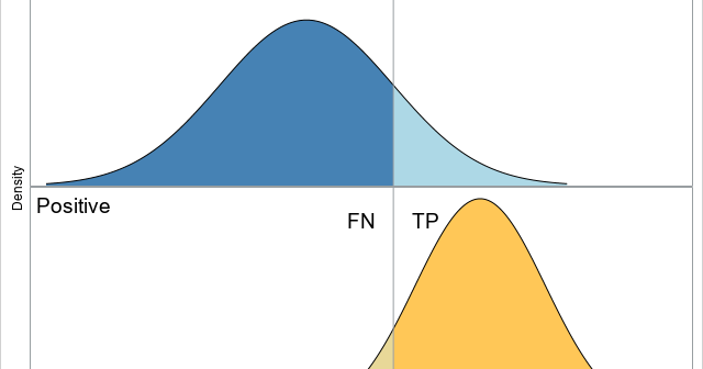
The purpose of this article is to show how to use SAS to create a graph that illustrates a basic idea in a binary classification analysis, such as discriminant analysis and logistic regression. The graph, shown at right, shows two populations. Subjects in the "negative" population do not have some
In a previous article, I showed how to perform collinearity diagnostics in SAS by using the COLLIN option in the MODEL statement in PROC REG. For models that contain an intercept term, I noted that there has been considerable debate about whether the data vectors should be mean-centered prior to
In my book Simulating Data with SAS, I show how to use a graphical tool, called the moment-ratio diagram, to characterize and compare continuous probability distributions based on their skewness and kurtosis (Wicklin, 2013, Chapter 16). The idea behind the moment-ratio diagram is that skewness and kurtosis are essential for