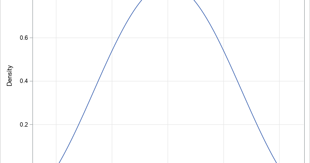
It isn't easy to draw the graph of a function when you don't know what the graph looks like. To draw the graph by using a computer, you need to know the domain of the function for the graph: the minimum value (xMin) and the maximum value (xMax) for plotting
Tag: Statistical Programming
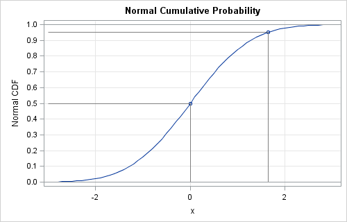
A colleague was struggling to compute a right-tail probability for a distribution. Recall that the cumulative distribution function (CDF) is defined as a left-tail probability. For a continuous random variable, X, with density function f, the CDF at the value x is F(x) = Pr(X ≤ x) = ∫
I previously wrote about partial leverage plots for regression diagnostics and why they are useful. You can generate a partial leverage plot in SAS by using the PLOTS=PARTIALPLOT option in PROC REG. One useful property of partial leverage plots is the ability to graphically represent the null hypothesis that a
A previous article shows how to compute the probability density function (PDF) for the multivariate normal distribution. In a similar way, you can compute the density function for the multivariate t distribution. This article discusses the density function for the multivariate t distribution, shows how to compute it, and visualizes
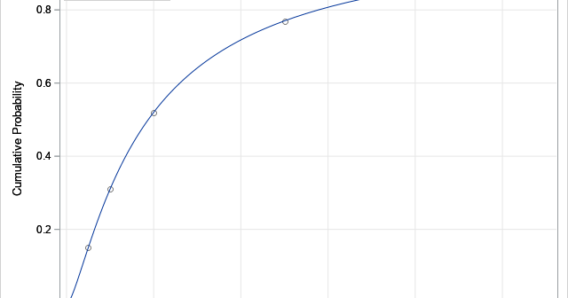
Recently, I needed to solve an optimization problem in which the objective function included a term that involved the quantile function (inverse CDF) of the t distribution, which is shown to the right for DF=5 degrees of freedom. I casually remarked to my colleague that the optimizer would have to
A common question on SAS discussion forums is how to randomly assign observations to groups. An application of this problem is assigning patients to cohorts in a clinical trial. For example, you might have 137 patients that you want to randomly assign to three groups: a control group, a group
In categorical data analysis, it is common to analyze tables of counts. For example, a researcher might gather data for 18 boys and 12 girls who apply for a summer enrichment program. The researcher might be interested in whether the proportion of boys that are admitted is different from the
Recently, I wrote about Bartlett's test for sphericity. The purpose of this hypothesis test is to determine whether the variables in the data are uncorrelated. It works by testing whether the sample correlation matrix is close to the identity matrix. Often statistics textbooks or articles include a statement such as
Recently, I showed how to use a heat map to visualize measurements over time for a set of patients in a longitudinal study. The visualization is sometimes called a lasagna plot because it presents an alternative to the usual spaghetti plot. A reader asked whether a similar visualization can be
What is McNemar's test? How do you run the McNemar test in SAS? Why might other statistical software report a value for McNemar's test that is different from the SAS value? SAS supports an exact version of the McNemar test, but when should you use it? This article answers these