It isn't easy to draw the graph of a function when you don't know what the graph looks like. To draw the graph by using a computer, you need to know the domain of the function for the graph: the minimum value (xMin) and the maximum value (xMax) for plotting the function. When you know a lot about the function, you can make well-informed choices for visualizing the graph. However, without knowledge, you might need several attempts before you discover the domain that best demonstrates the shape of the function. This trial-and-error approach is time-consuming and frustrating.
If the function is the density function for a probability distribution, there is a neat trick you can use to visualize the function. You can use quantiles of the distribution to determine the interval [xMin, xMax]. This article shows that you can choose xMin to be an extreme-left quantile such as QUANTILE(0.01), and choose xMax to be an extreme-right quantile such as QUANTILE(0.99). The values 0.01 and 0.99 are arbitrary, but in practice, these values provide good initial choices for many distributions. From looking at the resulting graph, you can often modify those numbers to improve the visualization.
Choose a domain for the lognormal distribution
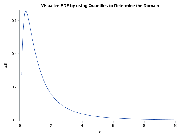
Here's an example. Suppose you want to graph the PDF or CDF of the standard lognormal distribution. What is the domain of the lognormal distribution? You could look it up on Wikipedia, but mathematically the 0.01 and 0.99 quantiles of the distribution provide an interval that contains 98% of the probability. Thus, it makes sense to use the quantiles for an initial visualization of the density function. The following SAS DATA step evaluates the PDF at 201 evenly spaced points on the interval [xMin, xMax]:
/* Choose xMin and xMax by using quantiles, then use equally spaced intervals in x */ data PDF; xMin = quantile("LogNormal", 0.01); /* p = 0.01 */ xMax = quantile("LogNormal", 0.99); /* p = 0.99 */ dx = (xMax - xMin) / 200; do x = xMin to xMax by dx; pdf = pdf("Lognormal", x); output; end; drop xMin xMax dx; run; title "Visualize PDF by using Quantiles to Determine Domain"; proc sgplot data=PDF; series x=x y=PDF; run; |
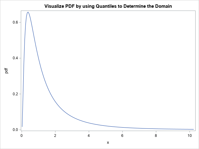
This graph is pretty good, but not perfect. For the lognormal distribution, you might want xMin to move to the left so that the graph shows more of the shape of the left tail of the distribution. If you know that x=0 is the minimum value for the lognormal distribution, you could set xMin=0. However, you could also let the distribution itself decide the lower bound by decreasing the probability value used for the left quantile. You can change one number to re-visualize the graph. Just change the probability value from 0.01 to a smaller number such as 0.001 or 0.0001. For example, if you use 0.0001, the first statement in the DATA step looks like this:
xMin = quantile("LogNormal", 0.0001); /* p = 0.0001 */ |
With that small change, the graph now effectively shows the shape of the PDF for the lognormal distribution:
Visualize discrete densities
You can use the same trick to visualize densities or cumulative probabilities for a discrete probability distribution. For example, suppose you want to visualize the density for the Poisson(20) distribution. If you are familiar with the Poisson distribution, you might know that you need an interval that is symmetric about x=20 (the mean value), but how wide should the interval be? Instead of doing computations in your head, just use the quantile trick, as follows:
/* A discrete example: PDF = Poisson(20) */ data PMF; xMin = quantile("Poisson", 0.01, 20); /* p = 0.01 */ xMax = quantile("Poisson", 0.99, 20); /* p = 0.99 */ do x = xMin to xMax; /* x is integer-valued */ pmf = pdf("Poisson", x, 20); /* discrete probability mass function (PMF) */ output; end; drop xMin xMax; run; title "Visualize Discrete PDF by using Quantiles to Determine the Domain"; proc sgplot data=PMF; vbar x / response=pmf; run; |
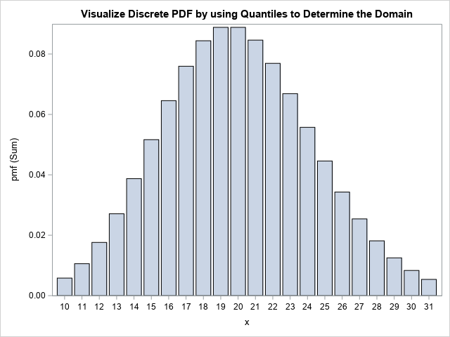
Notice that the DATA step uses integer steps between xMin and xMax because the Poisson distribution is defined only for integer values of x. Notice also that I used a bar chart to visualize the density. Alternatively, you could use a needle chart. Regardless, the program automatically chose the interval [10, 31] as a representative domain. If you want to visualize more of the tails, you can use 0.001 and 0.999 as the input values to the QUANTILE call.
Summary
This article shows a convenient trick for visualizing the PDF or CDF of a distribution function. You can use the quantile function to find quantiles in the left tail (xMin) and in the right tails (xMax) of the distribution. You can visualize the function by graphing it on the interval [xMin, xMax]. I suggest you use the 0.01 and 0.99 quantiles as an initial guess for the domain. You can modify those values if you want to visualize more (or less) of the tails of the distribution.
