The DO Loop
Statistical programming in SAS with an emphasis on SAS/IML programs
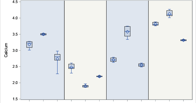
Box plots are a great way to compare the distributions of several subpopulations of your data. For example, box plots are often used in clinical studies to visualize the response of patients in various cohorts. This article describes three techniques to visualize responses when the cohorts have a nested or

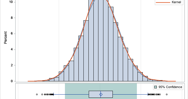
When I run a bootstrap analysis, I create graphs to visualize the distribution of the bootstrap statistics. For example, in my article about how to bootstrap the difference of means in a two-sample t test, I included a histogram of the bootstrap distribution and added reference lines to indicate a

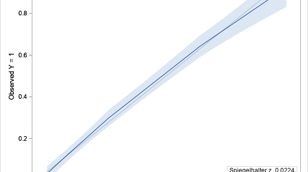
Last year I published a series of blogs posts about how to create a calibration plot in SAS. A calibration plot is a way to assess the goodness of fit for a logistic model. It is a diagnostic graph that enables you to qualitatively compare a model's predicted probability of
