The DO Loop
Statistical programming in SAS with an emphasis on SAS/IML programs
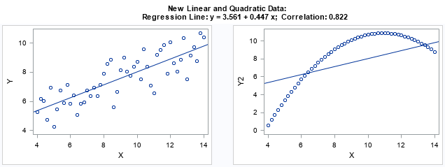
I think every course in exploratory data analysis should begin by studying Anscombe's quartet. Anscombe's quartet is a set of four data sets (N=11) that have nearly identical descriptive statistics but different graphical properties. They are a great reminder of why you should graph your data. You can read about

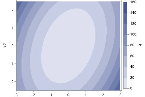
A quadratic form is a second-degree polynomial that does not have any linear or constant terms. For multivariate polynomials, you can quickly evaluate a quadratic form by using the matrix expression x` A x This computation is straightforward in a matrix language such as SAS/IML. However, some computations in statistics

In numerical linear algebra, there are often multiple ways to solve a problem, and each way is useful in various contexts. In fact, one of the challenges in matrix computations is choosing from among different algorithms, which often vary in their use of memory, data access, and speed. This article
