The DO Loop
Statistical programming in SAS with an emphasis on SAS/IML programs
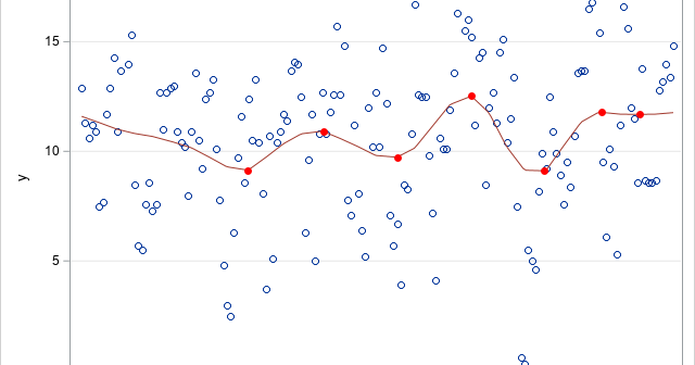
This article shows how to find local maxima and maxima on a regression curve, which means finding points where the slope of the curve is zero. An example appears at the right, which shows locations where the loess smoother in a scatter plot has local minima and maxima. Except for

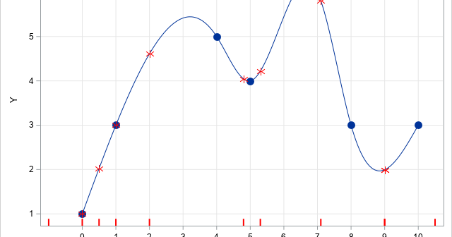
I recently showed how to use linear interpolation in SAS. Linear interpolation is a common way to interpolate between a set of planar points, but the interpolating function (the interpolant) is not smooth. If you want a smoother interpolant, you can use cubic spline interpolation. This article describes how to

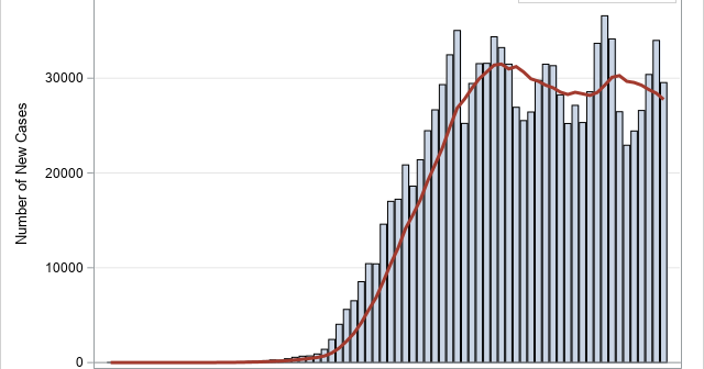
During this coronavirus pandemic, there are many COVID-related graphs and curves in the news and on social media. The public, politicians, and pundits scrutinize each day's graphs to determine which communities are winning the fight against coronavirus. Interspersed among these many graphs is the oft-repeated mantra, "Flatten the curve!" As
